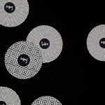
Finísima by Savvy
Finísima is the latest ale to emerge from the independent Mexican beer brewing category and is described as being for both those unaccustomed with the world of artisanal beer and the connoisseur. The ale’s packaging treatment, created by Mexican design studio Savvy, reflects its artisanal origin “without sacrificing the reach and reception of more commercial brands” by combining familiar craft aesthetics with...
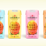
The Coconut Collective by Marx Design
The Coconut Collective is a new Australian brand of organic, flavoured, coconut waters drawn from Sri Lanka’s king rather than green coconut, a first for the market. Soulfresh, the company behind the brand, describe the water from the king coconut as having a ‘cleaner taste profile’, one that should appeal to a broader consumer base. The Coconut Collective’s brand identity and...
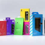
uBear by Hype Type Studio & Mash Creative
uBear is a high-end mobile phone, tablet and laptop accessories business located in Los Angeles, California. Their visual identity, developed by Hype Type Studio and Mash Creative, included a new logo, stationery set, packaging and responsive website. By utilising the bold graphic detail of diagonal stripes, sans-serif type, a bright and diverse colour palette, fine diagrammatic illustration, foils and varnishes and a simple bear...
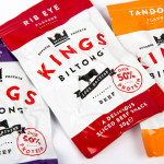
Kings Biltong by Robot Food
Capitalising on the increasing demand for healthy protein-rich snacks and sports supplements Kings Biltong, a business established by three former England rugby professionals, have launched a three flavour, cured and sliced, grass-fed British-beef range that offers athletes an “alternative to chalky protein bars and other supplement snacks that miss the mark in terms of both taste and quality perceptions.” Designed...
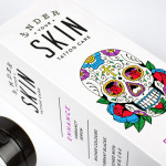
Under Your Skin by Robot Food
Under Your Skin is a specialist tattoo and skin care range made up of three treatments; ‘Recover’, ‘Protect’ and ‘Enhance’, developed in response to skin art’s move from sub-culture to the mainstream. Under Your Skin’s brand identity—which included a logotype, original illustrative work and packaging design, developed by Leeds-based Robot Food—was created to appeal to a broad audience, “from the newly marked”...
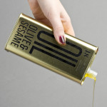
Olive & Sesame Oil by Lo Siento
Design agency Lo Siento have recently completed their packaging design work for Spanish olive oil producer Olis Bargalló‘s new Olive & Sesame variety. Lo Siento’s use of condensed sans-serif typography, stacked vertically, and printed with a single black ink makes great use of the tall tin and its warm gold colour. Typography, structural choice and straightforward language share a similar commercial...
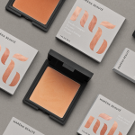
Maréna Beauté by We Are Bold
Maréna Beauté is a new Swedish cosmetics brand, founded in 2013 by make-up artist Diarry Maréna, that creates high quality products for people with dark skin types. Stockholm-based design studio We Are Bold were commissioned by Maréna to develop a brand identity solution for her range of foundations, powders and blushers—which included a monogram, logo-type and packaging design—that would appeal to a market currently...
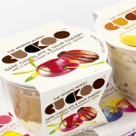
Cuckoo Muesli by B&B Studio
Cuckoo is a ‘modern’ wheat-free bircher muesli range that blends oats, yoghurt and fruit. Individual flavours include ‘Choco Sour Cherry with a smooth layer of Madagascan Vanilla’, Mango & Coconut with a tropical twist of Lime and Ginger’ and ‘Elderflower & Cranberry with a Blueberry & Blackcurrant compote’. London-based design agency B&B Studio, inspired by Swiss graphic posters, developed a new...
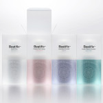
Beatific by Mousegraphics
Beatific is a new skincare range from Greek private medical service provider Hygeia Group “for women who are aware of the benefits of cosmeceuticals and can appreciate the results of thorough clinical research and high end care”. Created by Mousegraphics, the brand identity and packaging for Beatific takes the medical precision, exclusive care and expertise established by the Hygeia Group and a contemporary clinical experience...
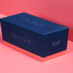
Oblique Paul Smith Edition by Graphical House
Graphical House and Derek Welsh Studio recently produced a special edition version of their distinctive domino set and collaborative project Oblique for Paul Smith. The dominoes, handcrafted in walnut using 45 processes, 8,400 hand drilled holes, 155m of walnut, 15m² of laminate, 75m² of 150 grit sandpaper, 20m² of 320 grit sandpaper and 18 hand files, come in a drawstring bag packed in...
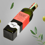
Olaf Olive Oil by Anagrama
Olaf is a Mexican cold-pressed extra-virgin olive oil produced by Olivarera Italo-Mexicana – a Mexican Italian collaboration – intended for healthy, home-cooked, family meals and makes up one-third of Olivarera ‘s olive oil range, which also includes Valentto and Olive Gold. Anagrama, the design agency behind Olaf’s new visual identity, print materials and packaging, describe their approach as taking “typical Italian visual clichés...
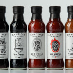
F. Whitlock & Sons by Marx
F. Whitlock & Sons is a New Zealand based producer of pickles and sauces with a heritage that dates back to 1877, a heritage that over the last century had disappeared from the packaging. Design studio Marx, in collaboration with running with scissors, sort to bring back and celebrate this with a mix of copywriting wit and illustrative authenticity based around Fred Whitlock’s love of...