
Daniel Juncadella by Mucho
Following his recent promotion to official Mercedes driver for the DTM (Deutsche Tourenwagen Masters) and test driver for The F1 Mercedes team, Daniel Juncadella recently commissioned design agency Mucho to “improve his personal brand and the way he communicated with his growing fan base and the press”....
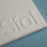
Síol Studio designed by Mucho
San Francisco-based architecture studio Síol recently commissioned multidisciplinary design agency Mucho to develop a new visual identity solution that would embody “their philosophy of conceptual, clean architecture for both interior and exterior design.” Based around a customised sans-serif logotype executed as a blind deboss, the identity conveys the familiar architectural themes of light and shadow formed within three-dimensional space and a practical, corporate efficiency....

Sancy & Regent by OK-RM
Sancy & Regent is a UK-based online boutique retailer of limited edition jewellery created by young international designers. Their visual identity, developed by independent design studio OK-RM, combines classic type, proprietary quirk and subtle embellishment with tactile material choices and a hidden high quality print finish, to convey small-scale craft with consistent, curated quality....
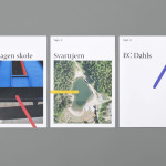
Tegn_3 by Neue
Tegn_3 is a Norwegian, multidisciplinary, architecture design studio that, through inclusive methods, process-oriented and competent project management, deliver holistic solutions that encompass the fields of architecture, planning and landscape, to large clients across Scandinavia. Their visual identity, developed by Neue, draws together the themes of technical knowledge, structure, connections, collaboration and creativity through neutral typography, a modular and expanding geometric...
Helsinki Food Company designed by Werklig
The Helsinki Food Company provides design and production services – including consultation, styling, photography and recipe development – to regional broadcast, print and event sectors. Created by visual communications agency Werklig, their visual identity – an economical single colour print treatment of a logo-type constructed from a single consistent line weight and culinary-related letter-forms across a variety of tactile and dyed craft substrates – sets...

Townhouse by Koniak
Townhouse is a hotel designed and ‘curated’ by The Kastiel Family and located at the heart of the Tel Aviv. Based around tactile material and print finish, a mixed typographical approach in conjunction with a simple sans-serif logo-type and monogram, Townhouse’s visual identity, created by boutique design studio Koniak, frames the traditional crafted luxury of the hotel’s interior fixtures and fittings with a...
Whisky Ambassador by O Street
Whisky Ambassador is an Accredited, UK-based one-day training course that introduces bar staff and license holders to the techniques of effective Scotch whisky selling. Based around a simple monogram and sans serif logo-type combination delivered as an emboss and metallic spot colour treatment across tactile and uncoated material choices, design studio O Street’s visual identity for Whisky Ambassador – a recent start-up –...

Plow by Perky Bros
Plow is a Tennessee based customer acquisition service and telecom/energy contractor for the large to mid-size business sector. Their identity, created by multidisciplinary design agency Perky Bros, neatly communicates the experience, professionalism and advisory nature of Plow’s service, the commodities they manage and their renewable energy options through a logo-type built from a stencil cut serif typeface and apostrophe detail set...

Privacy International by Paul Belford Ltd.
Privacy International is a UK based non-profit organisation established in 1990 to monitor the security intrusions of governments and business, increase the awareness of data protection concerns and establish ‘new forms of privacy advocacy’ at an international level. Made up of computer professionals, academics, lawyers, journalists and human rights campaigners the organisation has worked on initiatives across fifty countries and is...

Sellar by Campbell Hay
Sellar Development is a privately owned property investment, development and management business based in London and responsible for such high profile projects as The Shard and London Bridge Place. The company approached brand design agency Campbell Hay to develop an identity that would reflect their ongoing partnerships, collaborative process and involvement with the architectural world....

Norwegian Shipowners’ Association by Neue
Norwegian Shipowners’ Association is a group of businesses that collectively employ over 55,000 seafarers and offshore workers from more than 50 different nations. The association’s new visual identity, created by Oslo based design agency Neue, captures the open sea and sense of knowledge and experience with a two colour square and traditional serif combination....