
Amo Store by Studio SP–GD
Amo Store is a soon to launch Melbourne based men and women’s shoe boutique that will retail a curated collection of familiar brands and exclusive independent labels as well as clothing and accessories ranges to match. The store recently commissioned Studio SP-GD to develop a ‘simplistic’ brand identity that would effortlessly extend across a variety of formats....

Numbered by Martín Azúa by P.A.R
Numbered is a range of handcrafted home-ware products and individual commissions, created by Basque product, space and graphic designer Martín Azúa, that explore the relationship between functionality, emotion and conceptual thinking, and blur the line between tradition and innovation. A limited and controlled production context, personalisation and a connection to the local environment bring further value to each object and influence their...
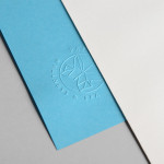
Papillon Blu by Sciencewerk
Papillon Blu is a privately owned spa and wellness centre located at the heart of Indonesia’s Surabaya City. Independent design studio Sciencewerk recently worked with the spa to develop a new brand identity, which included a logomark, logotype, print, environmental signage and website, based around the name blue butterfly....
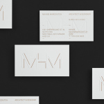
MHM Architects by 26 Lettres
MHM Architect is the studio of independent Canadian architect Maxine H. Marcovitch who, working with a team of professionals, trade and closely with clients, creates “beautiful, innovative, and unconventional architectural spaces.” The studio’s new brand identity, developed by 26 Lettres and which included a logotype, blind embossed business cards, portfolio with open stitch detail and website, delivers a familiar but appropriate...
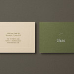
Brae by Studio Round
Brae is a restaurant, located in the Australian town of Birregurra, that describes itself as having a menu of unique and contemporary dishes built around a respect for nature and seasonality, and crafted from organic ingredients both locally sourced and grown on its own 30 acre site. Brae’s new brand identity—which included a new logo-type, menu, stationery set and website developed...

Håndværk by Savvy
Håndværk is a New York based clothing brand that mixes craftmanship, minimal elegance, premium materials and innovative fabrics to produce high quality everyday essentials for both men and women. Designed by Savvy, Håndværk’s new brand identity—which includes a logo, swing tags and packaging solution with a blind emboss detail—conveys the brand’s elegant and elemental nature with what Savvy describe as clean lines and...

Mellbye by Heydays
Mellbye is a Norwegian architecture firm founded in 1954 with a “mindset anchored in modernism”. Design studio Heydays created a new brand identity for the firm based around a geometric M symbol built from the initials of their two main services, architecture and interiors. Executed as a combination of blind deboss and die cut detail across a earthy and urban...
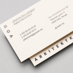
Goa Arkitektkontor by Heydays
Goa Arkitektkontor is an Oslo based architecture studio, established in 2012 by Johannes Ludvigsen Goa, that provides planning, regulation and architectural design services. The studio has a philosophy that sees restrictions such as economy, building regulations and social attitudes as opportunities, believes in simplicity and, a little unusually, is not afraid to be banal. These ideas are neatly resolved through...
Cemento by S-T
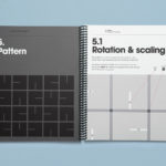
Cemento is the UK distributor of an Italian lightweight concrete product that can be used for wall panelling and furniture. Inspired by brutalist design — a movement that grew out of early 20th century modernist architecture and described by Wikipedia as being “linear, fortresslike and blockish” — London based studio S-T developed a visual identity for Cemento that included logo, logotype, brand...
Minna Palmqvist by Bedow
Minna Palmqvist is described by Bedow, the studio behind her new visual identity as a “critical, Swedish fashion designer”. Following the completion of a masters degree at Stockholm’s Konstfack College of Arts in 2009 Minna launched her own label to further develop her ‘Intimately Social’ series, “an evolving constant challenging the traditional fashion seasons and exploring the obsession with the female body, by merging social...

MDD9 by Two Times Elliott
MDD9 is a Hong Kong and London based multidisciplinary architectural and interior design studio, founded in 2009, that is engaged in a variety of building and construction projects that include new developments and renovations, urban planning, lighting, landscape and acoustic design. The studio’s visual identity, developed by Two Times Elliott, reflects the “dynamic outlook” of the individual architects as well...

No. Six Depot by Perky Bros
“No. Six Depot is a family owned, small-batch coffee roaster and café nested in the beautiful Berkshires. Located in a historic train station on 6 Depot St, they serve teas, salts and coffee from small farms and roast on location. Their identity [designed by Perky Bros] juxtaposes a mix of unique rural and modern elements — drawing inspiration from their own backyard railroad...