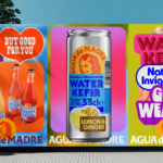
Agua de Madre by Chris Chapman
It seems you can’t move for well-designed, wellness-adjacent alcohol-free drinks brands right now. In the past couple of months alone we’ve covered a nightlife inspired Yerba Maté that went hard on Big Drink NRG and Rolus, a new botanically enhanced entry into the (apparently) burgeoning ‘braincare beverage’ category. Making it a hat-trick is London-brewed water kefir brand Agua de Madre’s...
Full Pin by Rethink
Since 2020, engineers-turned-mushroom entrepreneurs Vathana Len and Daniel Vogt have been growing the fanciest mushrooms I’ve ever seen, from their shiny urban greenhouse in Montreal. From Pholiote adipeuse to King eryngii (I don’t know what those are either) and everything in between, Full Pin’s mushrooms are cultivated with meticulous precision and at an impressive rate – over 700 pounds per...
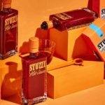
Stuzzi by Perron-Roettinger
Hot sauce branding has long been dominated by certain overarching tropes: there’s the hyper-trad (Cholula, Tabasco, Sriracha et al); the twee of the kitchen-table-scale small-batch brigade; and the I WILL RIP YOUR HEAD OFF! camp where products have names like ‘death’. In the first and second of those camps in particular, there’s a lot of decent branding. But this new...
Dark Arts Coffee by NOT Wieden+Kennedy
If a brand that fuses memes, hot takes, occultism, and coffee is going to succeed anywhere, it’s probably in east London. Dark Arts Coffee started out in 2014 in a Homerton railway arch, and managed to corner that distinct subgenre of goth/metal/biker-ish aesthetics which opts for craft ale over snakebite; Hackney over Camden; self-care over self-destruction. Where the old guard,...
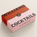
Williams Cocktails by Offff
In the last five years, canned cocktails have become ubiquitous, with offerings from MOTH: (packaging by Pentagram) and Whitebox (cans created in-house) among the strongest designs competing on the shelves of off-licenses, delis and bottle shops. Convenience and a post-pandemic demand for ‘on-the-go’ experiences have helped drive this trend, with Mintel data demonstrating that sales of spirit-based ready-to-drink beverages increased...

Tameko by DutchScot
Founded by Dominika Leveau and Chim Sonne-Schmidt in 2021, textile brand Tameko feels thoroughly ‘Scandi’ in aesthetics and ethos – it’s all clean lines, a singularly restrained stance on beauty. It’s form following function. Tameko embodies that very contemporary take on the luxury sensibility that never shouts about its status. It doesn’t need to: luxe quietly but confidently oozes from...
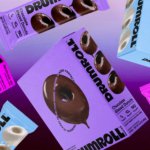
Drumroll by Gander
Donuts are one of life’s simplest pleasures, but they haven’t historically been the healthiest choice. Vegan – sorry ‘plant based’ – donuts are nothing new (Krispy Kreme’s been selling some non-dairy alternatives for a while now, and very nice they are too), but until now, we weren’t aware of donuts that also boast high-protein, low-sugar, gluten-free credentials. That is, until...
La Mia by Papanapa
In recent years, we’ve seen artisanal ice cream brands make an obvious departure from the maximalist, saccharine branding that their mainstream counterparts are so known for. In particular, the typeface-heavy, superimposed ice cream tubs of US-based brands have become a benchmark for exactly the kind of branding that more gourmet confectioners are keen to avoid. While Ben & Jerry’s iconic...
Imperia by Landor
As well as being a coastal city in south west Italy (formed in 1923 by none other than Benito Mussolini), Imperia is a pasta machine company that was formed from a ‘little artisan workshop’ in 1932. Imperia soon began to distribute pasta machines around the world; mainly catering to the US’ large Italian community. From its plant in Sant’Ambrogio, Turin,...

Kindred Black by Ania et Lucie
There has always been something borderline magical about the fields of beauty, makeup and skincare – a hint of esoteric or mystical knowledge. When it comes to visual storytelling, this association offers plenty of rich inspiration, along with established style signifiers that are easy to follow. Nods to old-school apothecaries abound in the likes of Typology Paris and Le Labo,...
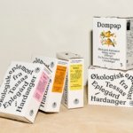
Tessas Eplegård by Olssøn Barbieri
One of the many brilliant things about the world of branding is that to work in it, write about it, or just take an interest in it forces you to learn something about pretty much everything. Maybe that’s how LEGO might actually be a better investment than gold; or that Murray’s Parmigiano Reggiano cheese pairs well with a nice New...
Matheson Food Company by Wedge
If nostalgia is a powerful force, arguably ‘fauxstalgia’ – that sense of longing and yearning for something that we never actually experienced – is even more so. Fauxstalgia isn’t the same as trend cycles – the baffling realisation that Gen Z is suddenly, unironically, into Nu Metal, for instance – it’s an internal sensation rather than an external observation. It’s...