Drizzle and Drama
I’ve never really thought about wedding venues needing a brand; but then again I’ve never really thought much about wedding venues at all – and neither is Chateau Engalin much like most other nuptials-centric sites. Recently bestowed with new brand design courtesy of Pentagram London partner Samar Maakaroun and her team, Chateau Engalin is based in the heart of the...

Gaming Goes Goblin-mode
Remember the heady days of 2022, as we emerged blinking into the light in a cautious post-pandemic haze – confused, slightly heavier, wondering whether we should cancel Disney+ now that going out was sort-of-possible? It was then that The Oxford Languages Word of the Year (well, two words if we’re being pedantic, which is surely an approach the famous dictionary-pedlars...

Mix and Match
Ten or so years ago I’d wager that most of us hadn’t even heard of padel, but the tennis-adjacent pursuit has boomed in recent years: there’s reportedly a whopping 30 million padel players worldwide, as of stats from late 2024. Despite the fact the name sounds somewhat Ye Olde-ish – it wouldn’t be surprising to see a reference or two...

Dating Apps Go Full Cerca
It wasn’t too long ago that we were deluged by think pieces bemoaning the state of dating apps; detailing their fall-from-favour in data that showed in cold hard numbers that their popularity had long since boomed. The swipe-laden online dating world, it seems, was drastically waning. All sorts of theories flew around: maybe Gen Z – frequently (bafflingly, implausibly) lauded...
HotDog by SMLXL
From the moment I turned the sound up (as per instructions) on the ‘about’ page of the HotDog website, safe to say I was obsessed with this brand and its branding. It’s laugh out loud hilarious – I truly loled, as did the person I was sharing a room with, and as I’m sure anyone within eye- or ear-shot would...

Yes we Makan
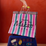
The chintzy rose; the bright but slightly dusky pink; the multifarious wordmarks; the apparently haphazard, painterly decorative flourishes; an approach to letter sizing that’s borderline unhinged – the branding for Makan has the potential to be all kinds of terrible. Instead, it’s absolutely the opposite, thanks to the deft hands at Foreign Policy (Park Bench Deli, Project Send, Critical Mass)....
Storrd by Among Equals
London is awash with convenience stores – from the acrid yellow signage of Nisa to the misleadingly named ubiquity of Costcutter to the countless independents named things like Ben’s, despite the fact they have nothing to do with anybody called Ben. Such shops – reliably there at most times of day, reliably overpriced (hence the convenience I suppose, like an...

3TEMP by Studio NARI
If you had to guess what 3TEMP is and does, it’s hard to imagine many people would come up with the right answer: with no prior knowledge of the company, it sounds like the sort of thing a half-arsed episode of Black Mirror could come up with – some kind of temping agency but everyone is actually AI, or perhaps...
Kanal by Base Design
Kanal is a museum-to-be with an admirable yet bold raison d’être that defies much of what we think we know about the nature of highbrow cultural sites: not a “finished institution, but a cultural project in motion,” as its general director Yves Goldstein puts it. Based in Brussels, Kanal will – somewhat surprisingly – become the city’s only museum of...

Eat Dirt by Cachete Jack and Marta Veludo Studio
The best branding and packaging projects – or at least the ones that most excite this slightly jaded old design hack – are those that not only take a category and do something genuinely innovative within it, but the ones that rethink structure as much as style. The identity for Eat Dirt does all that and more, and so safe...

Xochi by Kinoto Studio
Another day, another soft drink with a wild new angle: in the last year or so we’ve undoubtedly seen some impressive entrances to the category, from the shouty Yaté yerba maté to ‘braincare beverage’ Rolus to London-brewed water kefir brand Agua de Madre, to the unhinged Y2K lunacy of Fhirst. Now, meet Xochi, a prebiotic agave soda made with 100%...
Fello by Bold Scandinavia
When it comes to brand design, of all the sectors, mobile networks seem to play it pretty safe: functional, practical, all in all, pretty dry – or at the very least, unadventurous. Some are better than others, of course: I for one think that Giff Gaff’s wordmark is actually alright – I’m far from opposed to the quirk in joining...