
Great Wrap by A Friend Of Mine
Cling-wrap, cling-film, stretch-wrap, Saran-wrap or food-wrap. Wherever you’re from and whatever you may call the ubiquitous, sticky, transparent stuff, it’s been keeping food fresh since 1949, when the first branded form of cling-wrap made from polyvinyl chloride (PVC) appeared on the market. Once held up as a mould-thwarting modern marvel, the material is now widely derided as an environmental menace....
Cohere by Pentagram
From Wes Anderson to ‘accepting the job’ and distinctly dystopian new romantic relationship models; in recent years, it’s felt like you can’t move for chat about AI – its weirdest uses, its hilarious shortcomings, and a hell of a lot of scare-mongering about it stealing our jobs. The platform that’s dominated much of the conversation is ChatGPT, an AI chatbot...
Unmind by Ragged Edge
In recent years, employers have been rushing to offer an increasingly elaborate range of workplace perks, from the WeWork style beer on tap approach to sleep pods (begging the question, if you have to sleep at work, is this really a perk at all?) to Ben & Jerry’s rather busman’s holiday-ish promise that employees can take home three pints of...
Ostro by Mucho
Ostro isn’t the easiest of companies to make sense of. Billed as a ‘life science software company’, it straddles a number of different services that are both consumer and clinician-facing. In simple terms, though, it looks to help consumers and healthcare providers alike to navigate the complex, labyrinthine ins and outs of the complex US healthcare system; using software to...
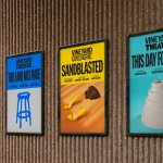
Vineyard Theatre by NB Studio
Much like identity work for art galleries and publishing houses, master brand design for theatre is often neutral, leaving plenty of space for a programme of diverse productions and eclectic marketing images to ‘take the stage’. When everything is in constant flux, there are typically some constants: a straightforward, recognisable wordmark, a distinctive typographic personality, and a consistently tight grid...
Mill by Manual
There’s a lot to be said for the Instagram-worthiness of, say, a faux-futuristic beauty brand identity that’s all gloopy, metallic, kinetic typography, ‘terminal green’, and unabashedly Gen Z-baiting ‘y2k’ art direction. It’s easy to assume that projects that allow designers the creative freedom for unabashed experimentation – playing fast and loose with legibility and lofty conceptual thinking – are the...
Going by Design Studio
If you’ve heard of Scott’s Cheap Flights, it’s more than likely through word of mouth – it’s the sort of thing shared by a helpful colleague or cousin when you discuss trying to make holiday plans, much like the sage advice to use a private browser when looking at flight prices. And from these fairly humble beginnings, the service –...
Top of the Mornin’ Coffee by Earthling
Anyone over about 25 would likely feel that of all people, big-time YouTubers aren’t exactly in need of a coffee fix: high-octane, breathless excitement and endless, pause free chitchat don’t exactly scream ‘3pm slump’. However, Irish YouTuber Seán McLoughlin, aka Jacksepticeye – who boasts more than 52 million social media followers, and nearly 16 billion views on YouTube alone –...
Wype by Among Equals
London-based creative agency Among Equals recently worked with ‘below-the-waist wellness company’ Wype on its brand identity and art direction, aiming to help the company build a new brand that would set it up for its next phase of growth. Wype is a gel that was designed to ‘turn any toilet paper into an eco-friendly wet wipe, all at the squeeze...
FitzJohn’s by DutchScot
When my partner and I first moved to London in 2014, surviving on scarcely more than minimum wage, it obviously seemed like a sensible idea to rent in Hampstead. We’d heard of the Heath, and were familiar with the Northern Line. The flat, apparently once a Sex Pistols’ squat, was tiny and hadn’t improved much since the 70s. Back then...
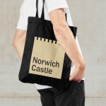
Norwich Castle by The Click
The competitive landscape for experiences has been significantly catalysed post-pandemic. Perhaps the sensory deprivation of stay-at-home orders created an intense need to make up for lost time, indulge in all manner of out-of-home activities and platform them. Times have changed. Old needs to feel new and fight on equal footing with what appears to be an endless stream of pop-up...
Whale Tales by Interbrand
Every year an impressive 40,000 humpback whales travel along the Sydney coastline. This annual migration pattern is one of the many awe-inspiring natural spectacles that make the city so unique. It is fitting then, that the New Sydney Waterfront Company chose to revitalise Sydney’s Western Harbour Precinct with an installation of thirty whale tail sculptures, telling thirty individual stories, or...