Dark Arts Coffee by NOT Wieden+Kennedy
If a brand that fuses memes, hot takes, occultism, and coffee is going to succeed anywhere, it’s probably in east London. Dark Arts Coffee started out in 2014 in a Homerton railway arch, and managed to corner that distinct subgenre of goth/metal/biker-ish aesthetics which opts for craft ale over snakebite; Hackney over Camden; self-care over self-destruction. Where the old guard,...
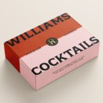
Williams Cocktails by Offff
In the last five years, canned cocktails have become ubiquitous, with offerings from MOTH: (packaging by Pentagram) and Whitebox (cans created in-house) among the strongest designs competing on the shelves of off-licenses, delis and bottle shops. Convenience and a post-pandemic demand for ‘on-the-go’ experiences have helped drive this trend, with Mintel data demonstrating that sales of spirit-based ready-to-drink beverages increased...

Tameko by DutchScot
Founded by Dominika Leveau and Chim Sonne-Schmidt in 2021, textile brand Tameko feels thoroughly ‘Scandi’ in aesthetics and ethos – it’s all clean lines, a singularly restrained stance on beauty. It’s form following function. Tameko embodies that very contemporary take on the luxury sensibility that never shouts about its status. It doesn’t need to: luxe quietly but confidently oozes from...
Yellowbird by Gander
Sauces, oils, seasonings and condiments are consistently thriving categories in direct-to-consumer packaged goods. These high-margin, shelf-stable products can be easily differentiated with unique flavours and ingredients, and have high branding potential that can quickly adapt to trends. Right now, hot sauce its having its moment, with celebrities from Ed Sheeran to Brooklyn Beckham jumping on the band wagon, following trailblazers...
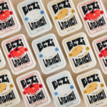
Bezi by Red Antler
Bezi was founded by Ilay Karateke – an Istanbul-raised, New York-based, ex-McKinsey consultant turned cheesemaker – and Hasan Bahcivan – a Berkeley-trained engineer from one of Turkey’s largest and most legacied cheesemaking families. Both grew up in large families, with their lives punctuated by big family-style meals shared with friends and neighbours. Labneh, a Middle Eastern spreadable cheese, was ever...
Wholy Greens by Control Studio
Wholy Greens is a B-Corp certified Dutch food brand dedicated to transforming the way people perceive and enjoy vegetables. Its mission is to create a mindset shift from ‘having to eat veggies’ to ‘genuinely loving veggies’ – and it uses pasta as its primary vehicle. It’s a smart set up, not least because, frankly, what experiences aren’t more enjoyable when...
Uoga Uoga Kids by andstudio
Since 2019, sales of beauty products labelled ‘clean’ have soared in popularity, and – as with all consumer trends, from interiors to fashion design – parental preferences influence the marketplace for children’s products as much as adults’. Enter Uoga Uoga (which translates to ‘Berry Berry’), a Lithuanian natural beauty and skincare company founded in 2010 that produces mineral-based makeup as...
Joyful Outdoors by Alphabetical
Over the years, London-based Alphabetical has honed both a distinctive style and a distinctive client list: often, its most celebrated projects are those for brands or organisations that are both a unique place, and more specifically a site for a community that’s underserved or underrepresented. In short, Alphabetical has honed its knack for uniting a people-centric, frequently cocreation based approach...
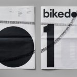
Bikedot by Studio Sutherl&
The concept of a brand today rarely has a sense of physicality. The hand (or indeed roller), the mark-maker, usually feels totally absent. It makes sense really, considering our primary interaction with a brand is often online; but when a project comes along that’s so obviously delighting in the possibilities of print processes, inks and paper it feels like a...
Coolhaus by &Walsh
Dessert-centric power couple Natasha Case and Freya Estreller met in around 2008, soon forming a partnership in both life and business: Coolhaus, a range of ice creams and other frozen treats that looks to inspire other female and LGBT+ founders. For those thinking, ‘what, like Rem Koolhaas?’ – yes, you’re right. Estreller originally trained as an architect, and before Coolhaus-proper...
Isle of Wight Tomatoes by B&B Studio
Having grown up near Portsmouth, the Isle of Wight carries a certain resonance, though perhaps unfairly. Aged around 14, when getting served in off licences/particularly lax pubs wasn’t always a given, we’d sometimes pass the time watching the IoW ferry. It felt rather bleak, and somehow a bit futile, just bobbing back and forth between two destinations (Southampton and Cowes)...
Sustana by Collins
For non-design nuts or print nerds, paper might seem pretty high up in the scale of banality and boringness. That’s likely the reason that the Wernham Hogg paper company was the setting of The Office: paper, and Slough, formed an easy sitcom shorthand for all that was unremarkable, trivial, and emphatically dry. But in fact, there’s a lot more to...