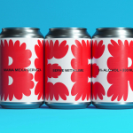
Mama Mexa by Seachange
Tacos are a Mexican staple, consisting of a small hand-sized corn or wheat-based tortilla topped with a range of fillings. They make for perfect on-the-go food, packed full of flavour. This combination of convenience (quick to make or eat) and tastiness has seen the traditional dish rise in popularity as an ideal product to package and sell in many markets....

Forward Majority by Order
The balance of power in the US isn’t decided in Washington. It’s decided in state capitols where Republicans have gained overwhelming control, asserting systematic bias on voting rights and election processes. Through policies of suppression and gerrymandering, certain priorities and populations are often neglected in election results. Forward Majority is a political action committee on a mission to accelerate Democratic...
Eames Institute by Manual
American industrial designers Ray and Charles Eames fundamentally believed that good design should be available to everybody. It’s ironic, therefore, that today – in part due to institutional bodies, galleries, collectors and capitalism – their work has been elevated far beyond the reach of the common person. Design that was supposed to be accessible has become a symbol of taste,...

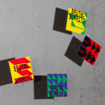
Brutal Burrito by Tres Tipos Gráficos
In 1984, the death of the wrestler Rodolfo Guzmán Huerta – commonly known as El Santo – sent shockwaves through Mexico. Over the course of five decades and 15,000 matches, the legendary fighter had captivated audiences, helping to fuel the growth of Lucha Libre around the world. Through his appearances in film, comic books and cartoons, he established himself as...
Ebb Dunedin by Maud
Design-savvy duo and father and son team Dylan and Frank worked alongside Gary Todd Architecture and interior design team INDYK Architects to develop Ebb, a contemporary boutique hotel located at the heart of Dunedin, a city on the South Island of New Zealand. Ebb is uniquely situated at the edge of the reclaimed Otago Harbour–a place where Polynesian travellers would...
Petit Planet by Studio fnt
The Hyundai is one of the three major department stores in South Korea, with its 15 branches across the regions of Seoul, Yeongnam and Hoseo accruing more than $6 billion in annual sales. Petit Planet is the Hyundai’s new specialised children’s division, presenting premium brands in an environment designed to stimulate young imaginations. This post includes Extended Insights for BP&O...

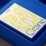
Crane by Collins
In 1775 Crane paper was used to print the first money for the American colonies, and by 1801 the company was the primary paper producer for local and regional banks. Later that century, equipped with an arsenal of innovative techniques from Europe, Crane won a contract with the Bureau of Engraving and Printing and became the supplier for the US...

Marc Jacobs by Triboro
Fashion designer Marc Jacobs heads his own eponymous fashion brand, as well as diffusion lines The Marc Jacobs and Heaven by Marc Jacobs. He was also creative director at Louis Vuitton from 1997 to 2014, where he created the company’s first ready-to-wear clothing line. In his own words, Jacobs’ work is ‘a little preppy, a little grungy, a little couture’, and this...
The Art Gallery of New South Wales by Mucho
The Art Gallery of New South Wales, founded in 1872 as the New South Wales Academy of Art, suffered from a fragmented brand architecture. Addressing this through a rationalised and simplified system, and reinforcing the master brand across all Gallery collateral became a central part of developing of a new brand identity which would support a repositioning strategy that moved...
Autex Acoustics by Marx Design
With manufacturing and sales teams throughout Australia, UK and the USA, Autex has grown to become the market leader in interior acoustic products in New Zealand, and the go to choice for leading architects aspiring to reduce the amount of atmospheric noise within cutting-edge residential and commercial spaces. Their products are innovative, produced in a variety of forms and colours,...
Piedmont Art Walk by Mucho
Piedmont is a small city in California named after the European region in the shadow of the Alps (from the Italian piemonte, meaning ‘foothill’). Surrounded on all sides by Oakland, the neighbourhood has a population of roughly 10,000 people and an active charity scene. This includes the Piedmont Arts Fund, a nonprofit group that promotes and supports visual and performing...
Metamorphoses by A Practice For Everyday Life
Metamorphoses is a contemporary art gallery that curates unique pieces by makers who turn one thing into another. It takes a special interest in works that are inspired by the past while displaying keen attention to present issues. These pieces, selected by the gallery, are often drawn from a body of work by artists who reflect on aspects of cultural...