Kettle Kids by Two Times Elliott
The once laudable claim to have started a thriving business with ‘a small loan’ from a doting family member may have been muddied beyond recognition by the truth-stretching of serial tax-offender and part-time Presidential candidate Donald Trump. Despite this, turning ‘one thousand pounds from nan’ into a luxury watch and diamond dealership with a sparkling flagship store in Mayfair remains...
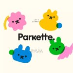
Parkette by Kinoto
Cute, bright, and striking; there’s very little not to love about this identity for Parkette. Based in Hamilton, Canada, Parkette is billed as a boutique shop ‘dedicated to kids and the kids at heart’, selling crafts kits, clothes, accessories, books, homeware, toys, and ‘other treasures’. The name is taken from a term many locals in Hamilton use to describe a...
Francos de Montréal by LG2
Les Francos de Montréal is Canada’s premier festival of French language music and culture. Held annually in downtown Montréal, it is a fixture in both the social calendar and cultural life of the city, and the wider francophone world. This year’s edition of the festival has been given a sophisticated new look, courtesy of LG2, Canada’s largest independent creative agency...

Pilo by 5.5
Youth hostels aren’t exactly associated with luxury – nor great branding. For the most part, they’re deemed the cheap and cheerful option; a trip where home comforts are sacrificed for socially minded living, affordability, and a more adventurous sensibility than the average Travelodge. They’re the sorts of places where creaky bunk beds, shower queues, pillows so thin they’re barely more...
Plume by Human After All
Plume is a Denver-based telehealth service (or ‘virtual-clinic’) tailored specifically to the needs of the trans community across the US, offering a range of services including prescriptions for oestrogen or testosterone. This is a hostile political landscape to step into, but Plume is doing it with bright and bold panache, courtesy of a fresh rebrand from London-based studio Human After...
Hometree by How&How
It’s all well and good for a design agency to make some wild, boundary-pushing, all-singing all-dancing work for things like Gen Z healthcare products; or ‘top shelf’ spirits; or craft beer. But most client projects aren’t going to be the sort of thing that merits bright orange and typography that dances around the boundaries of legibility. And arguably, it’s those...
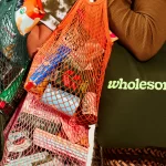
Wholesome by Universal Favourite
Wholesome is a new breed of supermarket that doesn’t fill a gap in a market so much as it positions itself at a nexus of multiple intersecting demands. The pursuit of ethical grocery and household shopping has, for decades, been both deeply commendable and exasperatingly time-consuming, expensive and convoluted. One supermarket will stock Fairtrade products but have a scant gluten-free...
Expensify by The Collected Works
According to The Collected Works, one of the main reasons its recent client Expensify was looking to rebrand was to remedy a perceived mismatch between the ‘wacky’ vibe of the brand’s marketing and ads (namely its 2019 Superbowl commercial), and its core visual identity. Which begs the question – how far does a brand identity itself have to mimic or...

Erbert by AUGE
Few countries on Earth take their food as seriously as Italy. It’s not difficult to justify the enormous pride Italians take in their spectacular culinary heritage, with their cuisine considered the ‘most exported’ on the planet. But while the wider world is undeniably in thrall, Italians’ patriotic palettes create and necessitate a notoriously conservative domestic cooking culture. Italian ingredients, recipes...

Casa Malka by Nihilo
Branding agency Nihilo is more adept than most at shattering stereotypes – both in the work they make, and in terms of who the agency is, and what it’s all about. Founded by designer Emunah Winer and writer Margaret Kerr-Jarrett in Israel in 2021 and now based in Columbus, Ohio, the agency takes its name from the Latin term ‘creatio...
Beams by Only Studio
The Beams is ‘an expansive new venue and event space on the Royal Docks in the heart of East London’ (that’s as long as you prefer your cartography loosely impressionist). Manchester-based Only Studio was tasked with branding the former Tate & Lyle sugar factory. The award-winning agency has previous form in the field of London industrial-eyesores-turned-cultural-juggernauts: it was also responsible...
Philharmonie Luxembourg by NB Studio
It is fair to say that rebrands of music organisations, of which there have been a number in the past few years, have benefitted from the recent explosion of graphic design into the world of sound and motion. Music has always inspired other forms of art, but these new digital tools are uniquely suited for producing design solutions for these...