Fhirst by Mother Design
We’ve arrived at a point where the idea of ‘y2k’ as an aesthetic has stretched beyond ‘trend’ or ‘cycle’ and morphed into an entity almost entirely devoid of the temporal placemarker its name suggests. Having been repeated ad nauseum, ‘y2k’ is no longer about a visual/cultural moment and/or collection of moments around 25 years back. Instead, it’s become a Burroughs...
IAAC by Mucho
The IAAC (Institute for Advanced Architecture of Catalonia) is an organisation which boasts a remit that feels both nigh-on impossibly wide but also hyperspecific. Based in Barcelona and founded in 2001 as a hub for innovation in architecture and design, IAAC describes itself as ‘a platform for producing knowledge to shape the future of cities, buildings and society’. The long...
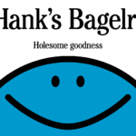
Hank’s Bagelry by Studio Ongarato
Sometimes, a brand identity can be deeply strategic, have a rich heritage or an involving narrative. Other times, it can be simply eye catching and cool. Suites of custom designed icons, art directed photography, tone of voice, motion behaviours, programmatic graphic elements and bespoke in-house content generating tools…. not every brand needs these. They’re colours to paint with. I call...
Pinky Swear by The Working Assembly
I could be totally wrong, but it really does look like New York-based branding agency The Working Assembly had a lot of fun working on the branding for Pinky Swear. A restaurant and cocktail lounge on Chrystie St on Manhattan’s Lower East Side, Pinky Swear opened earlier this year as a fascinating concept unlike anything we’ve really encountered before: yes,...
Monica Rich Kosann by Here
There’s been a fair bit of chatter in recent times in the brand design world about the ‘new codes of luxury’ – how today’s hip young well-to-dos are eschewing the signifiers of yesteryear (ostentation, gold, bling, anything remotely showy) for a more understated aesthetic. Being fabulously rich today, then, is perhaps a little like the whole ‘no makeup’ thing: anyone...
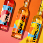
Phoenix Organics by Marx Design
It’s a tale as old as time: a once beloved brand – a pioneering brand even, the first of its kind or category – that gets rather lost over the years, muddled in a confusion of sub-brands and spin-offs. Such brands often fall victim to a sort of design by committee – and rarely intentionally: as companies grow and expand...
Wolfe Bros Cellos by OurCreative
The likes of Strawberry & Lime Kopparberg and Old Mout Cider (pronounced, either ‘moot’, or ‘mowt’, few know, few care coz that cute little kiwi bird is so distracting) are both, let’s face it, the semi-grown up, pretty acceptable face of alcopops: people order them at very normal (even gastro!) pubs and no one bats an eyelid – the same...
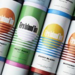
Fire Island Tea by Stephen Moss
Fire Island has always seemed far more a mythical utopia than a real, physical geographical, location to me; in part simply because of its name: Fire Island seems wrenched straight out of Greek legend – elemental, fearsome, alluring, almost a contradiction as surrounded by water yet inherently burning. But mostly, it’s thanks to Frank O’Hara, whose mid-20th-century poetry eschewed the...
Cashflow Vodka by Marx Design
Few brands dare to break the fourth wall, and all too often those that do, do it badly. Some smash through that wall Mr Blobby style – sure, it’s fun, but it’s so bold that it feels a little ridiculous, à la Brewdog’s ADVERT adverts by Uncommon. Some try to be a ickle-wickle bit clever but land on saccharinely twee:...
Muse Group by Collins
Muse Group exists as a collection of digital products covering all aspects of the creative process in music. This reviewer is familiar with Audacity and has used it in the past, but other platforms include Ultimate Guitar, MuseClass, MuseScore, and MuseHub. These tools are used by a range of professional musicians, budding amateurs, and everyone in between, working across all...
Windham Campbell Prizes by Pentagram
Back in 2013, Michael Bierut’s team at Pentagram (Twelve Labs, Becan & Natural History Museum) created the identity for Yale University’s inaugural Windham Campbell Prizes, a major literary award that honours outstanding achievement in the fields of fiction, non-fiction and drama. Bestowed by the estate of the writer Donald Windham and his companion Sandy M. Campbell, the awards are administered...
12 by Base Design
If New York really is the city that never sleeps, that’s in no small part thanks to coffee – and now, increasingly, a newer entrant to the socially acceptable uppers scene, matcha. Capitalising on the growing interest in the sludgy green pick-me-up is 12, a new-ish matcha-centric café and retail store that opened last year in Manhattan’s NoHo area. Sited...