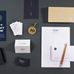
Townhouse by Koniak
Townhouse is a hotel designed and ‘curated’ by The Kastiel Family and located at the heart of the Tel Aviv. Based around tactile material and print finish, a mixed typographical approach in conjunction with a simple sans-serif logo-type and monogram, Townhouse’s visual identity, created by boutique design studio Koniak, frames the traditional crafted luxury of the hotel’s interior fixtures and fittings with a...
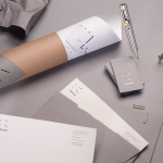
Krohn by Commando Group
Krohn is a young but experienced Oslo based furniture, interior and architecture design studio that develops holistic solutions that strengthen and add value to businesses through interior environments. Krohn’s visual identity, website and stationery—created by visual communications agency Commando Group—captures the multi-disciplinary nature of the studio and juxtaposes bold architectural structure and simple interior spaces with fine, high quality detailing, through an abstract,...
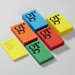
GR Communications by Ascend
GR Communications is a London based PR agency that is described as being made-up of a ‘close knit group of progressive and forward thinking experts’. Their visual identity, designed by independent brand, graphic and web design agency Ascend, captures the idea of unity, communication and creativity through a simple ligature detail, single quotation marks and a diverse, vibrant but complementary...
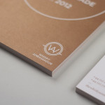
Whisky Ambassador by O Street
Whisky Ambassador is an Accredited, UK-based one-day training course that introduces bar staff and license holders to the techniques of effective Scotch whisky selling. Based around a simple monogram and sans serif logo-type combination delivered as an emboss and metallic spot colour treatment across tactile and uncoated material choices, design studio O Street’s visual identity for Whisky Ambassador – a recent start-up –...
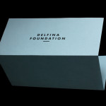
Delfina Foundation by Spin
“Delfina Foundation is an independent, non-profit foundation dedicated to facilitating artistic exchange and developing creative practice through residencies, partnerships and public programming, with a special focus on international collaborations with the greater Middle East & North Africa”. The foundation’s visual identity, developed by London-based design agency Spin, mixes a bold typographic solution and underline detail, a modern take on a...
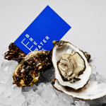
Breakwater by Lundgren+Lindqvist
Breakwater is a Swedish logistics company that services the marine cargo sector. Their visual identity and stationery, created by Gothemburg-based studio Lundgren+Lindqvist, brings together the themes of open sea, systems and cargo through the vertical and horizontal intersection of a geometric sans serif, simple grid-based layout, plenty of space and a vivid blue and icy white colour palette....
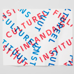
The Finnish Cultural Institute by Kokoro & Moi
The Finnish Cultural Institute for the Benelux (Fins Cultureel Instituut, Institut Culturel Finlandais) is a non-profit organisation that promotes Finnish arts and culture to the Benelux countries of the Netherlands, France and Belgium, with the intention of fostering collaborative opportunities for artists and organisations within the fields of music, literature, design, cinema and the performing and visual arts. The institute’s visual identity,...
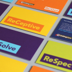
ReGen by Studio Brave
ReGen, formerly known as Uniting Care Moreland Hall, is a not-for-profit drug and alcohol treatment and education agency established in 1970 for the Victoria and Tasmanian regions of Australia. Following the recent name change Studio Brave developed a new visual identity that would better reflect the ReGen’s evidence based practices and the positive, practical outcomes it achieves, through a combination of...

Plow by Perky Bros
Plow is a Tennessee based customer acquisition service and telecom/energy contractor for the large to mid-size business sector. Their identity, created by multidisciplinary design agency Perky Bros, neatly communicates the experience, professionalism and advisory nature of Plow’s service, the commodities they manage and their renewable energy options through a logo-type built from a stencil cut serif typeface and apostrophe detail set...
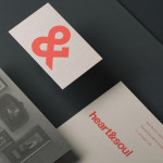
Heart & Soul Interiors by Band
Heart & Soul is an Australian interior decoration firm, specialising in residential properties, with a holistic, adaptable and flexible philosophy. Adelaide-based design studio Band were commissioned by the firm to update their brand identity so that it would better reflect their contemporary approach. Based around the duality of a heart/ampersand marque, a sans-serif logotype and print that juxtaposes a modern bright red...
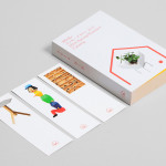
Minke Design Store by Studio Lin
Minke is a Tokyo homeware store that stocks hard to find designer objects and furniture. The store’s identity, created by New York based design firm Studio Lin, neatly resolves the classic and the contemporary, the structured and the anarchic, creativity and practicality through a union of bold serif, modernistic structure, random geometric detail and a bright but restrained primary colour palette....
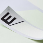
Etxe by Blok
“Etxe is a small, innovative industrial design studio based in Mexico City. Their philosophy is to design to the very essence of a product. There is no room for extraneous elements; they believe that the beauty and artfulness of a product lies in its purest functionality. The identity itself is thus a distillation of their unique approach.” – Blok...