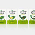
Higher Living by B&B Studio
Higher Living is a British company who have been blending teas, herbs and spices for over 45 years using only 100% natural and organic ingredients. Continuing their collaboration with Higher Living, which began back in 2010, London-based graphic design studio B&B Studio worked with the company, following a recent expansion of the range, to help redefine its packaging and brand identity with the intention...
Solrug by Bielke & Yang
Solrug is a high-quality, ready-cut, Finnish sourdough rye bread created for the Norwegian market by Magnus Högnäs, a Finnish expat living in Norway, and in response to the county’s poor wholemeal choice. The bread is dense with a strong flavour, low in sugar and salt but high in fibre and protein, and produced by Finnish bakery Leipomo Rosten Oy using only...
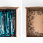
Biggans Böcklingpastej by Bedow
Böcklingpastej is a smoked herring fish paste from Biggans, a small family owned company creating products for the Swedish market since 1952. The company recently worked with Stockholm-based graphic design studio Bedow, who had previously helped them with the packaging for their range of sauces, to develop product packaging and POS for Böcklingpastej. This replaces a heavily branded logo-centric design with one of...
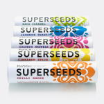
Superseeds by B&B Studio
Superseeds is a range of flavoured seeds available in five varieties, all of which are 100% organic, gluten and dairy free. These include Chili Smoke, Maca Caramel and Japanese Tamari. It is the first product from UK health food business Punch Foods, which looks to balance artisanal practice with optimal nutrition and punchy flavour. Taking their inspirations from the origins of each variety, and the...
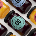
Danish Selection by Kontrapunkt
Danish Selection is a new range of high-quality fruit spreads cut with alcohol. The range includes blackcurrant infused with Jamaican rum, orange with cognac and a wild blueberry variety with Scotch whiskey. Orkla, the company behind Danish Selection, worked with Copenhagen based graphic design studio Kontrapunkt to develop a packaging treatment that would clearly communicate this new concept to consumers. Kontrapunkt’s solution is...
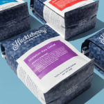
Huckleberry Roasters by Mast
Huckleberry is a Colorado-based coffee roaster established in 2011 by Koan Goedman and Mark Mann. Huckleberry worked with local graphic design studio Mast to rework their packaging in a way that would make the most of some well-established assets which included Mackey Saturday’s logotype, and would introduce more of the personality of its founder’s. This was achieved through the introduction of bright spot colours, geometric pattern...
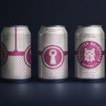
Forgotten Boardwalk Brewing by Perky Bros
Forgotten Boardwalk is a New Jersey microbrewery producing uniquely flavoured, year-round and seasonal craft beer. It was set up by Jamie Queli, one of the youngest female brewery owners in the US, and draws its name from the folklore of the Jersey Shore Boardwalk. This is the foundation of an extensive new brand identity, designed by Tennessee based Perky Bros, which brings to life the sideshow...

Lune Croissanterie by A Friend Of Mine
Lune Croissanterie is a Melbourne based bakery dedicated to the craft of Viennoiserie. After gaining a cult following and amassing long cues it quickly outgrew its small shop and moved into a larger warehouse space in the suburb of Fitzroy which features a distinctive interior design by Studio Esteta. To coincide with this move, Lune Croissanterie worked with the Australian graphic design studio A Friend Of Mine to...
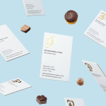
Bombonería Pons by Mucho
Bombonería Pons is a family owned Barcelona based business, established in 1960, dedicated to producing the finest handcrafted chocolates. With a desire to engage with a younger consumer Bombonería Pons worked with international graphic design studio Mucho to develop a brand identity that would be sensitive to its traditional values and history yet give it a contemporary appeal. This extended across packaging, brochure, stationery, business cards and...
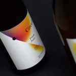
Black Estate — Circuit by Toko
Circuit is a 2014 Pinot Noir and 2015 Pinot Gris range from New Zealand’s Black Estate, a Vineyard run by The Naish Family and located across three hillsides in the Waipara Valley, an area of North Canterbury with clay and clay-limestone soil. Black Estate worked with Australian graphic design studio Toko on the branding and packaging of these two new wine varieties...
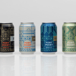
Fort Point Beer Co. by Manual
Fort Point is a San Francisco-based small batch craft beer company that references traditional styles yet is firmly rooted in the present, and has a philosophy that values craftsmanship and innovation, creativity and technique. In 2015, working with local graphic design studio Manual, Fort Point launched a new graphic identity and packaging system to unite its expanding range. Fort Point’s forward-thinking, fast-growing...
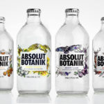
Absolut Botanik by Bold Inc.
Absolut Botanik is a new ready to drink, pre-mixed, single-source vodka range from distiller Absolut, flavoured with Scandinavian lingonberries, cloudberries and blueberries, blended with either pear, apple or lime. The range features a distinctive and bespoke single-serve bottle with a silver crown cap, and the Absolut logotype framed by rich illustrative detail. This mixes bold watercolour strokes with finer pen...