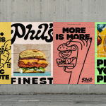
Phil’s Finest by Gander
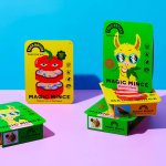
It’s a moot point now that the last few years have seen an explosion in all things vegan and ‘plant-based’ (a term arguably used lightly, when you consider the ingredients in many no-meat, no-dairy, no-animal product alternatives). There’s vegan cheese that actually tastes nice, there’s mushroom and hemp ‘magic mince’, even vegan tuna. I’m writing this while eating a vegan...
Frydate by Skinn
Beyond its eye-wateringly strong beers, decadent chocolates, and waffles; Belgium is famous for serving up one beloved belt-buster that’s easy to eat, and deceptively hard to get right: chips. A new Belgian homemade burger and snacks offer, Frydate, positions itself far beyond a humble chippie and into the realm of ‘Belgian frymanship’-led ‘friterie concept’. To help it achieve its ‘insatiable...

Departed Spirits by Marx Design
Maybe it’s been ‘silly season’ summer; maybe there’s a lack of risk-taking/imagination/budget; maybe I’m just jaded, but it’s felt as though recent months haven’t exactly seen a wealth of particularly exciting branding and packaging projects. That’s not to say there hasn’t been a steady stream of good work, but I’ve personally not felt hugely ‘wowed’: there’s been work that’s strong,...
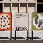
Entrée by Saint Urbain
More than three years since the outbreak of the Covid pandemic, we’re in a strange situation when it comes to all the things that flourished due to lockdown – grocery delivery services like Getir, et al; streaming services that poured literally billions into what once seemed like a never-ending gold-rush of content-consumption; flashy home-centric lifestyle brands like Peloton. Indeed, the...

Loot by Seachange
Where have all the simple playful ideas gone? You know the ones, a bit of wit, spun into a multitude of playful expressions across a number of different touch-points? Design craft has gotten so good over the last few years, but I miss the smile-in-the-mind stuff. Paul Belford’s New Chapter, Seachange’s Think Packaging and Mucho’s Art Walk. They’re not strategic...

Woven by Adam Smith by Magpie
Coworth Park is a grand 18th-century manor-house-turned-luxury-spa-hotel, set among a profusion of wildflowers in a sumptuous patch of Berkshire countryside. It’s part of the Dorchester Collection: ten prestigious hotels scattered across the world, all owned (through the Brunei Investment Agency) by Hassanal Bolkiah ibni Omar Ali Saifuddien III, the Sultan of Brunei. Bolkiah rules as an absolute monarch, and personally...
Fergus by Principal Studio
Organic food brands often land in the same visual territory as many vegan and eco-conscious counterparts – but when did the pursuit of consumer trust become so entwined with muted colour palettes, illustrated veg and rustic textures? There’s nothing inherently problematic with this combination of design elements, yet it has become a tired and overused formula for brands operating in...
Food Nation by Seachange
It’s about time plant-based brands found their sense of humour. Having been a vegan for 17 years now, I can safely say that veggie/vegan brands have historically been tiresomely dull – and until recently, they’ve been allowed to be. But with the recent years’ boom in all things ‘plant based’, simply existing because there’s no other type of soy milk...

Great Wrap by A Friend Of Mine
Cling-wrap, cling-film, stretch-wrap, Saran-wrap or food-wrap. Wherever you’re from and whatever you may call the ubiquitous, sticky, transparent stuff, it’s been keeping food fresh since 1949, when the first branded form of cling-wrap made from polyvinyl chloride (PVC) appeared on the market. Once held up as a mould-thwarting modern marvel, the material is now widely derided as an environmental menace....
Top of the Mornin’ Coffee by Earthling
Anyone over about 25 would likely feel that of all people, big-time YouTubers aren’t exactly in need of a coffee fix: high-octane, breathless excitement and endless, pause free chitchat don’t exactly scream ‘3pm slump’. However, Irish YouTuber Seán McLoughlin, aka Jacksepticeye – who boasts more than 52 million social media followers, and nearly 16 billion views on YouTube alone –...
Goldmine Gummies by Robot Food
While cannabis products still make up a sector overmuch in its infancy, it’s one that’s already birthed its fair share of design cliches – from Camden Market-leaning leaf designs to ‘millennial pink’ trendiness to branding that owes way too much to adjacent sectors, like D2C beauty products or ultra-minimal pharmaceuticals. This recent work from Robot Food, however, manages to demonstrate...
Veg NI by Jack Renwick Studio
The economics of regional farming, in the face of global market forces, continues to be unfavourable to local producers; narrowing margins and pushing some out of business. Alongside this, unfair and self-defeating politics continue to chip away at a basic message; locally grown food is a good, not just in a regional economic sense, but in terms of the health...