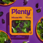
Plenty by &Walsh
Agricultural practices are constantly changing to provide greater crop yields. In an effort to achieve this goal, modern farming has created a host of ecological side effects. Most notably, overconsumption of water and a reliance on chemical fertilisers, GMOs and pesticides. Plenty is an indoor vertical farm providing green produce to the masses through sustainable practices, using less space and...
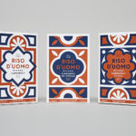
Riso D’uomo by Here Design
Riso D’uomo is a Milanese Carnaroli rice brand, cultivated from the same stock over hundreds of years, and grown within sight of the historic Duomo di Milano. Carnaroli is often referred to as ‘the king of rice’, and is known for its high-quality nutritional properties, cooking consistency and a ‘bite’ that makes it ideal for risotto. Taking inspiration from Riso D’uomo’s provenance, specifically the ornate...
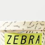
Zebra Dream by TCYK
Zebra Dream is a range of organic, soy and dairy-free coconut based ice-creams made from fair-trade ingredients. With a desire to capture a larger portion of the market whilst retaining its die-hard following, Australian design studio The Company You Keep (TCYK) reimagined the brand from the ground up, redesigning Zebra Dream’s graphic identity and packaging, taking it from a dark pack with a...
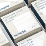
The Living Food by Francesc Moret Studio
The Living Food is a Barcelona-based grocery store and deli stocking organic and vegan foods. Francesc Moret Studio worked with the store to develop a packaging design for its range of nine vegan cheeses. Drawing on the brand’s established visual identity of silhouettes, the studio built a visual language with a bold graphic style, typographical detail, and a modern and distinctive...
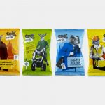
The London Popcorn Co. by B&B Studio
The London Crisp Co., a hand cooked British crisp brand available in local pubs throughout the capital, has expanded to include popcorn. Local graphic design studio and packaging specialists B&B Studio returned to the project that they help establish the visual language for. This time, introducing anthropomorphised animals inspired by what the studio describe as modern London tribes, and include yummy mummies, Hoxton...
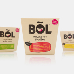
BOL by B&B Studio
BOL is a range of vegetable pots made from fresh natural ingredients using recipes inspired by local chefs and street market stalls from a variety of international destinations, packed and presented with a modern on-the-go convenience in mind. BOL was created by Paul Brown, the former general manager of Innocent’s food division, following the company’s exit from the category, and features...
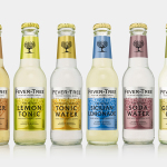
Fever-Tree by B&B Studio
Responding to the continued and widespread use of preservatives, artificial sweeteners and cheap aromatics, Charles Rolls and Tim Warrillow combined their experience of the beverage and luxury food industries to develop a tonic made from natural high quality ingredients. Since its launch in 2005, under the brand Fever-Tree—the colloquial name for the cinchona tree, source of quinine, a key ingredient in tonic—the range has grown year...
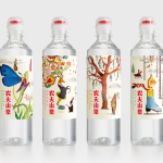
Nongfu Spring Mineral Water by Horse
Nongfu Spring is a bottled mineral water brand and a leading Chinese beverage business. Nongfu worked with British design studio Horse to develop a new package design treatment that, using labels illustrated by designer Brett Ryder and a distinctive structural design with a slim profile and proprietary leak-free sports cap, would engage the youth market....
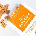
Bocce’s Bakery by Robot Food
Bocce’s Bakery creates nutritious handcrafted dog treats from natural, nutritious, locally sourced and seasonal ingredients from its premises in the New York borough of Brooklyn. Each of the bakery’s treats are batch-produced from four or less ingredients, brought together using simple wheat-free recipes, and born of a passion for conscientious organic cookery and inspired by Bocce, a biscuit loving dog who was carrying a few extra pounds. Bocce’s reached out...
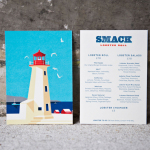
Smack Lobster Roll by & Smith
Smack Lobster Roll is a takeaway business, located on Mayfair’s 26 Binney Street, serving freshly cooked lobster in brioche rolls, as well as a variety of other fillings. In conjunction with a name change, formerly Smack Deli, and to coincide with the opening of a second site on Dean Street in Soho, British graphic design studio & Smith worked with Smack to...
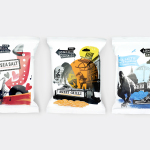
The London Crisp Co. by B&B Studio
The London Crisp Co. is a new hand cooked British crisp range, now available in local pubs throughout London, with a packaging treatment developed by B&B Studio. Absent the story you might expect from a small artisan crisp brand and avoiding the current favour for reduction, B&B Studio’s approach goes all in for provenance and visual impact, embracing a rich...
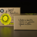
Teahouse Exclusives by Peter Schmidt Group
Teahouse Exclusives is a German company with a portfolio of high-quality black, green, fruit, and herbal teas, a philosophy that revolves around sophistication, quality and modern lifestyle values, and describes itself online as being trend-conscious. Based around the concept of individuality and strong character, integrated brand consulting business Peter Schmidt Group worked with Teahouse Exclusives to develop a new packaging treatment for its...