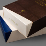
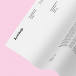
Antéoise by UMA
Antéoise is a creme dacquoise range from Anténor, a Japanese patisserie established in 1966 that creates French style cakes, cookies, tarts and variety of other confectionery. Antéoise’s brand identity and packaging treatment, developed by Osaka based graphic design studio UMA, draws on the range’s flagship positioning, high quality ingredients and the craft employed in its creation, the heritage and experience of Anténor, the streets of Kobe, and the...
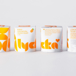
Lycka by BVD
Lycka is a 100% natural hand filled frozen yoghurt brand from Germany that donates 11 cents from each sale to Welthungerhilfe, a humanitarian aid project tackling issues such as world hunger, land grabbing in Cambodia and displacement across Syria and Iraq, amongst many other issues. Lycka’s brand identity and packaging, a mix of bright geometric forms which appears to draw some of...
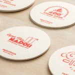
Melt by Can I Play
Melt is a Australian takeaway and restaurant franchise with a philosophy that looks to honour the 200 year old Napoli history of pizza making and its origins as a fast and nutritious meal by mixing high quality ingredients and recipe authenticity with the speed, price-point and openness that today’s consumers have come to expect. These values are also reflected through an absence of oil, fat or sugar...
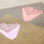
Mr Big Stuff by Can I Play
Mr Big Stuff is a Melbourne-based Southern American soul food restaurant and cocktail bar with a unique and distinctive interior designed by Technē Architecture and influenced by the music and film culture of the 1970’s and 80’s. The restaurant features an exposed concrete floor, timber and acoustic foam walls, neon signage and utilitarian furniture, as well as interior graphics and a brand identity treatment...
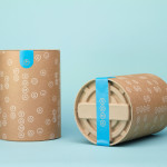
Korshags by Kurppa Hosk
Korshags is a family-owned seafood company located in Falkenberg on the Swedish west coast. Previously named Falkenbergs Lax (Falkenberg’s Salmon), Korshags has grown from a small local company specialising in smoked salmon, into an international player with a variety of products. With this in mind the company commissioned Stockholm-based Kurppa Hosk to establish a new name and brand identity that would better position...
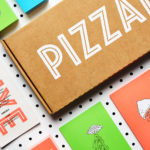
PizzaLuxe by The Touch Agency
PizzaLuxe began in 2011 as a single restaurant located on London’s Brick Lane hand making good-value, freshly baked pizzas using locally sourced, ‘deluxe’ ingredients. To coincide with an expansion into the Stratford’s Westfield Centre, the brand approached Edinburgh-based design studio The Touch Agency in 2013 to develop a new visual identity that would communicate their core values within a more ‘polished’ environment. In 2014, The Touch Agency continued...
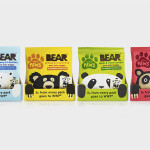
Bear Paws by B&B Studio
Bear Paws is a baked and shaped pure fruit snack range available in four distinct flavour combinations and produced by the British health food brand Bear Nibbles. To draw attention to endangered species such as pandas, polar and sun bears, the brand recently launched a limited edition pack design alongside a pledge to donate 5p per sale to the WWF. This limited...
Soma by Manual
Soma is a water filtration brand that is described by Manual, the design studio behind its brand identity and packaging treatment, as bringing together sophisticated design, sustainability and charity. These values are evident within Soma’s first product, a glass water carafe that uses a 100% compostable filter, its packaging, and the commitment to charity donations that comes with each sale....
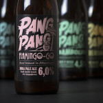
PangPang Summer Beer by Snask
PangPang is a Stockholm based microbrewery that was established by oddball Fredrik Tunedal in 2011. Fredrik, only 23 at the time, tattooed PangPang across his knuckles to celebrate the founding of what he believes to be Sweden’s first microbrewery. These knuckles now form the basis of the brewery’s logotype. Swedish design studio Snask were commissioned to develop a strategy for PangPang’s 2014 summer series...
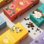
Daebeté Scented Tea by Victor Design
Daebeté is a floral infused tea range that uses a high-grade Taiwanese oolong variety, made using a unique process of withering, oxidation, curling and twisting, that has then been given a floral hint using ancient baking methods. This process creates a subtle yet sweet flavour profile that carefully balances the aroma of flowers with the flavour of tea. The packaging for the...
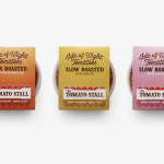
The Tomato Stall by Designers Anonymous
The Tomato Stall is a grower of speciality tomatoes whose distinct flavour is attributed to the increased sunshine they receive from being farmed on the southern English island of the Isle of Wight. From these, The Tomato Stall produces a range of ‘tomato inspired’ artisanal products that are stocked by farm shops and delis throughout the UK and sold from...
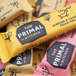
The Primal Kitchen by Midday
The Primal Kitchen is a UK based health food brand founded by nutritionist Suzie Walker with the intention of making the paleo lifestyle, a modern nutritional plan based on the presumed diet of Paleolithic humans, easier and more accessible. The Primal Kitchen commissioned design studio Midday to create a visual identity for the brand which would extend across the packaging for its cold pressed...