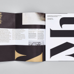
Mauritshuis by Studio Dumbar
Mauritshuis is an art museum and state-owned building constructed in the 17th century and located in The Hague. The building is described as being a fine example of Dutch Classicist architecture. It was formerly the residence of count John Maurice of Nassau and has been home to the Royal Picture Gallery since 1822. Today, it houses a plethora of Golden...
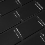
Space Division by Inhouse
Space Division is an architectural studio established in 2010 with an office in Auckland, New Zealand. It looks to contribute to and positively impact on the lives and environments of its clients and the communities it serves by producing simple and succinct spaces. The studio describe their projects as being inclusive and client-focused with physical constraints, budgets, time frames and compliance being...
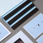
Blue Baths by Ryan Romanes Design
Blue Baths is a renovated bath house originally opened in 1933 and located in Government Gardens, Rotorua, New Zealand. Blue Baths features geothermal heated pools and art deco detail, and has the distinction of being one of the first places in the country to have offered mixed sex bathing. The venue is open to the public and hosts private functions including...

Carin Wilson by Studio Alexander
Carin Wilson is a renowned furniture maker, sculptor, design educator and leader of the New Zealand craft movement throughout the 1970s, 80s and 90s. As well as precisely crafted functional furniture, Carin also creates pieces that look to explore narrative through alternative form — check out his work Royal Pain in the Arse — and are influenced by his Maori heritage. Carin Wilson’s...
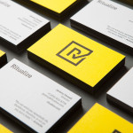
Ritualize by Shorthand
Ritualize is a cross-platform fitness and lifestyle app that utilises leaderboards, education, challenges and exercises to establish and track small habits that should lead to improved physical and mental health, and a sense of well-being over time. Shorthand, an independent brand identity and graphic design studio based in Newcastle, Australia, were recently commissioned to help bring the app to market. This included naming,...
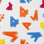
Making: by Garbett
Making: is the Australian Institute of Architects’ 2014 conference. Working in collaboration with creative directors Sam Crawford, Adam Haddow and Helen Norrie, Sydney based design studio Garbett developed a brand identity for the conference, which included logo, lanyard, merchandise and print design, that explores the role of the architect as maker of environments and connections that extend beyond the bounds of traditional practise. This was expressed...
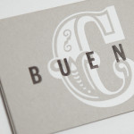
Buena C by Tres Tipos Gráficos
Buena C is an event planning agency, founded by Carolina Arjones, with offices in Madrid and Alicante. The agency provides both individuals and businesses with exclusive, individualised and detail orientated event consultation and organisation services that include, but are not limited to, sourcing locations, photographers, catering, stationery, transportation and accommodation for presentations, conventions and weddings. Alongside event planning the agency...
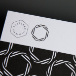
Scotland Can Make It! by Graphical House
Scotland Can Make It! is a limited edition collection of souvenirs, created by leading Scottish designers and artists in collaboration with manufacturers from across the country, for the Glasgow 2014 Commonwealth Games. The souvenirs are described by Graphical House, the design studio behind the collection’s brand identity and website, as being part of a programme of events that celebrate ‘Scotland’s cultural heritage, creative...
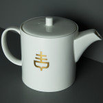
The Empire Café by Graphical House
The Empire Café is a pop-up venue located in Glasgow’s Merchant City that looks to explore Scotland’s relationship with the North Atlantic slave trade through coffee, sugar, tea, cotton, music, visual art, poetry, debate, workshops, walks, film and literature. The café’s brand identity, a ship-like logo, bold sans-serif typography and both a limited and rich approach to print, designed by Graphical House, is described as linking a contemporary ‘artistic programme...
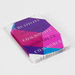
Alphabeta by Village Green
Alphabeta is an extensive property redevelopment project, designed by architects Studio RHE and located in London’s Finsbury Square, that is described as the latest architectural expression of the ‘new economy’. Due to open in late 2014 and managed by Resolution Property, the project will reconfigure a ‘substantial landmark building’ to create a new standard in contemporary work environments for the creative and technology sectors. The space will feature large...
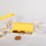
Waffee by A Friend Of Mine
Waffee is an authentic Belgian waffle and coffee chain with locations across Melbourne and Altona. Developed by holistic design practice A Friend Of Mine, Waffee’s brand identity, which included logo and packaging design, menu boards and a signage system created in collaboration with architects Hecker Guthrie and Foolscap Studio, mixes a typographically adventurous logotype with an illustrated character to establish a rich communicative duality and contrast...

Kid O by Studio Lin
Kid O is a modern American toy company that creates products that engage and stimulate children through a rich variety of shapes, colours, and sizes. Designed by Studio Lin, Kid O’s new packaging treatment — which included over 50 boxes — takes the vivid colours of the industry, reduces these down to four, contains them within geometric boundaries and pairs...