Logomarks
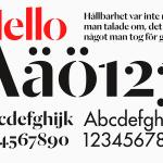
Essem Design by Bedow
Bedow worked with Essem Design, a Swedish manufacturer of ‘artisanal hallway interiors’ to develop a new brand identity treatment. This included logotype, advert, catalogue, product sheet and stationery design based around “Hej—Hej då”, hello and goodbye in Swedish, a reference, Bedow explain, to the most common phrase used in the hallway....
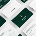
Guy Bauer by Anagrama
Guy Bauer is a Chicago-based video production company ‘committed to creating stories that elicit feelings’. The company’s new visual identity, based around a quill logo – conveying their story-telling philosophy – a stationery solution that references the film industry in its layout and a deep green color palette, designed to convey depth and reliability, was recently developed by independent design agency Anagrama....
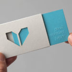
Minke by Atipo
Minke is a Spanish print production studio that favours ‘analogue splendour’ over mass manufacture, providing its clients with a variety of small-scale, mechanical and handcrafted processes. Their visual identity, developed by multidisciplinary design studio Atipo, reflects these services, processes and philosophy through a union of traditional and contemporary detail that exists across type, colour, material texture, print finish, pattern and die cut...
K2LD Architects by Studio Hi Ho
K2LD is a small Melbourne-based architecture and interior design firm with a project history that includes individual private homes, community precincts, multi-unit developments and large-scale commercial projects. The firm’s identity, an abstract, structural and modular amalgamation of initials (check the ideation animation here), uncoated materials and a monochromatic colour palette – developed by brand and communication studio Hi Ho – unapologetically embraces the established and reductionist cues of the industry....

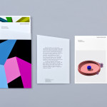
The Tokenhouse by Designers Anonymous
The Tokenhouse is a gastropub – run by hospitality brand Fuller’s – located on London’s Moorgate road. Designers Anonymous – the agency behind the branding of Fuller’s King’s Cross pub venture The Parcel Yard and fair-trade coffee range Brewer St. – developed a visual identity for the venue that appropriates 17th century history, gives it a contemporary vector treatment, a creative but cohesive diversity...

O Architecture by Heydays
O Architecture is a small, Lille-based multidisciplinary studio whose practices extend beyond traditional architectural services to include artistic installations, educational courses and editorial work. Their visual identity, ‘a solid circle with a disruption that creates a triangle reminiscent of an A’ – created by design agency Heydays – , unites the broad remit of the studio under a simple symbol with a revolving, holistic quality that...
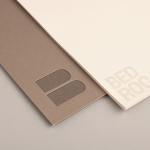
Bedroc by Perky Bros
Bedroc is a Tennessee-based consultancy firm that takes complex business issues and simplifies them with technology to reduce risk, optimise efficiency and creating revenue for its clients (ROC). The firm’s visual identity, created by multidisciplinary design agency Perky Bros, avoids the conventions of the industry and instead favours a direction that draws an analogy between bedrock and technology—the physical stability, sub-surface...
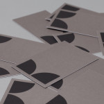
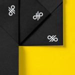
Nosive Strukture by Bunch
Nosive Strukture is a structural engineering firm who describe themselves as having a ‘unconventional attitude towards business, working environment and life itself.’ Inspired by their approach and a studio space of angled detail, independent design agency Bunch, “developed a stark, technical identity based around tensegrity structures and a black and white palette” executed across triplexed business cards, cardboard file folders, signage...
Crosskey by Kurppa Hosk
Crosskey is a Finnish company that develops and maintains systems and solutions for the Nordic banking sector and capital markets, making it ‘easier and more profitable for its customers to operate their banks’. Based around the idea “Banking Power!” design agency Kurppa Hosk developed a visual identity solution, which mixes a simple corporate typeface, iconic mark and an economical colour...
Krohn by Commando Group
Krohn is a young but experienced Oslo based furniture, interior and architecture design studio that develops holistic solutions that strengthen and add value to businesses through interior environments. Krohn’s visual identity, website and stationery—created by visual communications agency Commando Group—captures the multi-disciplinary nature of the studio and juxtaposes bold architectural structure and simple interior spaces with fine, high quality detailing, through an abstract,...

Askeroths Trappor Och Räcken by Bedow
Stockholm based graphic and product design studio Bedow recently developed a new visual identity and stationery solution for Askeroths Trappor och Räcken, a small Swedish manufacturer of specialist staircases. Based around a simple but identifiable abstraction, the logo-mark captures the elemental, functionality and practicality of staircases and the solid technical abilities of the craftsmen through the combination of a single, consistent line weight, basic geometry...
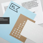
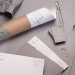
Paul Loebach by Studio Lin
Paul Loebach is a Brooklyn based three dimensional designer who specialises in product, furniture and emerging manufacturing technologies. His new identity, developed by Studio Lin, is a wonderful union of craft, structure, space and geometry that neatly reflects his use of both traditional materials and contemporary processes....