Graphic Design Trends: Monolinear Illustration
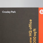
Croxley Park by Blast
Croxley Park is a business park located two miles from the town of Watford, United Kingdom, with good local public transport links and twelve minutes from the M25, an arterial route that encircles Greater London. Although strategically placed to make the most of these networks, Croxely Park also has a unique 25 acre parkland setting. Currently, this is home to both multi-national companies and...
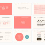
Fab Media by Bedow
Fab Media is one of Sweden’s leading media companies. It produces inspiring and entertaining content aimed at young women, and owns a variety of multi-media brands made up of websites, social media platforms and magazines. Fab Media’s specialisation, engaging exclusively women and the creation of modern cross-platform brand experiences, is expressed by their new visual identity, created by Stockholm-based graphic...
Faculty Brewing Co. by Post Projects
Faculty Brewing Co. strives to create an open and collaborative environment where visitors, of all levels of expertise, can learn about how craft beer is made with the intention helping them to navigating Vancouver’s thriving craft scene. The brewery boasts a 7 barrel, 1450 square-foot brewery with 6 fermentors, 6 bright beer tanks and 28-seat tasting room with an industrial and utilitarian interior design. It also...
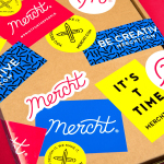
Mercht by Robot Food
Mercht is a UK based custom merchandise business, created by the team at Awesome Merchandise, that offers its customers a risk-free way to design, sell and ship customised t-shirts and wearable accessories, through an online showcase and print on demand service. It is a platform where, if designs sell well, both parties profit, with neither loosing if they do not. Leeds based graphic design...
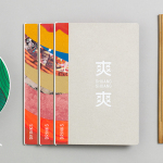
Shuang Shuang by ico Design
Shuang Shuang is new restaurant experience, located on London’s Shaftesbury Ave, that brings a contemporary twist on hotpot—a long-established and family favourite throughout China and East Asia, and a fun and social way of eating—to the United Kingdom. Shuang Shuang worked with London based graphic design studio ico Design on naming and interior design, as well as brand identity. This extends across signage, tableware, menus and...
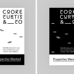
Cooke Curtis & Co. by The District
Cooke Curtis & Co. is an award-winning estate agent with an office in Cambridge, United Kingdom. It has a portfolio and a thorough understanding of properties throughout the city and in neighbouring villages. Although the business was established last year, its founders have over thirty-five years of industry experience. Local graphic design studio The District were commissioned by the estate agent to develop a visual identity that...
Hernesaaren Ranta by Werklig
Hernesaaren Ranta is an outdoor seaside area, located to the south of the Finnish capital of Helsinki, open during the summer months. It has food vendors, boat docks and terraces, and is part of an ongoing development project that also includes residential buildings. Graphic design studio Werklig were commissioned to create a comprehensive brand identity system for the entire area that, alongside...
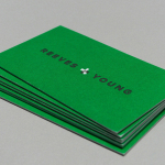
Reeves & Young by Matchstic
Reeves & Young is an Atlanta based construction and sub-contracting business that was formed in 2015 following the merger of Reeves Contracting Company and Potts Construction. To coincide with this merger, Reeves & Young worked with American graphic design studio Matchstic to develop a new brand identity that would convey the combined strength of the two businesses but would also be sensitive to...
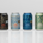
Fort Point Beer Co. by Manual
Fort Point is a San Francisco-based small batch craft beer company that references traditional styles yet is firmly rooted in the present, and has a philosophy that values craftsmanship and innovation, creativity and technique. In 2015, working with local graphic design studio Manual, Fort Point launched a new graphic identity and packaging system to unite its expanding range. Fort Point’s forward-thinking, fast-growing...

Teabox by Pentagram
Teabox is an e-commerce tea business, established in 2012 and located at the heart of India’s tea-growing regions, that looks to revolutionise the experience of buying and enjoying one of the oldest drinks in history by bringing it directly to consumers. It is based on the popular monthly subscription model, and uses data science to match teas to subscriber’s personal tastes. Teabox worked with Pentagram partner...
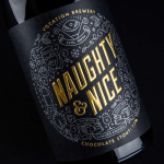
Vocation Brewery Limited Edition by Robot Food
Vocation is a UK microbrewery, established and run by John Hickling, with a range of craft beers described as having distinctive and punchy flavour profiles. Communicating the brewery’s unique personality and the crafted quality of its range rested in the hands of UK based graphic design studio Robot Food. Drawing on the beer’s tropical, fruity, floral and hoppy characteristics, the brewery’s fearless, daring and renegade attitude, and the...
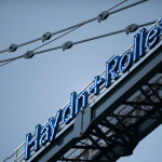
Haydn & Rollett by Richards Partners
Haydn & Rollett is an Auckland based construction company that has been in business since 1946. To coincide with its 70th birthday and in acknowledgement of the broadening of its services beyond just construction, the company worked with graphic design studio Richards Partners to develop a new brand identity that would better communicate who they are today whilst not abandoning their past. This...