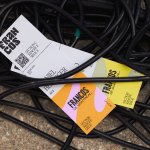
Francos de Montréal by LG2
Les Francos de Montréal is Canada’s premier festival of French language music and culture. Held annually in downtown Montréal, it is a fixture in both the social calendar and cultural life of the city, and the wider francophone world. This year’s edition of the festival has been given a sophisticated new look, courtesy of LG2, Canada’s largest independent creative agency...

Pilo by 5.5
Youth hostels aren’t exactly associated with luxury – nor great branding. For the most part, they’re deemed the cheap and cheerful option; a trip where home comforts are sacrificed for socially minded living, affordability, and a more adventurous sensibility than the average Travelodge. They’re the sorts of places where creaky bunk beds, shower queues, pillows so thin they’re barely more...

Plume by Human After All
Plume is a Denver-based telehealth service (or ‘virtual-clinic’) tailored specifically to the needs of the trans community across the US, offering a range of services including prescriptions for oestrogen or testosterone. This is a hostile political landscape to step into, but Plume is doing it with bright and bold panache, courtesy of a fresh rebrand from London-based studio Human After...
Hometree by How&How
It’s all well and good for a design agency to make some wild, boundary-pushing, all-singing all-dancing work for things like Gen Z healthcare products; or ‘top shelf’ spirits; or craft beer. But most client projects aren’t going to be the sort of thing that merits bright orange and typography that dances around the boundaries of legibility. And arguably, it’s those...

BP&O Voices
Rich Baird on Design History:
Bata by Design Research Unit, 1969
The story of Design Research Unit’s 1969 logo for Czechoslovakian shoe manufacture and retailer Bata....
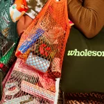
Wholesome by Universal Favourite
Wholesome is a new breed of supermarket that doesn’t fill a gap in a market so much as it positions itself at a nexus of multiple intersecting demands. The pursuit of ethical grocery and household shopping has, for decades, been both deeply commendable and exasperatingly time-consuming, expensive and convoluted. One supermarket will stock Fairtrade products but have a scant gluten-free...
Expensify by The Collected Works
According to The Collected Works, one of the main reasons its recent client Expensify was looking to rebrand was to remedy a perceived mismatch between the ‘wacky’ vibe of the brand’s marketing and ads (namely its 2019 Superbowl commercial), and its core visual identity. Which begs the question – how far does a brand identity itself have to mimic or...
Logo
Beatport by Kurppa Hosk, 2021
Beatport’s prior logo, an abstract pair of headphones used from the company’s founding in 2004, is labelled by Wikipedia as “not meeting the threshold of originality needed for copyright protection”. Ouch. To be fair, this is down to it “consisting of only of simple geometric shapes”. Surly that’s the point? Anyway, this is resolved by Kurppa Hosk with a new...
Recchiuti by Manual
Recchiuti Confections is a San Francisco-based gourmet chocolatier that creates chocolates with unique flavour combinations. Using traditional European techniques, with locally sourced ingredients from Northern Californian farms and markets, Recchiuti’s chocolates have earned a loyal customer base and several accolades. After 25 years in business, Recchiuti sought the expertise of Manual – a local design studio – for a brand...
Logo
Western Union by Love St. and Co., 2023
Western Union has felt like a high street mainstay. It’s black and yellow signage is easy to recollect, its logo, however, not so much. An uncomfortable overlapping of an ‘W’ and ‘U’ offered little cognitive prompts to latch on. There was clearly an opportunity to, at the very least, generate something with a modicum of creativity. The new monogram is...
Logo
Pursuit by Gander, 2023
‘What success really looks like’ is a great set up for Pursuit, a social enterprise that delivers transformation through training to wherever it’s needed most. A looping arrow designed by Gander captures the never-straightforward route to success (however you choose to define it). That this then forms a ‘P’ is a lovely synergy of idea and type. It’s dynamic and...

Erbert by AUGE
Few countries on Earth take their food as seriously as Italy. It’s not difficult to justify the enormous pride Italians take in their spectacular culinary heritage, with their cuisine considered the ‘most exported’ on the planet. But while the wider world is undeniably in thrall, Italians’ patriotic palettes create and necessitate a notoriously conservative domestic cooking culture. Italian ingredients, recipes...