Logo
International by Kurppa Hosk, 2025
International began life as International Harvester, a manufacturer of tractors and farming equipment for agriculture. Since its founding in 1902, the business has expanded to include trucks, busses and all variety of road vehicles. From 1946, International Harvester, renamed to just International, was represented by an IH monogram, composed stylistically to evoke the front profile of a tractor. This was...
Logo
ChatGPT & OpenAI by Ben Barry & Ludwig Pettersson, 2025
The initial ChatGPT logo was designed by Ben Barry and Ludwig Pettersson. While not conceptually all that interesting, it set the look and feel of many other AI projects that followed it, so significant more for its influence, and increasing ubiquity. In 2025, in an effort to formalise the OpenAI visual identity, a rebrand introduced a revised logo. This was...
Rolus by Re
Back in the early 00s – the era when arguably Hollyoaks was at its zenith, and bellybutton piercings their most bejeweled – Botox was gradually emerging from the hushed clinics of Harley Street and LA to become part of common parlance. As such, brands cottoned on to the word’s ‘eternal youth’ connotations: I distinctly remember a shampoo ad promising that...
Logo
TwelveLabs by Pentagram, 2025
Technology gallops on with a new video reading AI model Twelve Labs. Pentagram’s use of positive and negative space, allusions to packets of data, and stunning animation that nods to Eadweard Muybridge’s galloping horse from 1878 – an early photographic motion study – is pure joy. This stylisation, blending information and animation, beautifully conveys progress: bold strides forward, technological evolution,...
Logo
Eventbrite by Buck, 2025
With a renewed mission to “bring people together through live experiences” and “maximize the enjoyment of gathering” global events platform Eventbrite worked with Buck to develop a new visual identity, beginning with the design of a logo. This takes on the form of an energetic bolt with a sense of forward momentum alluding to the dynamism, electricity and rhythms of...
TwelveLabs by Pentagram
Remember when the conversation around gradients was about making ‘bad’ design look ‘better’? When RGB colours were frowned upon because you couldn’t print them? Yeah, those ideas feel a bit outdated now. HP Indigo can now run fluorescents affordably, and business card mock-ups (in RGB) are more about selling than printing. Technology marches on, expectations and standards evolve, and everything...
Logo
Equator by For The People, 2025
Equator is a platform that translates hundreds of data points into actionable insights for people that want to make sustainable choices when they travel and easier for travel operators to parse. Using the name as a starting point, For The People developed a new logo that uses the equator line and Earth’s axial tilt to create a globe with a...
Logo
Uniqode by Koto, 2025
The largest companies in the world rely on QR codes for the successful management of their daily operations. Uniqode helps brands connect with customers in the physical world, the digital one and between the two. Koto visualised this through the metaphor of stitching, “demonstrating the joining together of two planes with a simple needle and thread.” The effect is to...
Logo
Mount Capital by Studio South, 2025
To reflect a new, progressive and future-focused vision, private investment manager and non-bank lender Mount Capital worked with Studio South to devise a refreshed visual identity. This included the design of a new logo that depicts a mountain and its shimmering reflection in the water. The effect of the facets used to build the form generate a jewel-like impression. Despite the...
Logo
Chester Zoo by How&How, 2024
Zoo logos offer a unique challenge. These spaces often benefit from the diversity of animals they look after and available to see. So, choosing just one animal to use as logo does a zoo a disservice. This is unless that animal is a rarity, or has some symbolic significance (National Zoo). Other approaches have sough to include a variety of...
Logo
Ten by Paul Belford, 2025
Sometimes a logo has a story. Sometimes it is ‘read’, an idea inferred, a feeling conferred, or an abstract form that simply identifies. This logo–designed by Paul Belford Ltd for London-based health and fitness chain Ten–is one of those, a-ha, yes, its a ten, and its all about balance. Perfect. Distinctive, simple, ownable in context. And, in its solid geometric...
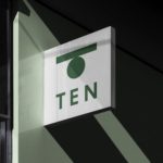
Ten by Paul Belford Ltd
I’ve been writing about the work of Paul Belford Ltd. (Next Chapter, Spudos & Social Enterprise) for very nearly fifteen years. Initially, and admittedly, the articles practically wrote themselves, which was ideal for a self-taught designer with very little experience but keen to take an approach to learning that was very much my own. That was to write about a...