Logo
Ancestrel Wine by All Purpose, 2025
I absolutely adore the way that the letterforms drip into each other in All Purpose’s logo for Ancestrel Wine, these collide and morph and generally glooping together like syrup. This ultimately forms the logo, and it’s not just a lovely piece of type design – it’s also a smart but rather subtle representation of a bunch of grapes. However, it...

Vans didn’t need reinventing – Accept & Proceed’s new brand identity understands that
I love my Vans almost literally to death: the little black, three-hole plimsolls are so well-loved that there are holes in both big toes, and on the right side, actual horizontal tears across the top. They’re sun-bleached to the point of almost unrecognition, holey as hell, ripped up and yet still, so unbelievably comfortable that I can’t bear to part...
Logo
Abitibi-Témiscamingue by lg2, 2026
Sometimes, in its simplicity, a logo looks like it designed itself. Other times, the solution was just hidden, waiting to reveal itself. Here, it’s the latter. In the overlapping of an ‘A’ and a ‘T’ you get a neat little coniferous tree, the terminals of the ‘T’ adding a mid-tree flaring that really sells it. Throw in a bit of...
All Purpose ditches wine clichés in its lurid new identity for natural wine importer Ancestrel
Based in leafy yummy-mummyish south London enclave Forest Hill, Ancestrel (yes that’s a deliberate misspelling) is a wine shop and so much more – it’s proudly the first company in the UK to import natural wine. Having started life in 2016, Ancestrel has spent the decade since making a name for itself as a renowned importer, wholesaler, and retailer of...
BP&O Voices
Packaging:
When Less Screams More
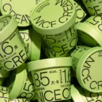
Packaging expert Lisa Cain shares her opinion on Han Goa’s packaging concept for ‘Nice Cream’...
Upgrade to
BP&O Plus
Read more
Pentagram nails controlled chaos in its identity for Manhattan “shophouse” style Thai restaurant LenLen
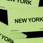
It’s not easy to make an identity look genuinely effortless – more often than not, the very intention to do so renders the result looking the exact opposite. And nothing, no one, ever wants to be levelled with the accusation of appearing to be ‘trying too hard’. However, Pentagram New York’s partner Andrea Trabucco-Campos and team has succeeded in that...
Coca-Cola’s new identity by JKR proves that sometimes the smartest rebrand is barely a rebrand at all
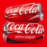
It’s hard to think of a bigger name client than Coca-Cola: the brand is so huge that it’s become a shorthand for anything meaning ‘global mega-corp’. Its reach is so vast, its history so firmly cemented in culture that it practically owns a certain combination of red and white; a specific sort of alliterative script serif type. Even its bottle...
BP&O Voices
Packaging:
Don’t Be the Sad Snack
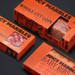
Packaging expert Lisa Cain shares her opinion on the brand identity for vegan meat brand Juicy Marbles designed by Ljudje....

20(Something) borrows from museum-modernity as much as tech in its new identity for civic software platform Open Point
I’ve no idea what this trend is called, or indeed if it even has a name, but I’m seeing it around a hell of a lot lately: t-shirts (usually very crisp, almost box-fresh-clean, and white) with a tonne of text emblazoned across the back. It doesn’t seem to matter at all what the text says, to means, but there’s a...
Logo
Open Point by 20 (Something), 2026
Open Point is a comprehensive suite of tools that brings Community Engagement and Stakeholder Relationships together under one platform, allowing organisations to listen better, understand insights faster, and act with confidence and compliance. Put simply, it’s an online tool used by local governments and big projects to talk with the public. A gear , a sun and a rotated ‘P’,...

Koto gives programmer forum Stack Overflow a reason to exist in the age of AI
Since starting life in 2008, Stack Overflow has functioned as a website/platform/forum that soon became a sort of internet go-to as a shared notebook or tool guide for programmers: somewhere they can ask questions, answer them, and have them answered by other actual real life people who’ve probably been there and done that, and want to impart the wisdom they’ve...