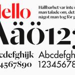
Essem Design by Bedow
Bedow worked with Essem Design, a Swedish manufacturer of ‘artisanal hallway interiors’ to develop a new brand identity treatment. This included logotype, advert, catalogue, product sheet and stationery design based around “Hej—Hej då”, hello and goodbye in Swedish, a reference, Bedow explain, to the most common phrase used in the hallway....
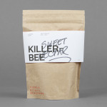
Single Origin Roasters by Maud
Single Origin is a Sydney-based coffee specialist with a roast works in Botany and a cafe in Surrey Hills. Single Origin approached Maud to create a brand identity solution—which included logo design, stationery and packaging—that would reflect the low-key nature of the brand, the founders’ desire to avoid any notion of commercialism and help them expand into new markets. In a ‘category rife...
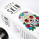
Under Your Skin by Robot Food
Under Your Skin is a specialist tattoo and skin care range made up of three treatments; ‘Recover’, ‘Protect’ and ‘Enhance’, developed in response to skin art’s move from sub-culture to the mainstream. Under Your Skin’s brand identity—which included a logotype, original illustrative work and packaging design, developed by Leeds-based Robot Food—was created to appeal to a broad audience, “from the newly marked”...

Intu by Heydays
Intu is a Norwegian accounting and consultation firm and real-time technological solutions provider located in the town of Bodø. Design agency Heydays developed a new brand identity solution for Intu—which included naming, logotype, business cards, print communication, custom typography and website design—based around the link between the firm’s two key services and the software it uses to deliver these efficiently....
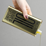
Olive & Sesame Oil by Lo Siento
Design agency Lo Siento have recently completed their packaging design work for Spanish olive oil producer Olis Bargalló‘s new Olive & Sesame variety. Lo Siento’s use of condensed sans-serif typography, stacked vertically, and printed with a single black ink makes great use of the tall tin and its warm gold colour. Typography, structural choice and straightforward language share a similar commercial...
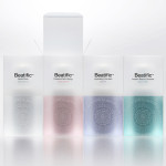
Beatific by Mousegraphics
Beatific is a new skincare range from Greek private medical service provider Hygeia Group “for women who are aware of the benefits of cosmeceuticals and can appreciate the results of thorough clinical research and high end care”. Created by Mousegraphics, the brand identity and packaging for Beatific takes the medical precision, exclusive care and expertise established by the Hygeia Group and a contemporary clinical experience...
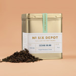
No. Six Depot by Perky Bros
“No. Six Depot is a family owned, small-batch coffee roaster and café nested in the beautiful Berkshires. Located in a historic train station on 6 Depot St, they serve teas, salts and coffee from small farms and roast on location. Their identity [designed by Perky Bros] juxtaposes a mix of unique rural and modern elements — drawing inspiration from their own backyard railroad...
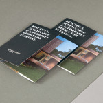
Vibe Select by Studio Constantine
Vibe Design Group are described by Studio Constantine, the design studio behind the brand identity of Vibe’s new sub brand Select, as a “multi award-winning Melbourne based architectural design practice” who produce “fiercely contemporary and conceptual buildings for the top end of the Australian residential market.” Studio Constantine worked with Vibe in the process of “productising and branding a new consulting...
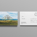
Valentto Olive Oil by Anagrama
Valentto is a Mexican cold-pressed virgin olive oil produced by Olivarera Italo-Mexicana – a Mexican Italian collaboration – created for commercial kitchen and restaurant use. Multidisciplinary design agency Anagrama recently developed a new brand identity and packaging solution for Valentto that juxtaposes the natural detail of Italian landscapes alongside the industrial utility of a square tin structural choice, described by Anagrama as being...
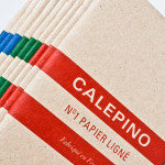
Calepino by Studio Birdsall
Calepino is a french manufacturer and brand of “traditional yet technical notebooks with an authentic vintage spirit” made from 100% recycled, locally sourced paper, covered with a cardboard from a factory with a heritage dating back to 1927 and assembled by hand. Calepino’s brand identity and print, recently designed by Florida based Studio Birdsall, juxtaposes the earthy craft textures of an...

Weekend by RoAndCo
Inspired by ‘cartoonish film titles from the 1980’s’, design agency RoAndCo recently developed the brand identity for Dallas coffee shop Weekend, an extension of their retail store “which has become a relaxing everyday haunt for vacationers”. Based around a tightly spaced Cooper Black logotype, a “minimal and refined typographic system” and a striking but restrained red and white colour palette, Ro&Co created a solution...
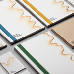
Jeremy Maxwell Wintrebert by Hey
Jeremy Maxwell Wintrebert is a glassware designer and manufacturer currently working in France with a free hand glass blowing philosophy mastered while traveling internationally across the US and Europe. Spanish design agency Hey recently developed a new visual identity solution for Jeremy that captures the heat, craft and art of glass blowing through a smart combination of colour and laser...