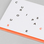
Curious Space by Mash Creative & May Ninth
Curious Space is a London-based scenographers—a specialist scene setter—that creates “unique and inspiring spaces for museums, galleries and more”. Their visual identity, developed by Mash Creative and May Ninth, ‘splits apart to create a physical space that intrigues whilst the type can sit either horizontally or vertically in numerous layouts within the dotted grid”, establishing a flexible and unusual yet structured...
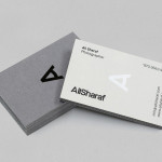
Ali Sharaf by Mash Creative
Ali Sharaf is a Bahrain-based commercial photographer who specialises in fashion, beauty and lifestyle images for the advertising and editorial markets. He describes himself as contemporary, upbeat, outspoken and edgy. Inspired by a shared interest in Swiss modernism and adopting a less is more approach, design studio Mash Creative developed a new brand identity for Ali that combines an iconic...
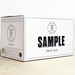
Sample Brew by Longton
To standout in an increasingly saturated market, boutique brewer Sample commissioned Melbourne-based design agency Longton to brand and package their American-inspired pale ale, slow brewed to the standards of the 1516 German purity law. Longton’s solution reflects this approach, a purity of ingredients and the brewery’s name with a distinctive and reductionist ‘sample pack’ aesthetic that balances a sense of small-scale,...
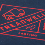
Treadwell by Perky Bros
Treadwell is a Kansas-based floor installation business that specialise in no-nonsense solutions that last. Perky Bros, the agency behind their name, visual identity and website, describe Treadwell’s philosophy as about ‘standing upright, walking the walk and empowering clients to move forward with confidence, secure in the knowledge that they’ve chosen the right product and the right people for the job’. The...
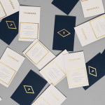
Tourean by Anagrama
Tourean is a British multinational venture capital firm that manages a variety of lifestyle subsidiaries within the music, design, events, social media and fashion industries. Their new visual identity, developed by design agency Anagrama and drawing inspiration from the Tourean name – a compounding of the words taurean and tour created to convey the values of strength, fortitude, courage and integrity as well as...
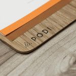
Podi by Bravo
Podi is a Singapore-based organic restaurant that ‘celebrates bold, robust and unique flavours’ and the responsible sourcing and cooking of ingredients. Drawing inspiration from the restaurant’s name, a Hindi word to describe a mixture of ground dry spices and herbs, design agency Bravo developed a visual identity that pairs a small, abstract interpretation of heaped spices with a bold logo-type, earthy tones and...
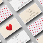
Cocolobo by Anagrama
Cocolobo is described by Anagrama – the multidisciplinary design agency behind their new visual identity – as a ‘high-end shopping boutique that caters exclusively to strong women with a confident and in vogue fashion sense’. For the name, Anagrama played with the patrons’ ‘characteristic duality’, with a ‘catchy and fun’ compounding of “Coco” (coconut in Spanish) and “lobo” (Spanish for...

Saxa by Graphical House
Saxa is an independent on-line dealer, publisher and commissioner of original and editioned works from international artists with differing perspectives and cultures, taking a curatorial and collaborative approach to make these available to collectors, galleries, institutions and the general public. Saxa’s visual identity, created by UK-based design agency Graphical House and inspired by crystalline structures, conveys the idea of buyer and artist networks through the coalescing and...
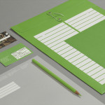
Storyline Studios by Work In Progress
As well as providing space, Storyline, Norway’s largest film studio, offers a wide range of services which include, but are not limited to, set building, lighting, VFX, audio and video post production as well as costume and equipment rental. Developed by Work In Progress, Storyline’s visual identity brings together the classic flourish of a script, the humanist qualities of hand drawn detail, a sense...
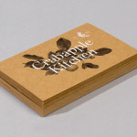
Crabapple Kitchen by Swear Words
Located on Hawthorn’s Glenferrie Road, Victoria, Crabapple Kitchen is a ‘high-end café/wine bar’ with an ever-changing menu of simple, rustic and seasonal Italian, French and Spanish cuisine created from local produce and served in a ‘homely and light-hearted environment’ – derived from the French and Italian countryside – made up of ‘beautiful fabrics, French pantries, hanging copper pots, comfy banquettes and...
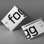
Fogg by Bunch & Kurppa Hosk
By purchasing overcapacity from international telecom networks, Fogg Mobile provides a fixed cost mobile data traffic service for people who want to avoid unexpected roaming bills when travelling abroad. Through the animate and evolving qualities of computer generated imagery and a combination of unbleached paper, stitching, flat coated colour and silver polypropylene, Fogg’s visual identity, created by Kurppa Hosk and developed by Bunch, delivers...

Newscope Films by Karoshi
Newscope Films is an independent, UK-based producer of feature films, television programmes and micro-budget movies for an international market. United by their mission to develop innovative, highly conceptual and original genre films, multi-disciplinary design agency Karoshi created a ‘progressive new identity solution which would capture this brand spirit whilst remaining accessible to a broad audience’....