Branding Agency
Barnardo’s by The Clearing
Barnardo’s is the UK’s largest children’s charity, and it undoubtedly does much good in the world. However, its history up to this point is also littered with uncomfortable controversies. Certainly, the most outlandish transgressions are concentrated in the late-19th and early-20th centuries. Founder Thomas John Barnardo was taken to court 88 times for kidnapping children (or ‘philanthropic abductions’, as old...
Qasa by Bold
Now that the likes of ed-tech (education technology) and fin-tech (financial technology) have become a natural part of everyday parlance, it was surely only a matter of time before prop-tech (property technology) entered the equation, too. Proptech largely refers to platforms and services that use tech to help people buy, sell, research, market, and manage a property – ranging from...

Antara 128 by Mucho
GT Alpina is described by type foundry and BP&O regular GrilliType as a workhorse serif that also delights in playing with the very meaning of concept, reaching into the ‘grab bag of typographic history to resurrect shapes some may falsely see as too expressive’. This feels an apt description for Antara 128, and the visual identity created by Mucho that...
Crumbl by Turner Duckworth
While we speak the same language, the cultural differences between us here in the UK and our pals in the US can feel vast. There’s pavement vs sidewalk, fringe vs bangs, ‘flavour’ vs ‘flavor’. There’s also biscuit and cookie – though where we draw the line between the two is another debate for another time. And seemingly at the forefront...
De-Extinction by Koto
Koto’s new work is undoubtedly gorgeous – after all, what’s not to love about a suite of very cute dinosaurs? Especially when they’re rendered in a charming faux naif sort of style, and the whole colour palette is based around Barney & Friends purpley pink and the effervescently Gen Z-baiting neon of ‘terminal green’. The project in question is Koto’s...
Moksi by FCKLCK Studio
Dutch studio FCKLCK’s all-caps, blood-red website is full of declarations of belligerent provocations such as ‘OUR FAVOURITE CLIENTS ARE THE ONES WHO HAVE EVEN BIGGER BALLS THAN WE DO’. Talk of ‘CUTTING THROUGH THE BULLSHIT’ is accompanied by a mouseover gif of a defecating bovine. The name is of course an expletive repudiation of serendipity (who needs luck when you’ve...
Kettle Kids by Two Times Elliott
The once laudable claim to have started a thriving business with ‘a small loan’ from a doting family member may have been muddied beyond recognition by the truth-stretching of serial tax-offender and part-time Presidential candidate Donald Trump. Despite this, turning ‘one thousand pounds from nan’ into a luxury watch and diamond dealership with a sparkling flagship store in Mayfair remains...
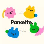
Parkette by Kinoto
Cute, bright, and striking; there’s very little not to love about this identity for Parkette. Based in Hamilton, Canada, Parkette is billed as a boutique shop ‘dedicated to kids and the kids at heart’, selling crafts kits, clothes, accessories, books, homeware, toys, and ‘other treasures’. The name is taken from a term many locals in Hamilton use to describe a...

Francos de Montréal by LG2
Les Francos de Montréal is Canada’s premier festival of French language music and culture. Held annually in downtown Montréal, it is a fixture in both the social calendar and cultural life of the city, and the wider francophone world. This year’s edition of the festival has been given a sophisticated new look, courtesy of LG2, Canada’s largest independent creative agency...

Pilo by 5.5
Youth hostels aren’t exactly associated with luxury – nor great branding. For the most part, they’re deemed the cheap and cheerful option; a trip where home comforts are sacrificed for socially minded living, affordability, and a more adventurous sensibility than the average Travelodge. They’re the sorts of places where creaky bunk beds, shower queues, pillows so thin they’re barely more...
Plume by Human After All
Plume is a Denver-based telehealth service (or ‘virtual-clinic’) tailored specifically to the needs of the trans community across the US, offering a range of services including prescriptions for oestrogen or testosterone. This is a hostile political landscape to step into, but Plume is doing it with bright and bold panache, courtesy of a fresh rebrand from London-based studio Human After...
Hometree by How&How
It’s all well and good for a design agency to make some wild, boundary-pushing, all-singing all-dancing work for things like Gen Z healthcare products; or ‘top shelf’ spirits; or craft beer. But most client projects aren’t going to be the sort of thing that merits bright orange and typography that dances around the boundaries of legibility. And arguably, it’s those...