Designtorget by Kurppa Hosk
Opinion by Richard Baird Posted 26 March 2015
Designtorget is a Swedish design store and brand founded by architect Jerry Hellström in 1993 with the intention of making the very best contemporary furniture, arts and design from across the country available to the mass market. It now has 16 stores throughout Norway and Sweden and a broad catalogue of functional, high-quality products, selected by jury, produced by both unknown and established designers, and considered creative, innovative and have their own history. The brand is actively involved in the design community, committed to helping emerging designers, and has become an important driver behind the growing popularity of Swedish design.
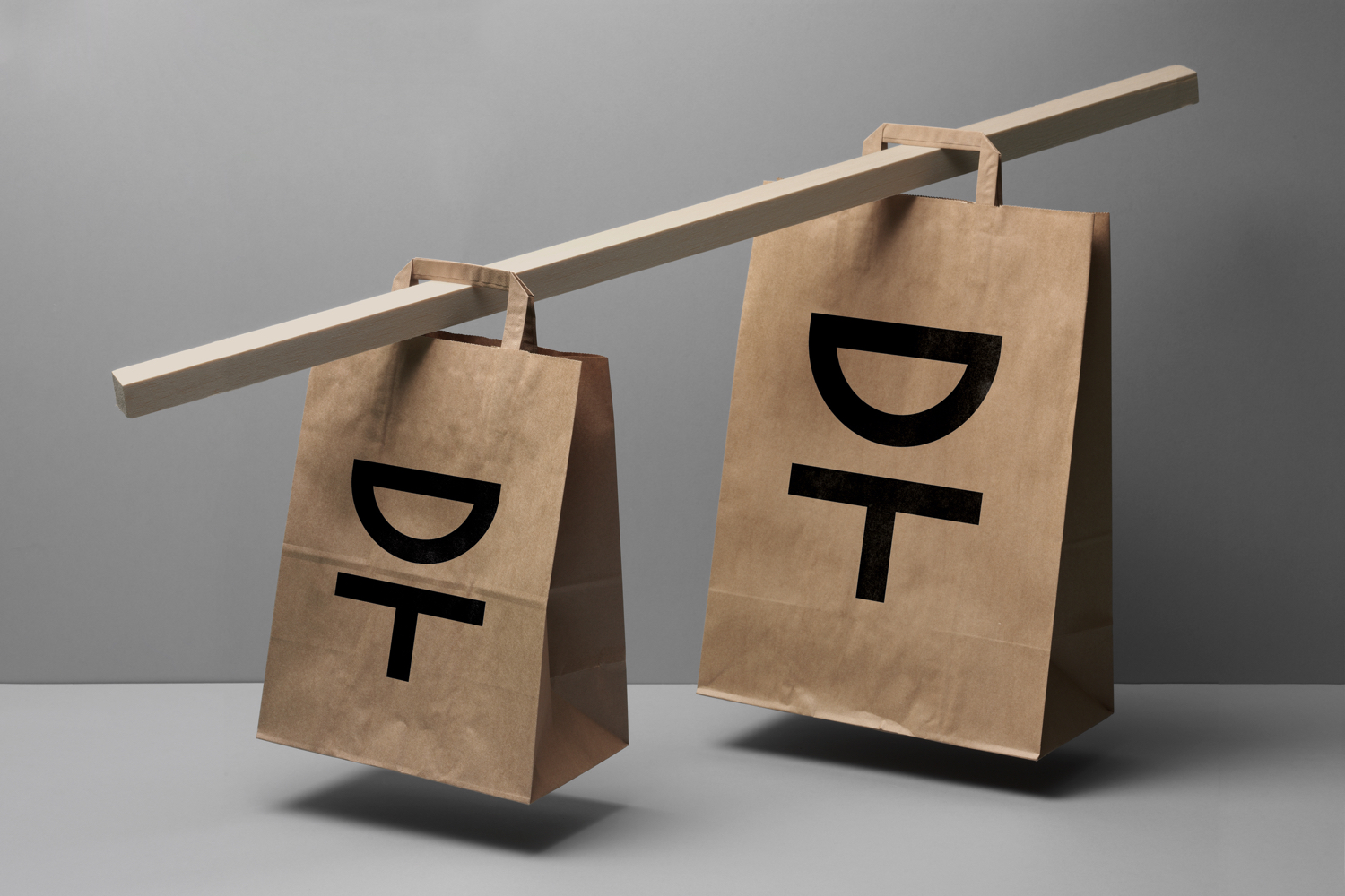
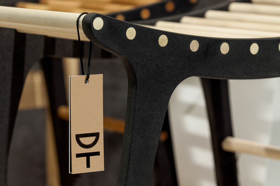
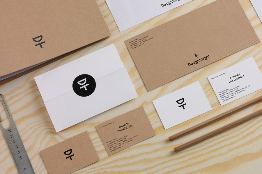
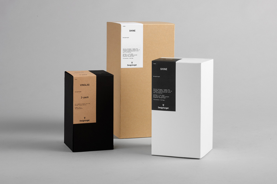
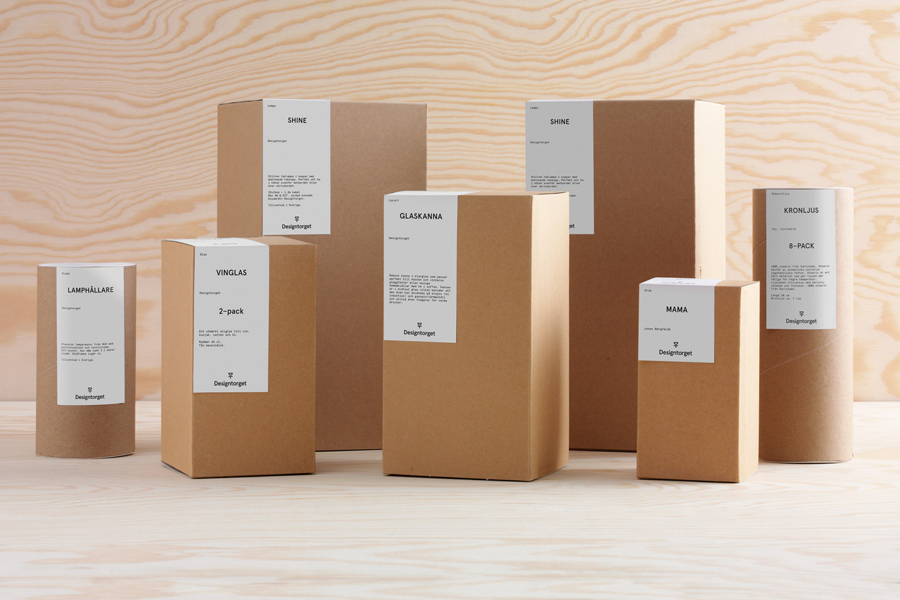
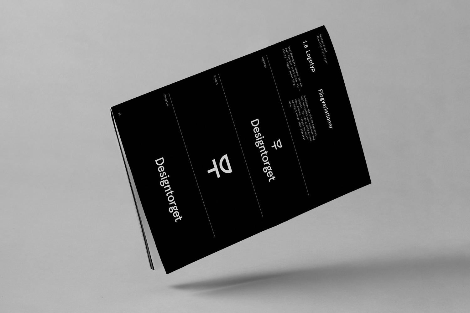
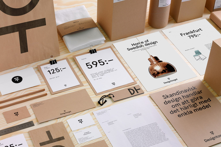
Designtorget worked with Stockholm based graphic design studio Kurppa Hosk to redesign its brand identity in a way that would secure the store a more contemporary look and feel. This went on to include logotype, a flexible animated logo, bags, tags, stationery, package design and brand book.
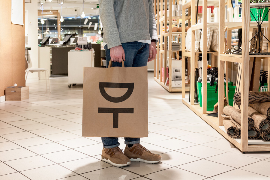
As you might expect from a Scandinavian brand identity, especially one representative of a design led business, Designtorget’s is pared back, constructed with a few but well-selected and high quality assets that sit alongside and frame but do not detract from, the unique characteristics—be that pattern, form or texture—of a curated catalogue drawn from a wide variety of designers, each with their own style and story to tell. These are weaved together with the finest of threads, close to neutrality, that avoids imposing its own overbearing personality and compliments an interior of uncoated wood racks and tables, exposed air conditioning and bulbs, knotted cables and white tiled floors.
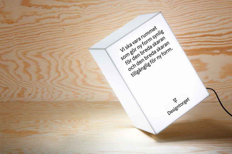
Although made up of few components these are weighted well within the context of a physical in-store experience and sensitive to products with rich aesthetic and conceptual detail. A typographic contrast of humanist and monolinear lines, character detail and size, packaging and label, bag and logo proportion, a contrast of black ink, white and unbleached paper, empty space and detailed product image, left-aligned and centre-aligned text, draw moments of interest and distinction from utility, in keeping with the functionality of the catalogue.
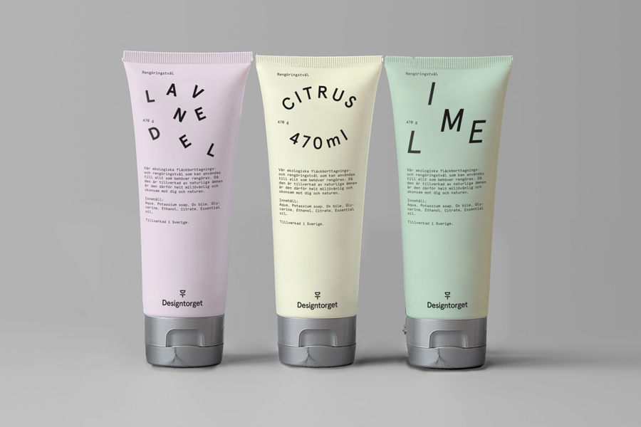
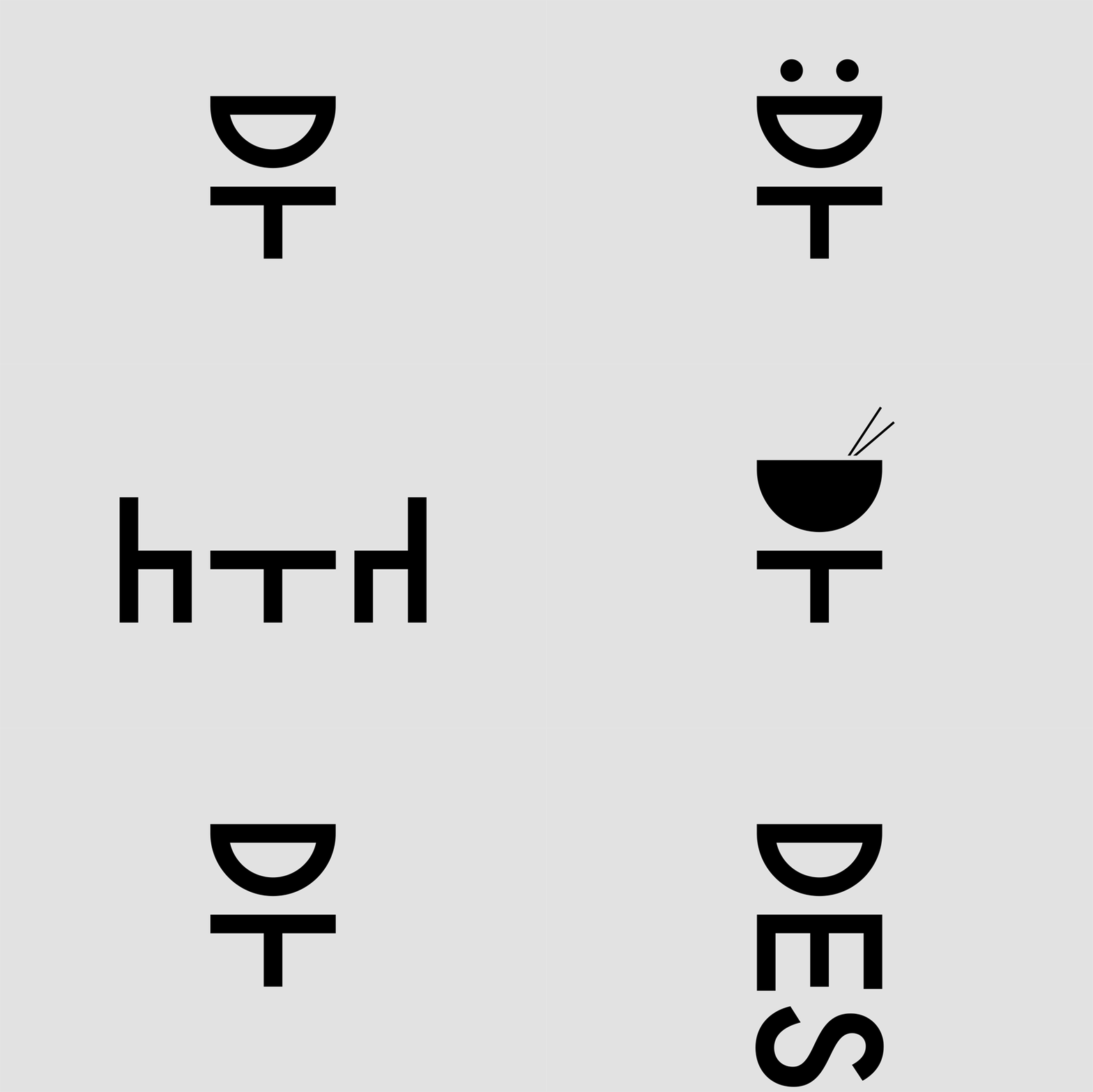
Aperçu, the pastel colours and typographic play of Designtorget’s own brand products, and the flexible and dynamic qualities of the logo introduces a little character and highlights potential. The creative flourish of the logo is grounded by a functional pictographic layer of communication, presumably picking out sections of the shop or product categories. The logo currently only anchors a few icons but has plenty of room to grow.
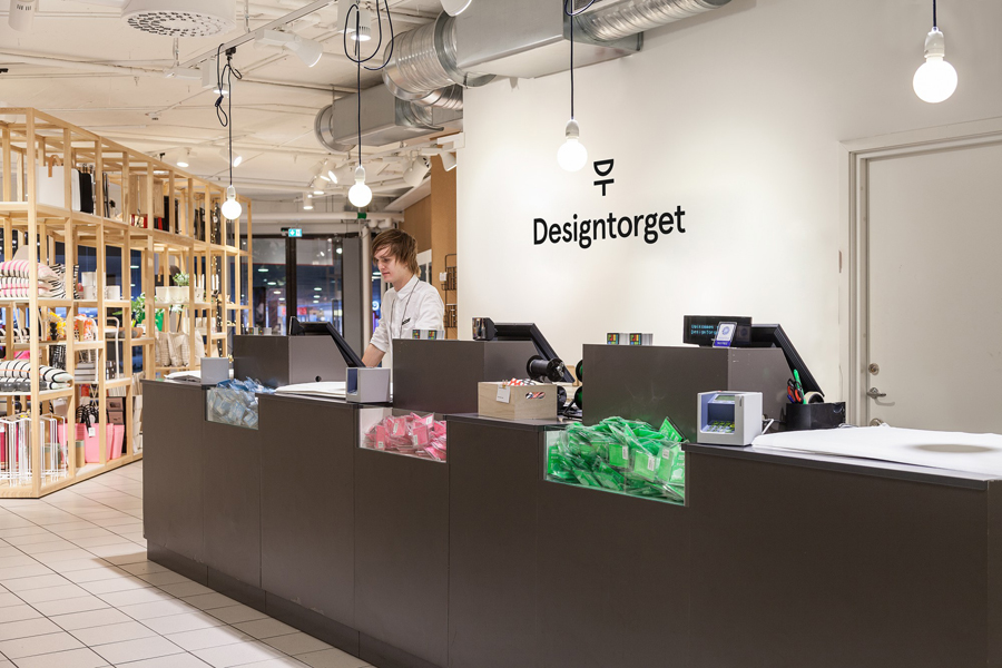
It would be difficult not to acknowledge the current and familiar qualities of the approach to identity and interior, it is, however, worth recognising the difficulty of pulling this off well and the level of understanding that it takes to appreciate its strengths, weaknesses and appropriateness. This project benefits from the right choices applied within the right context, the use of reduction and neutrality only because of the strength and uniqueness of the catalogue it needs to unite, and acknowledges the roll product and environment plays in setting tone. Although the update has not made its way online it is easy to imagine how this might look in the future. More from Kurppa Hosk on BP&O.
Design: Kurppa Hosk. Opinion: Richard Baird. Fonts Used: Aperçu & Aperçu Mono
