The Best of BP&O — March 2017
Opinion by Richard Baird Posted 31 March 2017
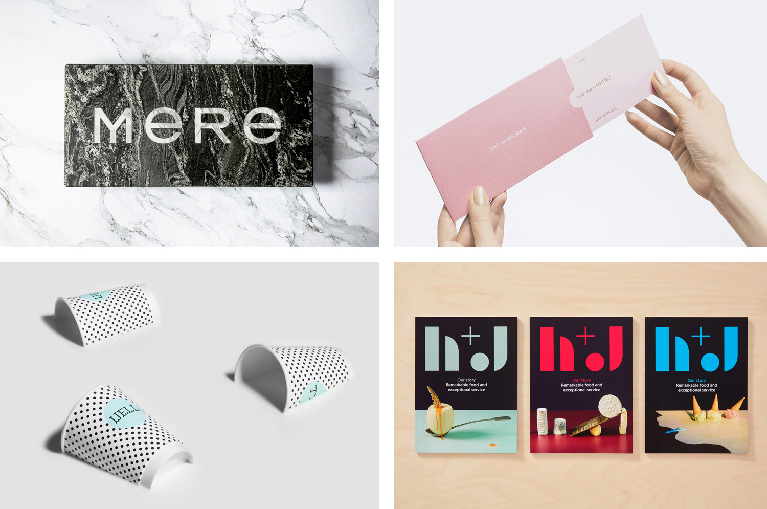
March’s highlights included Tsto’s brand identity for Artek Helsinki, the furniture manufacturer’s flagship store, Studio fnt’s patterns and product design for Korean entertainment network tvN and BVD’s playful typographical brand identity for Blå Bär, a retailer of Scandinavia goods in Osaka, Japan. However, there were five projects that stood out, and have made it into BP&O’s Best Of Series.
This feature brings together some of the most thoughtful and distinctive projects published on BP&O each month for another opportunity to be seen and shared. These typically balance a strong concept with a compelling aesthetic and clear communicative intention that appropriately plays with form, colour, type and layout, as well as material, texture, image and print finish.
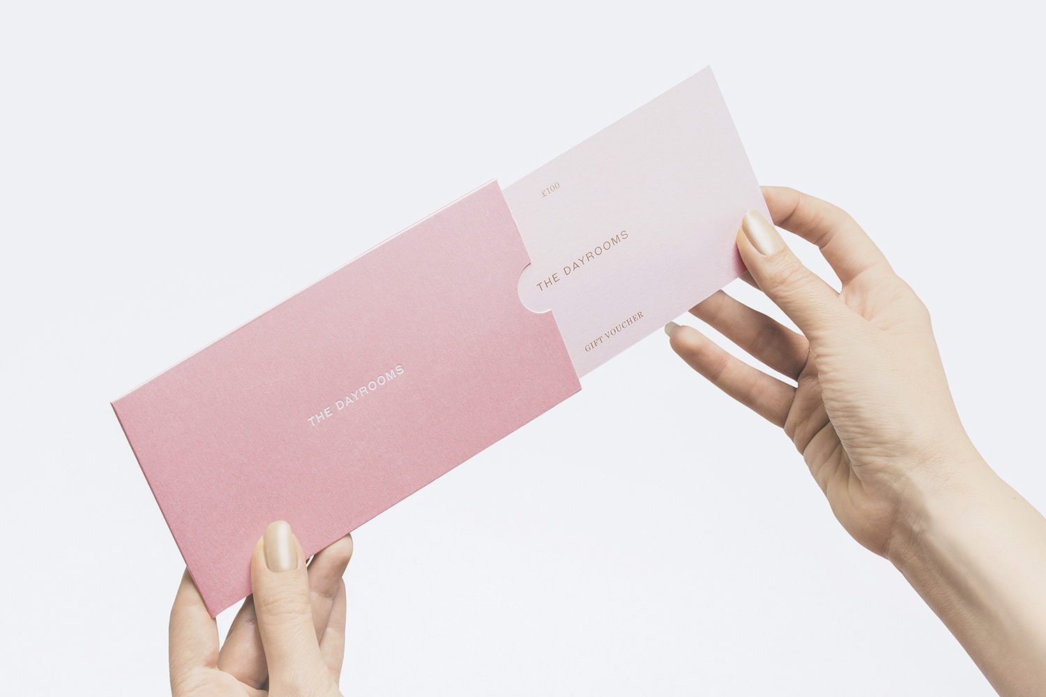
The Dayrooms by Two Times Elliott, United Kingdom
The Dayrooms is a multi-label womenswear store, located in the London district of Notting Hill, created by Aytan Mehdiyeva and Zumrud Mammadova. The store gives a UK platform to emerging Australian designers and is an expression of Aytan and Zumrud’s shared passion for fashion and travel, and Aytan’s love of photography, textiles and Australian craftsmanship. This is reflected throughout The Dayroom’s brand identity, developed by Two Times Elliott, not only in the simple but carefully crafted intersection of reductive graphic expression and material detail, but in the concept of curated moments, expressed through language, image and objects.
See more of this project here
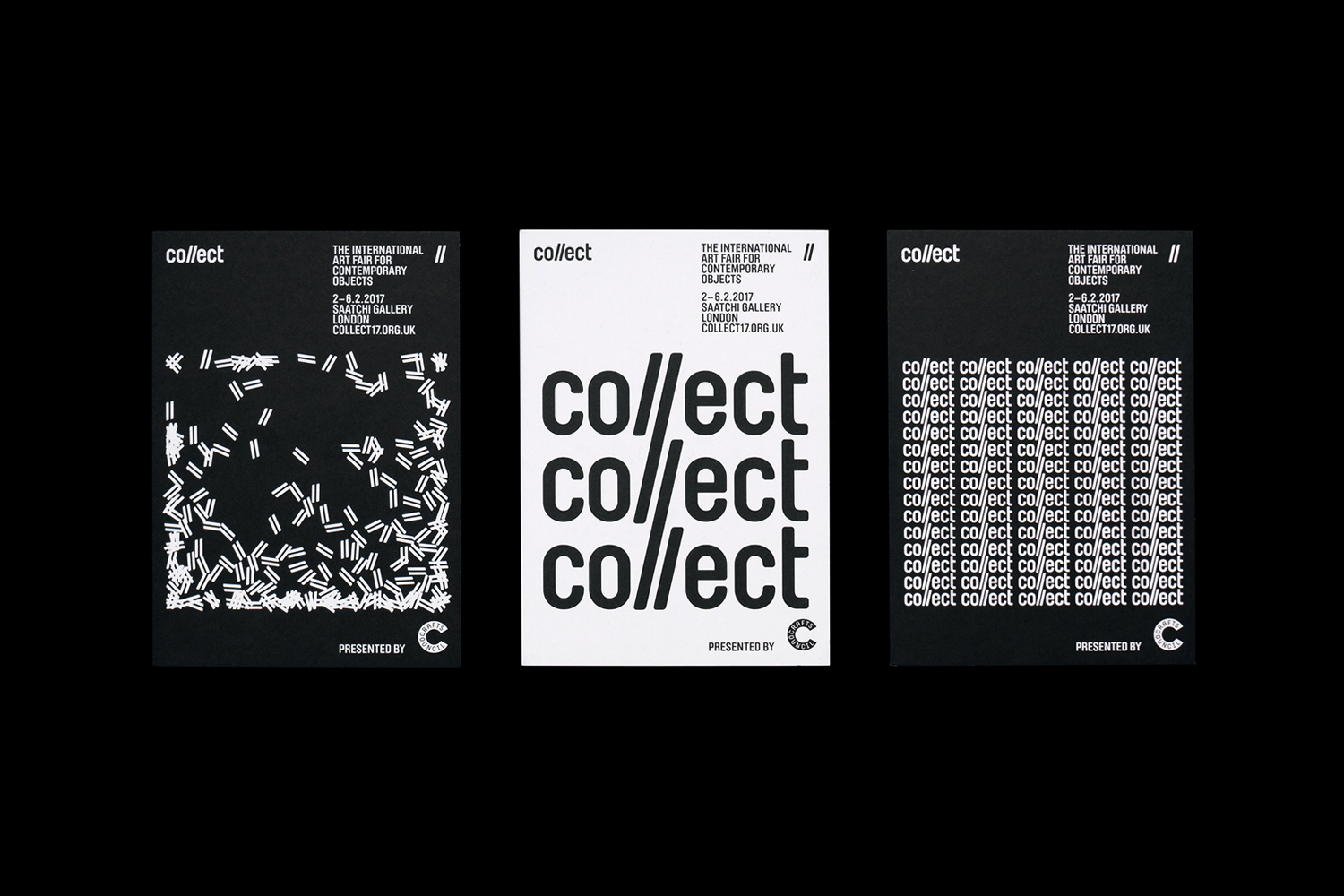
Collect by Spin, United Kingdom
Collect is an international art fair that this year took place between the 2–6 of February at London’s Saatchi Gallery. Presented by the Crafts Council, Collect gave visitors the chance to see and buy museum-quality and contemporary ceramics, glass, jewellery, wood, metal and textiles created by established and emerging artists and makers represented by over thirty of the world’s best galleries.
Collect’s brand identity, designed by Spin, draws character, play and visual interest from an economical use of a single and fairly austere font, and a black and white colour palette, and went on to include a variety of print communications including leaflets and catalogue, art direction, animation, advertising, signage and environmental graphics.
See more of this project here
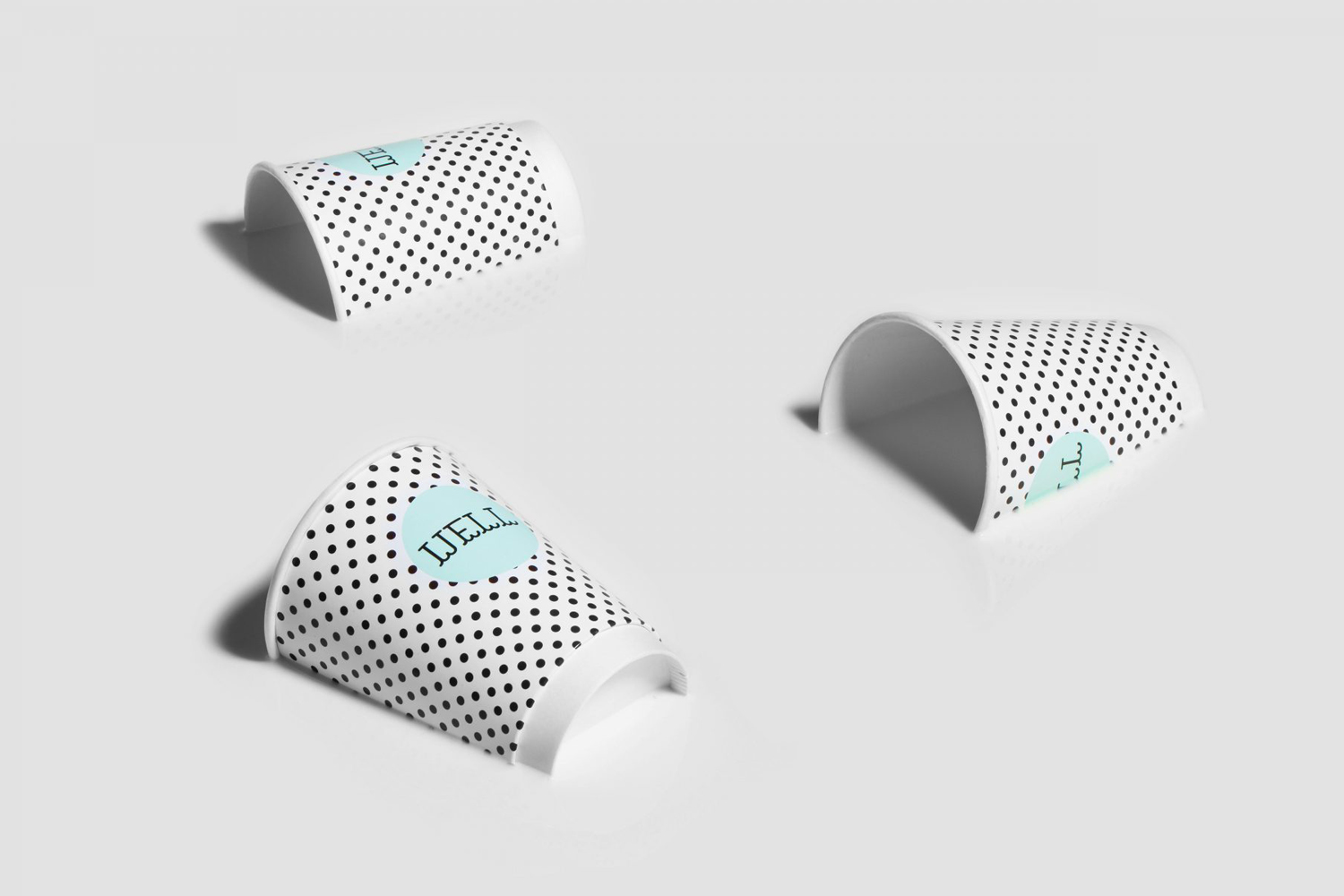
Well Coffee by Bond, Finland
Well Coffee is a new vegetarian café in the centre of of the Finnish capital of Helsinki. It has a distinctive interior of steel frames and wood surfaces, exposed concrete walls, drilled and CNC cut panels of circles, large menu board, marine lamps and potted plants. These blend the current and utilitarian with the more welcoming. Scandinavian graphic design studio Bond worked with the café on brand identity. This included illustration and custom typography, implemented as signage, across packaging and throughout website. These are linked by wave-like elements, inspired by the symbol associated with cafe’s location in Kaivopiha, and recurring circular detail that makes a connection with interior design.
See more of this project here
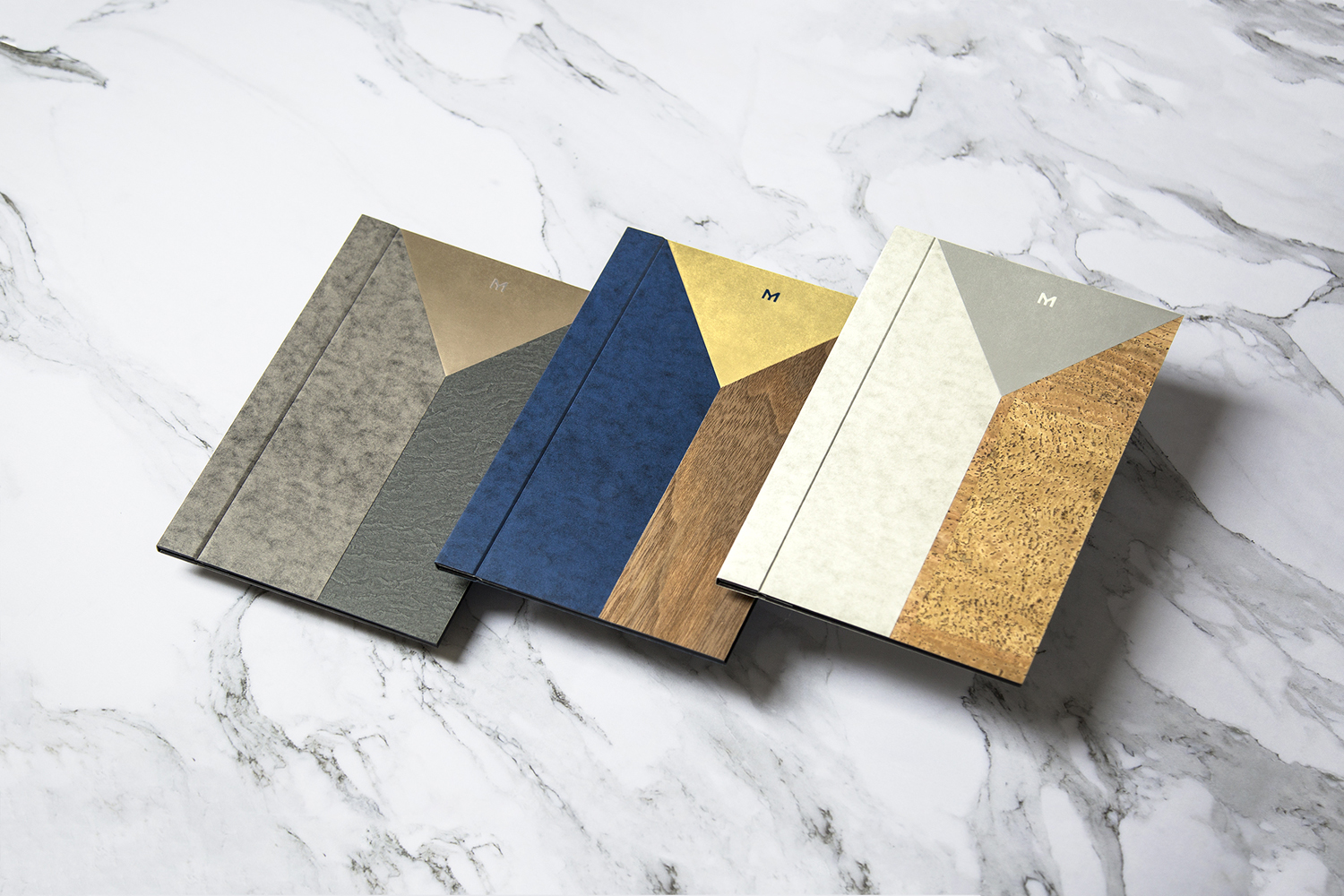
Mere by Bibliothèque, United Kingdom
Mere–pronounced Mary–is a modern two-storey restaurant and bar, located in London’s Fitzrovia, developed by chef Monica Galetti and sommelier David Galetti, working in collaboration with Westbury Street Holdings.
The restaurant has a menu of simple dishes made from seasonal produce using classic techniques, and influenced by the French and South Pacific heritage of David and Monica, respectively. It also features a warm interior of rich material detail and pattern, created by Softroom.
Mere’s brand identity, developed by London-based design studio Bibliothèque, brings these interior details together and draws a sense of refinement, craft and character from the intersection of materials and the use of unusual typographic form across menus, receipt holders, business cards, cloakroom tags and signage.
See more of this project here
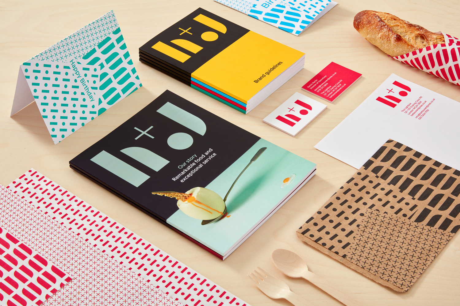
H+J by Spy, United Kingdom
H+J is a UK independent catering business, established in 2004, that has provided food and catering solutions to venues such as The Cutty Sark, Moët & Chandon, Abbey Road, RIBA and Selfridges. Their services include working lunches and private dining rooms, large scale food courts, cafes and deli bars. London-based graphic design studio Spy worked with H+J to develop a new brand identity that would better express their growing ambitions and help them stand out within a highly competitive industry. This included logo design, still life photography, tone of voice, stationery, business cards, packaging and website design.
See more of this project here

