BP&O Collections — Wine
Opinion by Richard Baird Posted 3 January 2018
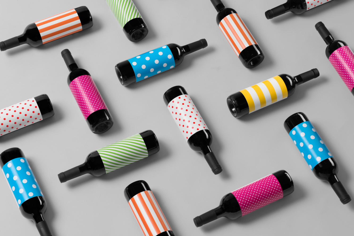
A continually updated gallery that takes a look at the visual, material and structural language of the wine industry, populated by projects reviewed and published on BP&O. This post features work by Inhouse, Mucho and Frost, and covers small and large wineries and their labels, wine events, wine bars and shops. These take a variety of approaches, from the illustrative to the typographic, the abstract to the literal, and between them play with a sense of provenance and terrior, winery legacy and individual family histories. Stylistically and conceptually, these move between the modern and singular in concept, to those that utilise traditional motifs and enduring finishes. Be sure to click the images to read more about the project and the intentions of each design.
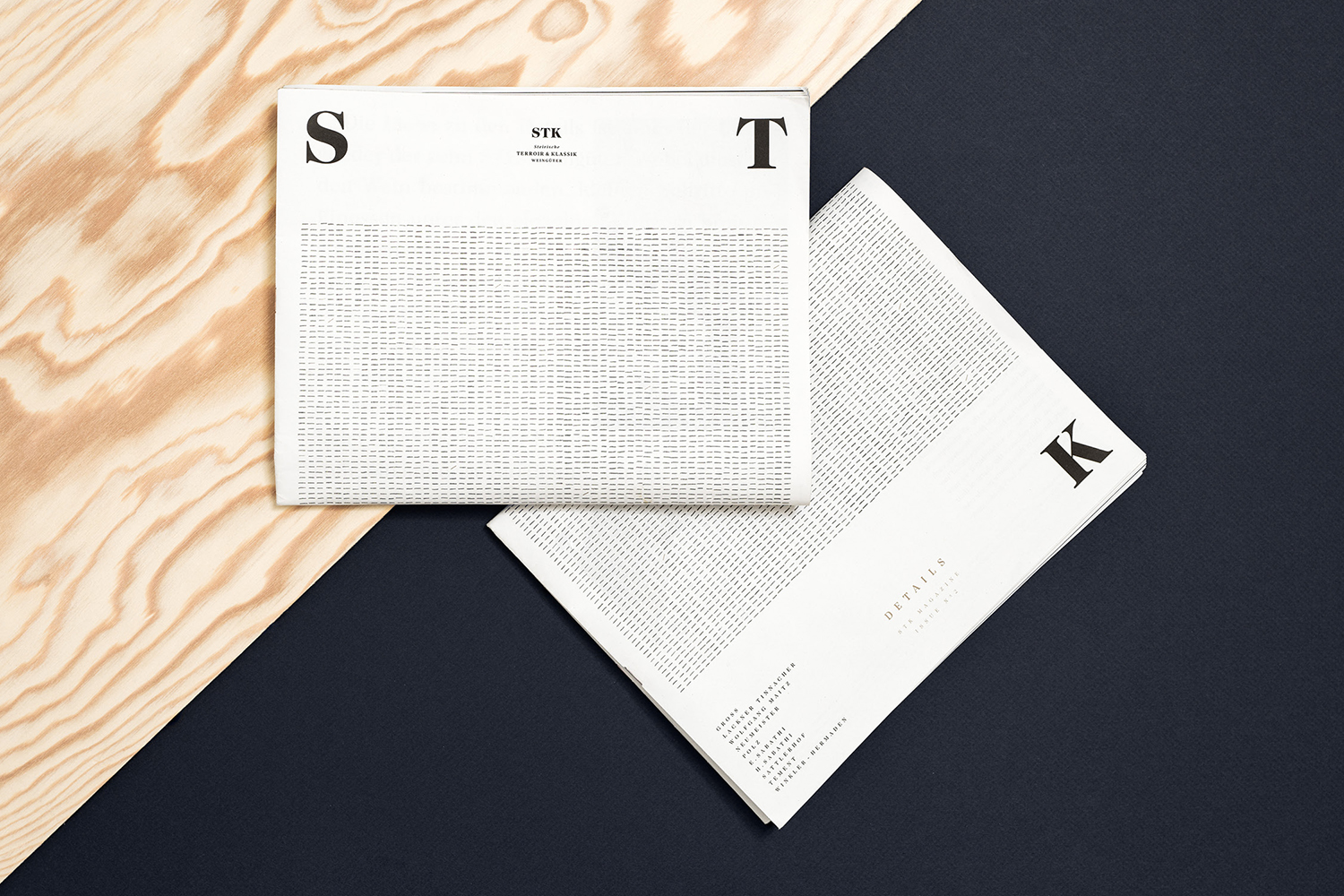
STK Magazine by Moodley, Austria
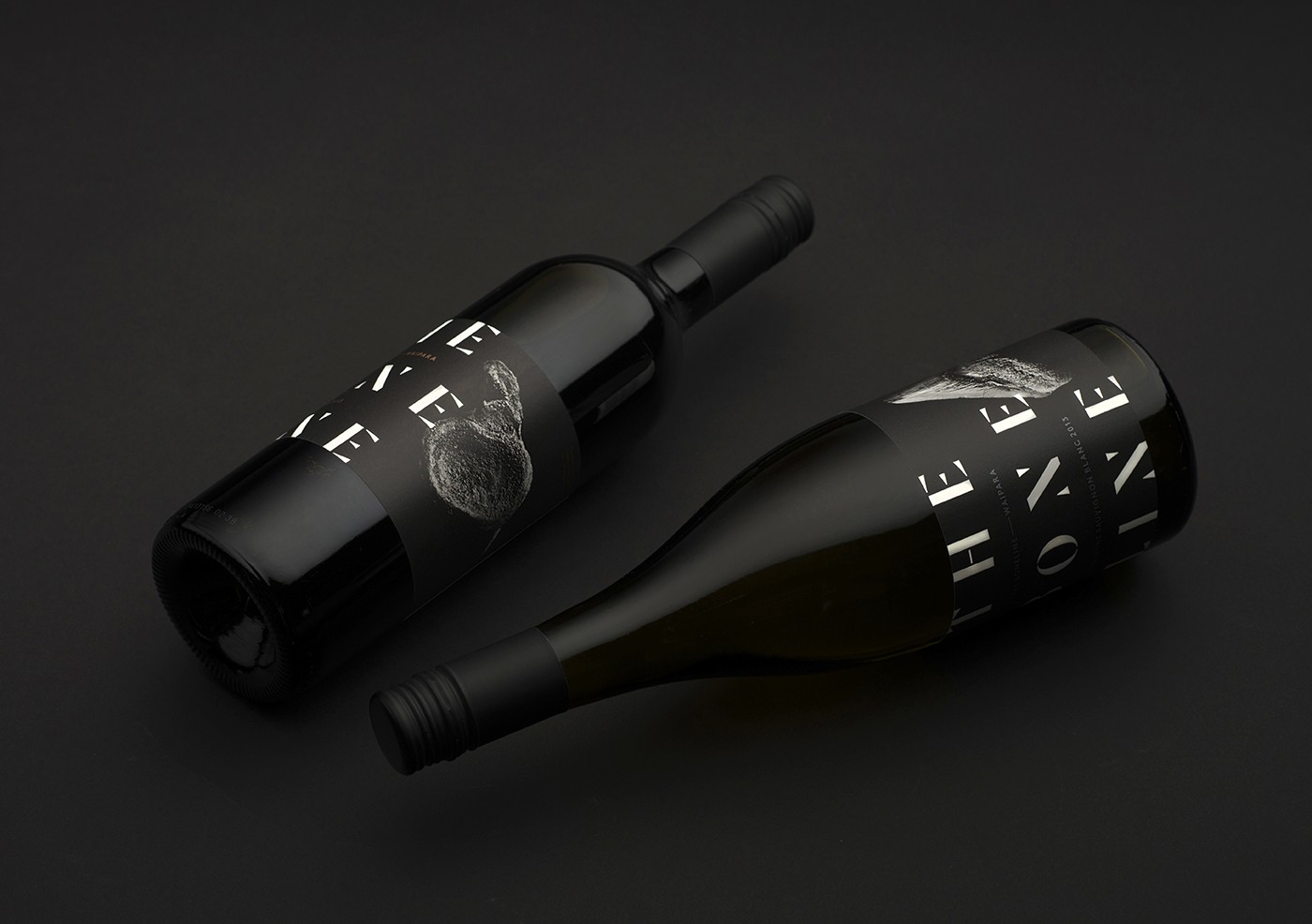
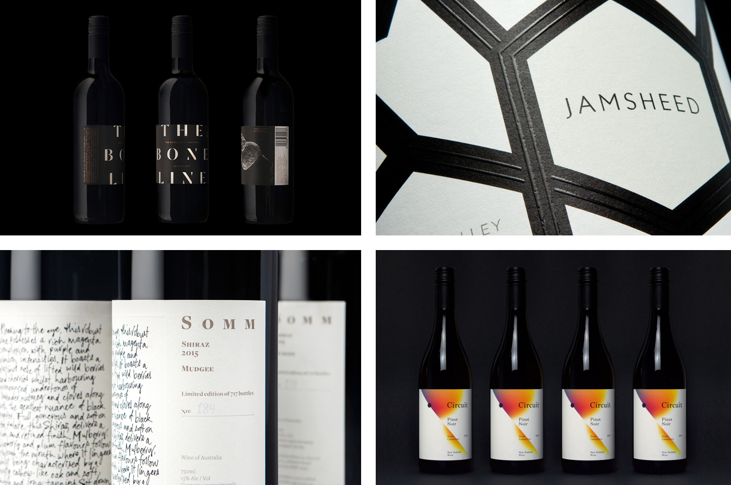
The Bone Line by Inhouse, New Zealand
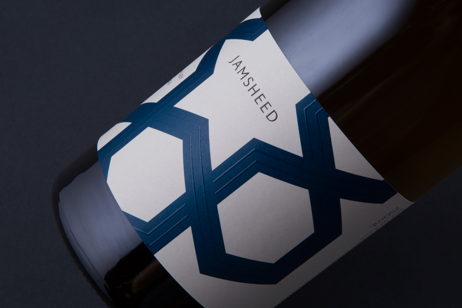
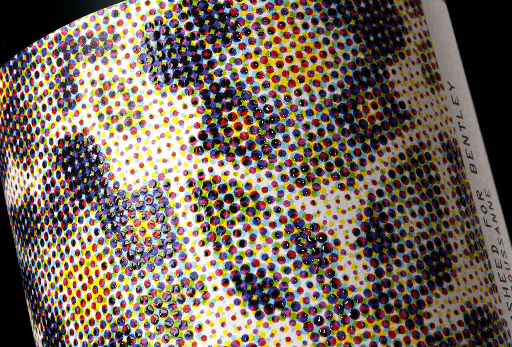
Jamsheed for Bentley by Cloudy Co., Australia
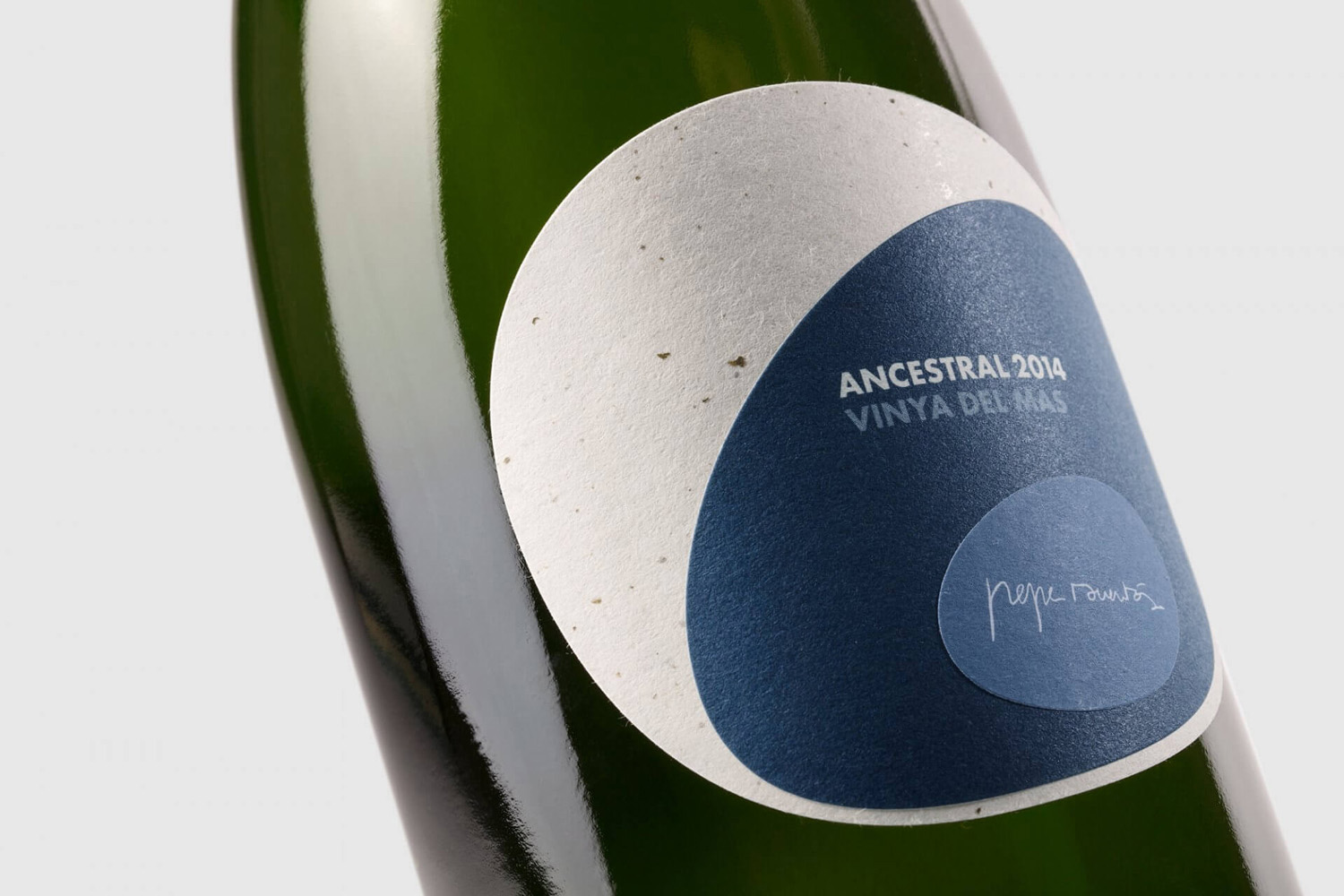
Pepe Raventós Natural Wines by Mucho, Spain
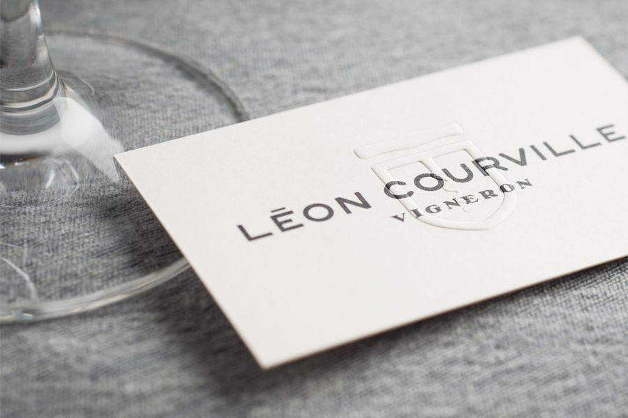
Léon Courville Vigneron by lg2 boutique, Canada
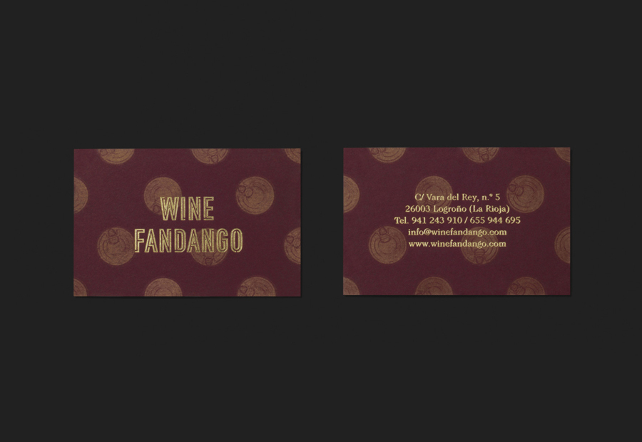
Wine Fandango by Moruba, Spain
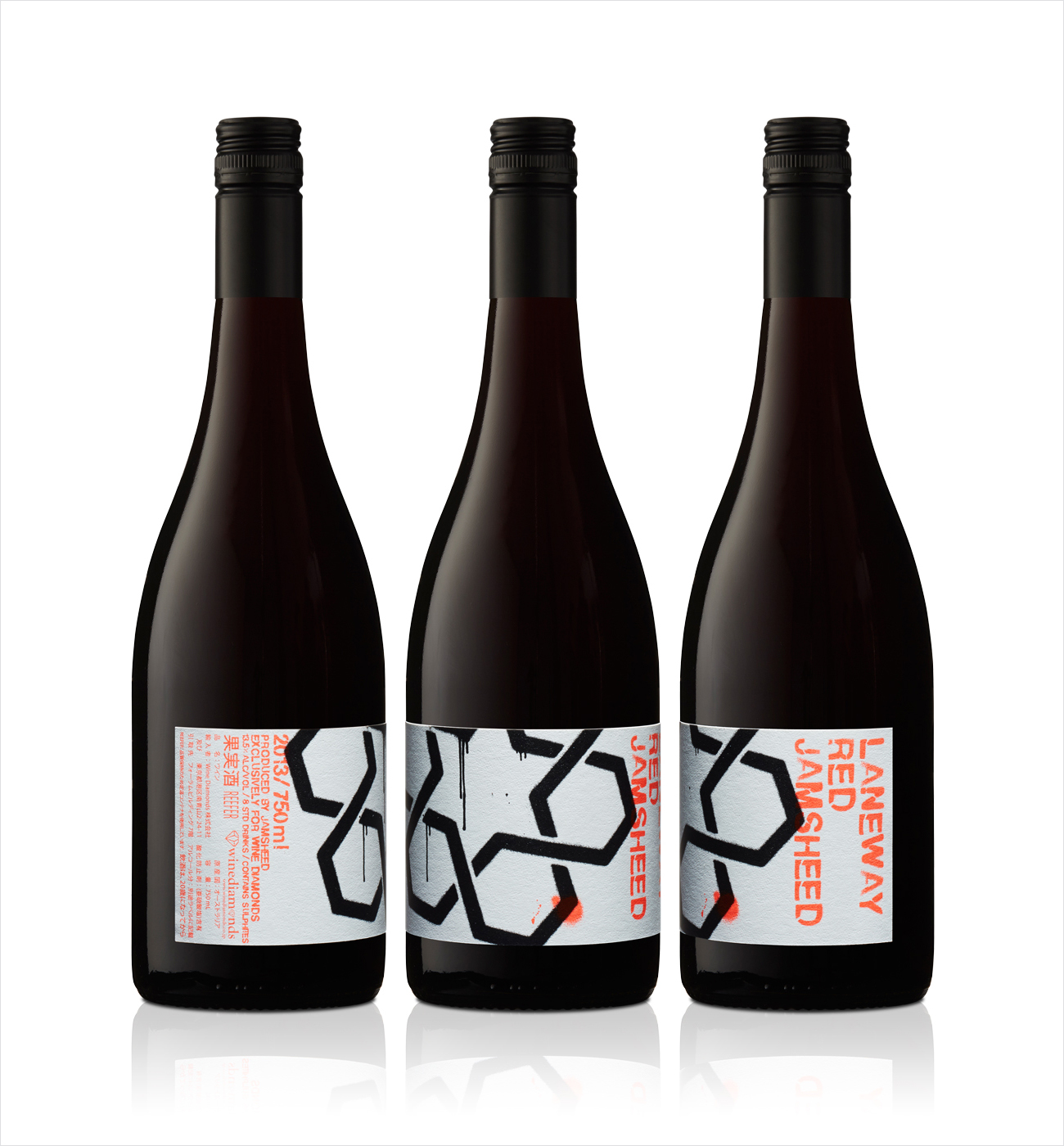
Jamsheed Laneway by Cloudy Co., Australia
Sommos by Mucho
Vi Novell 2016 by Atipus, Spain
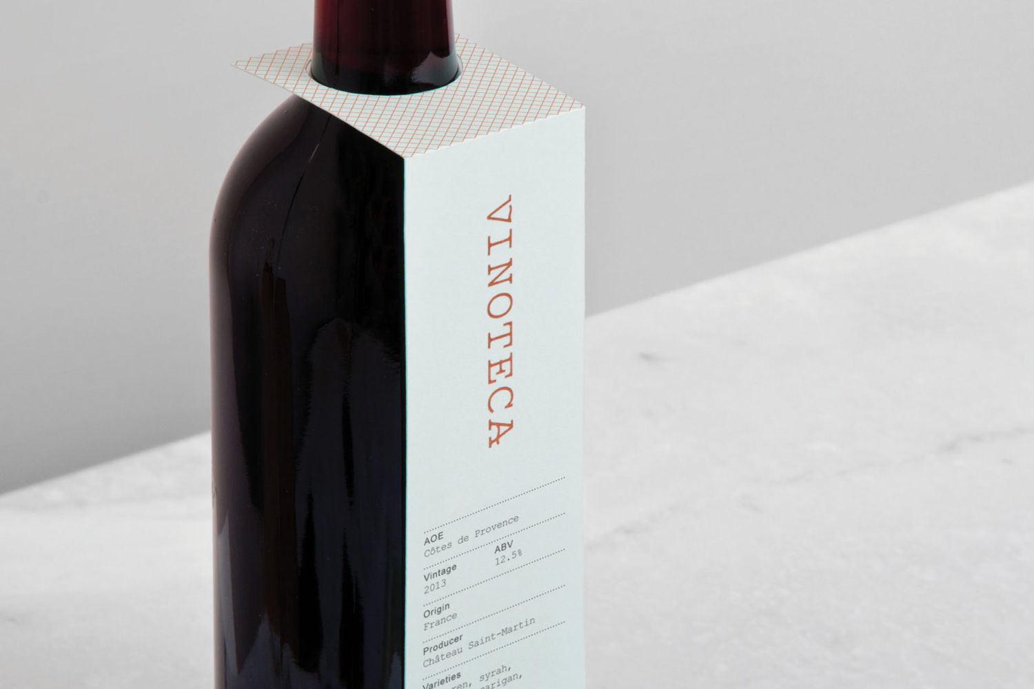
Vinoteca by dn&co, United Kingdom
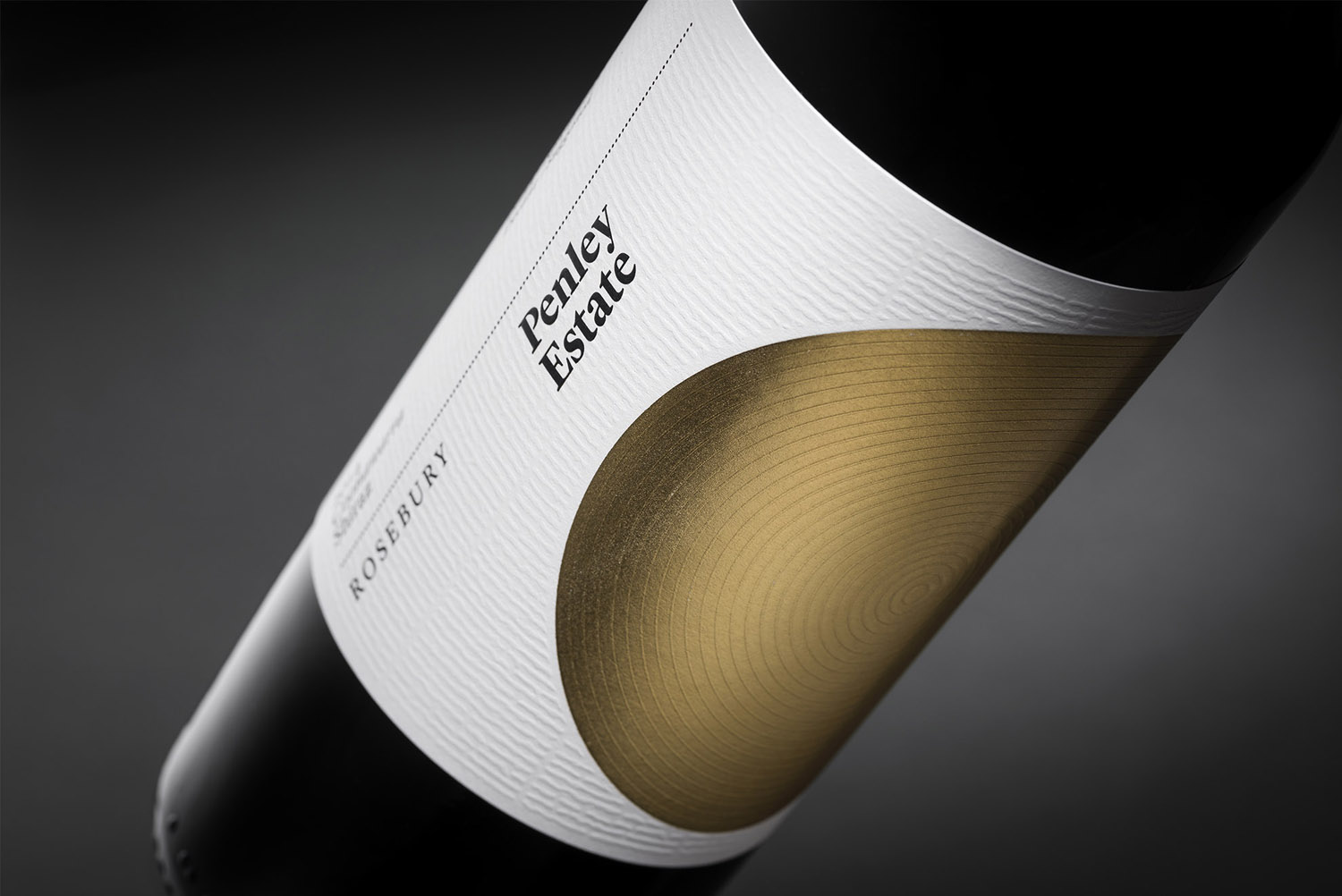
Penley Estate by Parallax Design, Australia
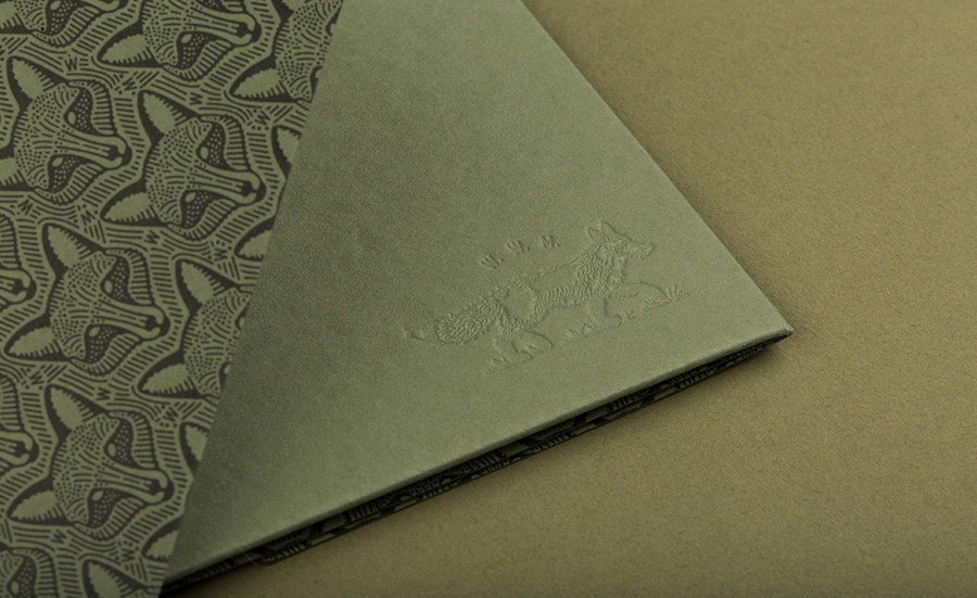
Woodland Wine Merchant by Perky Bros, United States
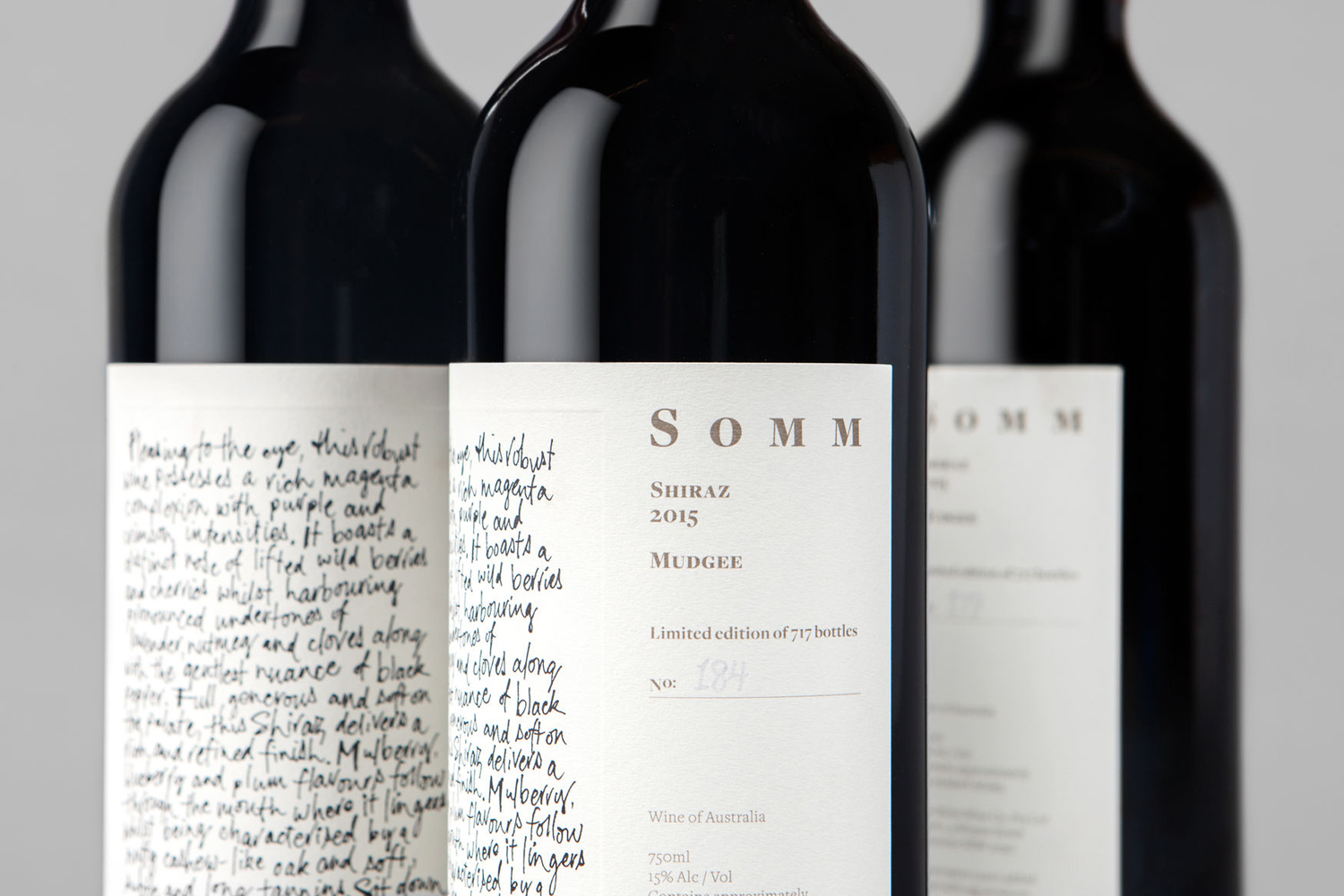
Niche Wine Co. — Somm by Frost, Australia
Jamsheed For Bentley by Cloudy Co., Australia
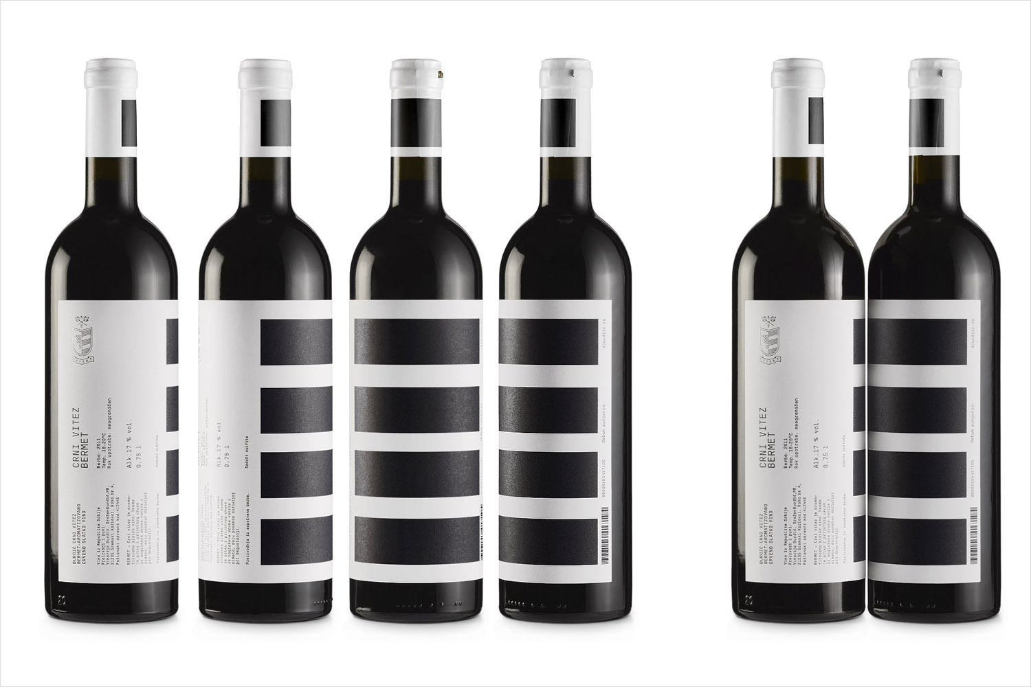
Djurdjic Winery by Peter Gregson, Serbia
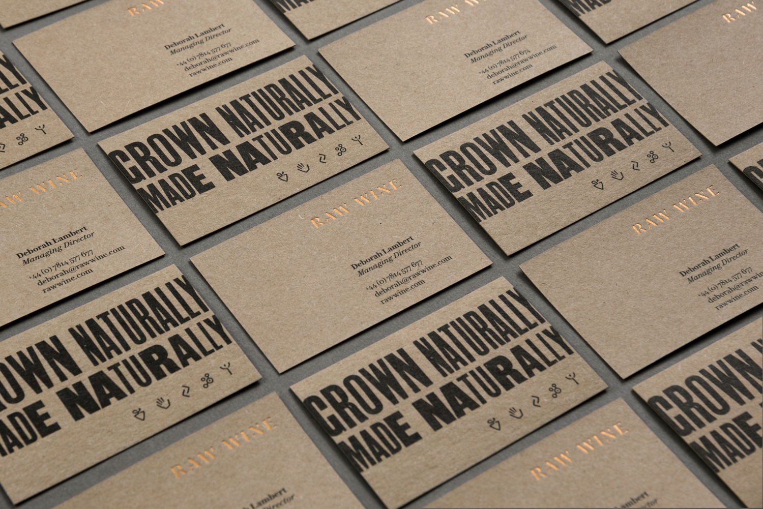
Raw Wine by The Counter Press, United Kingdom
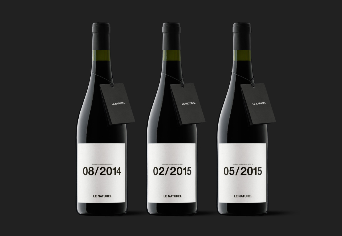
Le Naturel by Moruba, Spain
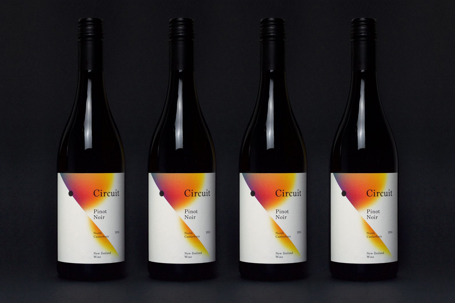
Black Estate — Circuit by Toko, Australia
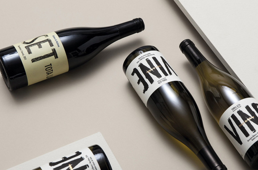
Estones de Mishima by Folch, Spain
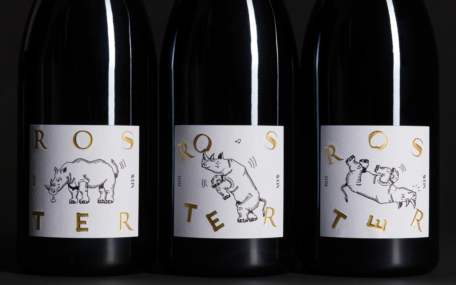
Roster by Bond, Finland
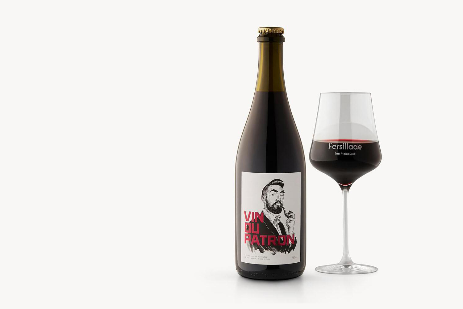
Persillade Cafe by Clear Design, Australia
Winecast by Anagrama, Mexico
