The Best of BP&O — October 2018
Opinion by Richard Baird Posted 31 October 2018

October’s highlights included property identities for 246 Queen and The Maitland by Studio South and Studio Brave, respectively. There were, however, five projects that stood out and have made it into BP&O’s Best Of Series. Between them these typically balance a strong singular concept or an appropriate confluence of ideas with a compelling visual character and clear communicative intention that appropriately play with form, colour, type and layout, as well as material, texture, image and print finish.
BP&O, in this end of month review, tries to recognise both the smart use of small budgets—those that channel spending into the most appropriate assets—and those projects with a broad and holistic quality, establishing a continuity (conceptual and/or visual) across multiple touch points. Many of the projects share a concise aesthetic expression, yet there is nuance and strategic weight to these, so do click through and read more about each of these.
Throughout the month BP&O also continued to expand on its collections series as another way to jump through to older posts on the site. This included a collection of projects that feature banner design.
Felt Coffee by Studio fnt

Felt is a coffee shop in Seoul with their own brand of speciality coffee which has been sourced by way of direct trade and roasted in Gyeonggi-do, a populous (relevant later) province of South Korea. They opened their first store in September 2015 and a second in October 2018. The team at Felt see every part of the coffee experience; its growing, harvesting, sourcing, roasting, preparing, branding, packaging and spatial experience as part of a total project, visiting coffee-producing regions to handpick raw beans, engage the quality control of professional green bean buyers, cuppers, roasters and baristas, in the creation of thoughtful space and in the commissioning of Studio fnt to develop visual identity.
Drawing on the experience of drinking the same coffee in the same space, a shared feeling but peripheral connection, Studio fnt worked with Felt to develop a visual identity and packaging for its coffee ranges. This is characterised by the simple and textural, and the precise and immediate, unified by a thoughtful and subtle concept, the use of intersecting lines and the demarcation and crossing of space.
See more of this project here

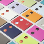
Anton&Anton Kioski by Bond

Anton&Anton (A&A) is an alternative to and antithesis of the large supermarket chains. Staff are described as relaxed, smiley and proud. Their ranges (mostly) organic, some homecooked and also available online for home delivery. With a desire to express an approachable, playful yet credible positioning, and a need to develop a cohesive set of packaging and communications assets A&A worked with Bond to create a new visual identity. This is characterised by an intersection of an elegant wordmark, simple shapes, multi-colour and distinctive structural designs that also move into a retail space designed by Futu Design. Alongside wordmark, iconography and packaging, Bond also designed signage, tote bags, aprons and sweatshirts.
See more of this project here
MacGuffin Magazine. No.6

MacGuffin is a biannual design, art and crafts magazine that commissions stories on, around or jumping off from ordinary things, uncovering personal and curious relationships with the objects that surround us. Issues 1 to 5 explored The Bed, The Window, The Robe, The Sink and The Cabinet. The Ball, MacGuffin Magazine No.6 Autumn/Winter 2018, the one BP&O has its hands-on, takes a look those related to the spherical; from the ballpoint pen to the disco ball, Harvey Ball (the designer of the smiley face), to the Biosphere and the sphere as the building block in which to shape a Japanese future.
The magazine mixes writing styles and lengths with documentary and cinematic stills, still life and artworks, the diagrammatic, illustrative and iconographic. Featured writers include Danish artist Nicolai Howalt, graphic designer Paul Gangloff and Real Review’s Jack Self who reflects on Bisosphere 2, an eco-futurist experiment.
MacGuffin, in its content, manages to draw beauty from the banal, the hidden and the utilitarian, elevating the every using a plethora of interesting and revealing philosophical, historical and socio-cultural insights. These moves from the micro, macro and abstract, viewed through an architectural or art and design lens. There is, occasionally, a form of meta-criticism at play which is a nice observation on the spherical type element of the Selectric Typewriter, nicknamed the golf ball, doing the hitting, rather than being hit. However, the publication largely leans towards the simple joy of revealing the idiosyncrasies and legacies of the commonplace or the overlooked. The spirit of this is expressed graphically, typographically and materially by editors Kirsten Algera and Ernst van der Hoeven working with Dutch Designer Sandra Kassenaar. MacGuffin Magazine No.6 is 210 x 218mm, 232 pages and features five Pantone inks. It is supported by adverts, these come in the form of a fold-out cover, back page and the first five pages. It costs 14GBP / 16EUR / 20USD, and is also available as a yearly subscription.
See more of this project here
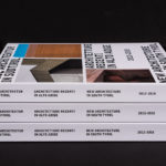
New Architecture in South Tyrol 2012—2018 by Studio Mut

New Architecture in South Tyrol—a travelling exhibition and catalogue—brings to light the unique architectural boom happening in Alto Adige, also known as South Tyrol, the predominantly German-speaking northern-most province of Italy.
Selected by an international jury, the catalogue focuses on fifty-nine buildings from the region, realised between 2012–2018, and have gained local contemporary architects international recognition. These buildings are marked by their keen sense of locality and materialisation. This is documented throughout the exhibition catalogue by way of images and plans. Texts in English, German and Italian augment these, providing a comprehensive survey of recent architectural trends and developments in the region with the intention of facilitating international comparison.
The design of the exhibition catalogue, developed by Studio Mut, channels the architectural continuities present within the region and draws these out through the immediacy of imagery and technical drawings, and explored playfully in the balance of type and space. In this, the design of the catalogue captures the “lively and innovative architectural scene” rooted in a rich tradition of craftsmanship, and set within, and often in contrast to, an alpine context.
See more of this project here
Korea International Art Fair 2018 by Studio fnt

Each year KIAF plays host to and brings to the Korea domestic market the artworks of international artists and galleries. This year, the 17th Korea International Art Fair took place between the 4–7 October in the city of Seoul.
With a desire to become the pre-eminent art platform of South Korea, serve as a conduit between the Asian and international art scene, and function as a tool in which to introduce vibrant new Korean art to a global audience of curators and collectors KIAF seeks out, collates and presents the groundbreaking and thought-provoking.
Studio fnt worked with KIAF to develop a new visual identity for the fair. With such a wide variety of works on display; those of different origins, techniques, physicalities and modes of expression, the confluence of colour, proportionality and abundance serve as a unifying visual language that links posters, catalogues, tickets, banners and tote bags.
See more of this project here