The Best of BP&O — December 2018
Opinion by Richard Baird Posted 31 December 2018

November’s highlights included Studio South’s graphic identity for property development opportunity Outline, The Studio’s work for Brilliant and Metric’s graphic identity for Vega Scene. There were, however, five projects that stood out and have made it into BP&O’s Best Of Series. Between them, these typically balance a strong singular concept or an appropriate confluence of ideas with a compelling visual character and clear communicative intention that appropriately play with form, colour, type and layout, as well as material, texture, image and print finish.
BP&O, in this end of month review, tries to recognise both the smart use of small budgets—those that channel spending into the most appropriate assets—and those projects with a broad and holistic quality, establishing a continuity (conceptual and/or visual) across multiple touch points. Many of the projects share a concise aesthetic expression, yet there is nuance and strategic weight to these, so do click through and read more about each of these.
Strandgut – Vasas Flora Och Fauna by Bedow

Vasas Flora Och Fauna is a Finnish indie pop-group and trio of musicians. Their new album Strandgut is made up from eleven songs taken from the band’s first two albums, which were then re-recorded in German. This was released on both LP and CD by the record label Startracks. Swedish design studio Bedow worked with Vasas Flora Och Fauna to create the packaging for Strandgut. Referring to the album’s title, jetsam in English, this features a series of figures/sculptures that have been built from maritime debris found on the beach. This is complemented by a custom typeface of drawn and ribbon-like letterforms.
See more of this project here

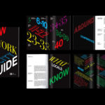
New York Architecture Book Fair by Pentagram

Storefront for Art and Architecture is an independent not-for-profit art and architecture organisation, located in New York’s Soho, dedicated to advancing architecture, art and design. To further this remit the organisation developed the New York Architecture Book Fair, an event and platform that brings together authors, designers, publishers, critics and readers to consider, through a programme of discussion, installation and pop-ups, which publications have driven architectural and design discourse forward through their insight and contemporary relevance. This took place at the Storefront for Art and Architecture and at local bookstores throughout the city in June.
Pentagram partner Natasha Jen and team led the design and development of the visual identity for the first edition of the New York Architecture Book Fair. This is built around a form language that makes a connection between the spine of a book and the side elevation of a building plan but also explores the liminal space between the printed book and architecture structure, and the material and digital space the visual identity needed to exist within. This links a variety of communication materials for the event, these included motion graphics and data visualizations, book design, tote bags and signage.
See more of this project here
Hackney Forest School by Spy

Forest School is a scheme set-up by Hackney Council, London that seeks to connect children living within the local built-up area with the thrill of the rural outdoors. The scheme reaches out to schools and parents, offering programmes that cover all areas of the curriculum and aims to engage and develop a child’s understanding of sustainability.
London-based design studio Spy was commissioned to develop a visual identity for Forest School with the intention of increasing awareness and uptake. Following hands-on experience running activities on Hackney Marshes and having conversations with children, families and teachers the studio developed an eye-catching design direction of bold colour and shape. This is codified with a ring-bound brand guidelines document and runs across and connects club cards, posters, postcards and business cards, work packs, apparel, bags, stamps, cards and badges.
See more of this project here
Heyday by Collins

Heyday is a range of 150 moderately-priced high-quality own-brand consumer tech products from American retailer Target and their first foray into the electronics and tech accessories sector. The range includes battery packs and chargers, cables, covers and wireless speakers amongst many other products. These share a form language that balances an everyday simplicity, robustness and utility with novelty and cheerfulness by way of shape, colour and materiality. Heyday’s visual identity and packaging design, developed by New York and San Francisco-based Collins in collaboration with Target Creative, is deceptively simple, it is loaded with a bunch of neat ideas that recognise, not just how product is presented and its value and functionalities communicated in store, but also how these products migrate and seek attention online. This can be seen in the approach to product, packaging and lifestyle photography.
See more of this project here
Espelma by Commission

Espelma is a clean-burning natural wax candle company. They have an online store and have hosted pop-ups in London and New York. Each candle comes in a refillable glass vessel, designed by Espelma founders Clara and Claudia, and handmade on the Italian island of Murano. Espelma is distinguished by its mix of glass craft, distinctive colour and form, the clean-burning nature of the candle’s formulation and the thought given to sustainability by way of refills. Further, each fragrance is inspired by the two founder’s summers spent as children at their grandmother’s house near Barcelona. This regional reference, and the implication of a story can be seen woven throughout Espelma’s brand identity, designed by Commission, in the arched white architecture present in still life imagery, and in the colour and texture, shape and structure used across packaging.
See more of this project here