The Best of BP&O — February 2019
Opinion by Richard Baird Posted 2 March 2019

Five projects that stood out in February and have made it into BP&O’s Best Of Series. Between them, these typically balance a strong singular concept or an appropriate confluence of ideas with a compelling visual character and clear communicative intention that appropriately play with form, colour, type and layout, as well as material, texture, image and print finish.
BP&O, in this end of month review, tries to recognise both the smart use of small budgets—those that channel spending into the most appropriate assets—and those projects with a broad and holistic quality, establishing a continuity (conceptual and/or visual) across multiple touch points. Many of the projects share a concise aesthetic expression, yet there is nuance and strategic weight to these, so do click through and read more about each of these.
Alongside reviews BP&O introduced a new text series, the second of which The Beauty Of The Commonplace, is an excerpt taken from a 10,000-word transcript of an hour-long conversion between Richard Baird and Jack Self.
Architect’s Bookshop by Garbett

The Architect’s Bookshop is a new design-focused retailer, located in Sydney’s Surrey Hills, devoted to the books of architecture and interior design, landscaping and urban development. The space was conceptualised as being more than a bookshop but a place to take time out to browse, a chance to engage with the material and form of the books, and as a place for those interested in all things related to the built environment to meet and engage in informal conversation and design discourse.
Australian design studio Garbett worked with The Architect’s Bookshop to develop a visual identity that would capture the spirit of the space, the positioning ‘a place for architecture lovers’ and comfortable with and distinct from a material and graphic sophistication of architectural publishing, channelling the universal, enduring and immediate form language associated with architectural structure and book reading. This project covered, alongside logotype, tote bag, bookmark/business card, bookstands, signage, price stickers, gift cards and art direction.
See more of this project here

Kaiyo by Pentagram

Kaiyo, formerly Furnishare, is an online platform for the reselling and buying of used furniture, currently available in New York City and New Jersey, but with the intention to expand this internationally. Kaiyo picks up, inspects, cleans, photographs and uploads furniture to its online catalogue, easing the difficulties of selling secondhand online. It is part of a growing up-cycling movement, challenges the notion of seasonality promoted by large furniture retailers and was created in response to the approximately 8 million tons of furniture that ends up in American landfill each year. Eco-modernist, good design available to everyone, reuse and longevity are central to Kaiyo’s positioning. This was developed by Pentagram partner Natasha Jen and team, alongside naming and graphic identity which runs across website, brochure, van livery, tote bag and box tape.
See more of this project here
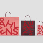
Åhléns by Happy FB

Åhléns began in 1899 as a small mail-order business. Aside from it being one of the oldest it has also grown to become one of the largest retail chains in Sweden. By carefully collating a variety of items across brands and price categories, the retailer maintains its relevance today, understanding and responding to the many ways in which its customers have changed over its long history. Happy FB, the Scandinavian design studio behind Åhléns new visual identity, puts it simply “to Åhléns’ urbane and socially conscious patrons, shopping and sustainability are not contradictions. Inspiration and trends do not equate to use and discard. Premium can be inexpensive and cheap doesn’t necessarily mean a drop in quality”. The retailer’s new visual identity expresses this by taking the well-established Åhléns wordmark and single red and builds this out into a range of changing graphic expressions, imbuing a variety of touchpoints, material and digital, with more character whilst retaining a recognisable immediacy through simplicity.
See more of this project here
WeWork by Gretel

Founded in 2010 and headquartered in New York, WeWork began as a workspace provider and has grown to offer a broader infrastructure of community management and support, event programming and virtual network management for small and large businesses, entrepreneurs and freelancers.
With significant and rapid growth WeWork worked with Gretel to align its visual identity with its purpose. “Framework”, a graphic route that functions as a visual metaphor for WeWork itself, replicating its activities and behaviours, is a responsive and dynamic structure that responds to any spatial format in new and interesting ways, on screen and in print, governing and linking, alongside a simple colour palette and imagery, all of WeWork’s communications. These include small and large format posters, signage, magazine and website design.
See more of this project here
StrangeLove Lo-Cal Soda by Marx Design

StrangeLove is an Australian soft drinks brand that began with a four flavour range of energy drinks. Although mass-produced, each of these was created with the intention of evoking a taste of the homemade through carefully sourced and high-quality organic ingredients. The range was developed in response to energy drink brands who StrangeLove believed had failed to live up to their premium positioning.
Keen to avoid the tricks and tropes of the category and secure a witty, eye-catching and original look, New Zealand-based Marx Design worked with StrangeLove to improve on the illustrative character that had been used across the brand’s earlier bottles, developing simpler compositions surrounded by plenty of white space and paired with sharp and humourous copywriting. Check out the BP&O review of these here.
StrangeLove went on to create a range of mixers, organic soft drinks and source a mineral water, each with its own unique visual language. 2019 sees the brand continue to expand their range and explore and challenge the drinks market, further working with Marx Design, this time on a range of “Lo-Cal” sodas.
See more of this project here