BP&O Collections — Pastels In Branding
Opinion by Richard Baird Posted 8 May 2017
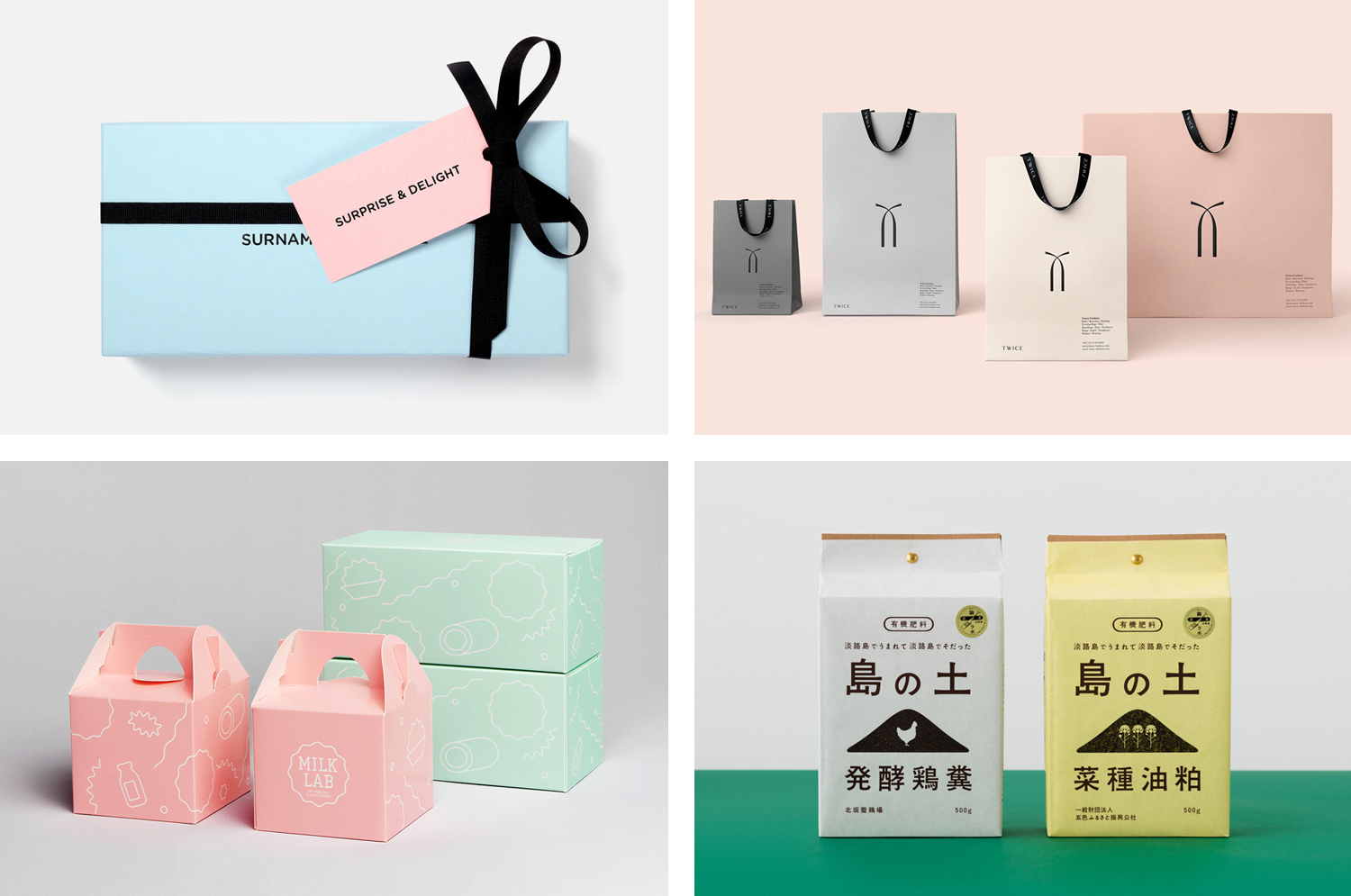
A collection of some of the best brand identity, packaging and graphic design projects that effectively utilise pastel colours, reviewed and published on BP&O. This post features work by Studio fnt, Post and Socio Design, and covers simple logo and stationery projects, and extends to broader brand identity programmes that include packaging and a variety of print communications. Be sure to click the images to read more about the project and the intentions of each design. Check out more from BP&O Collections here.
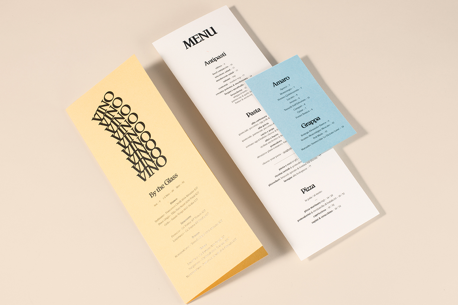
Di Beppe by Glasfurd & Walker, Canada
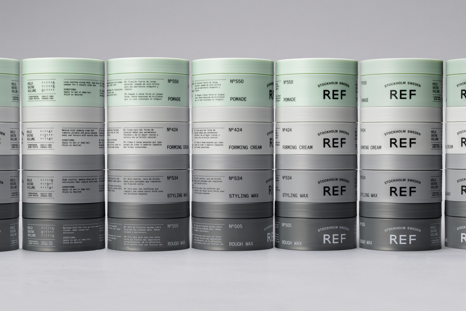
REF by Kurppa Hosk, Sweden
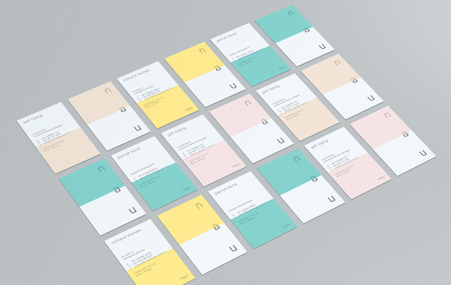
NAU by Design by Toko, Australia
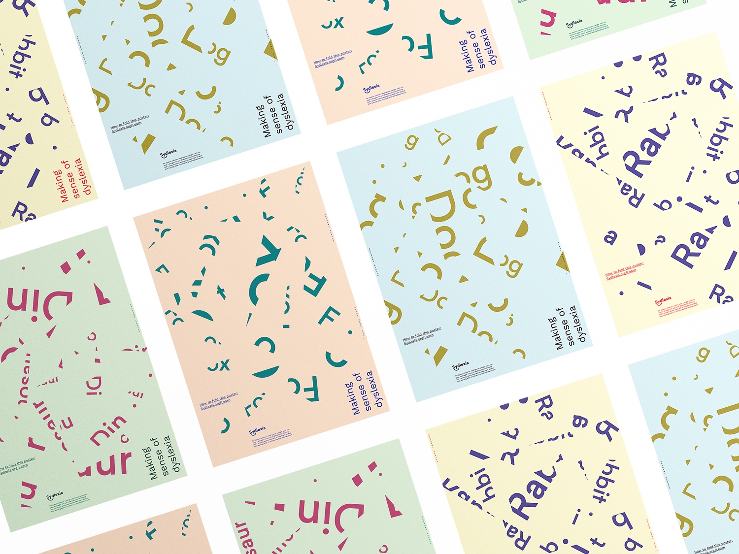
Sydlexia: Making Sense Of Dyslexia by BBDO Dubai, UAE
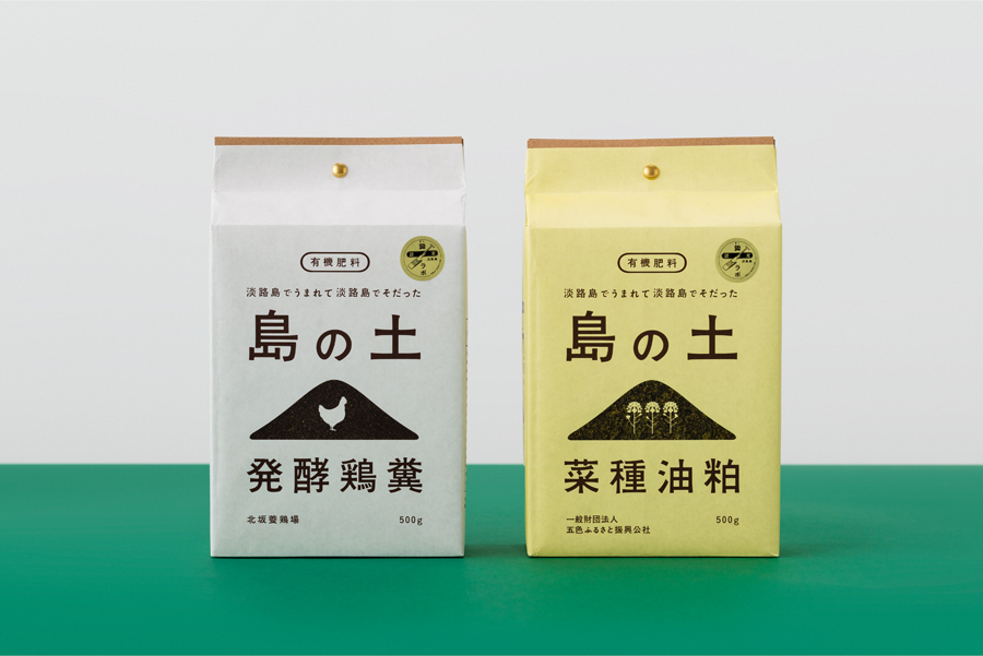
Organic Fertilizer of Awaji Island by UMA, Japan
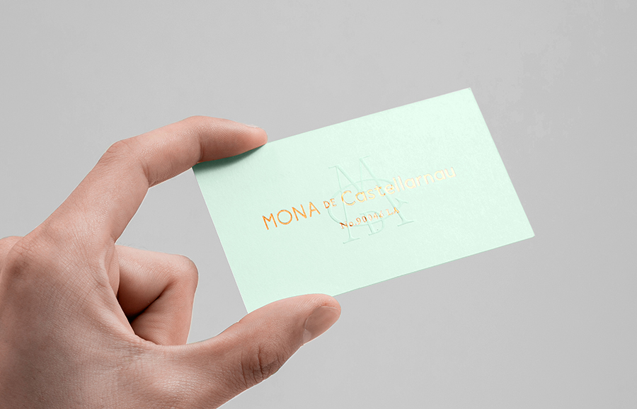
Mona De Castellarnau by Anagrama, Mexico
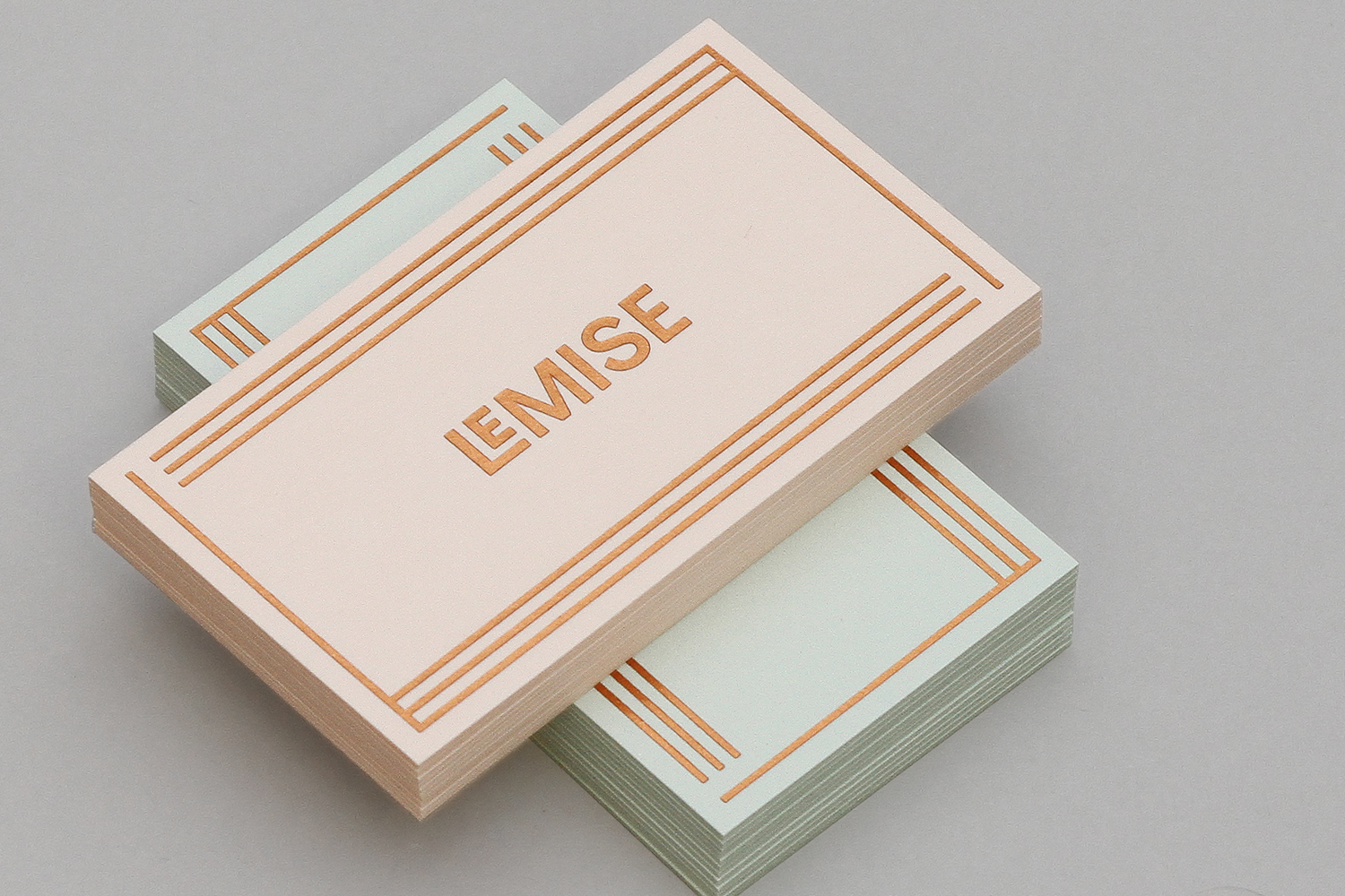
LeMise by DIA, United States
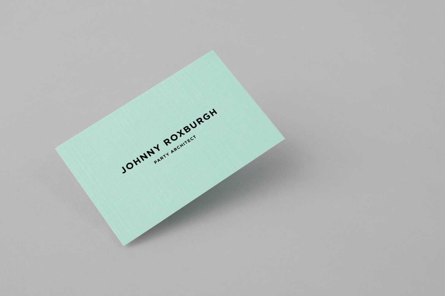
Johnny Roxburgh by Bunch, United Kingdom
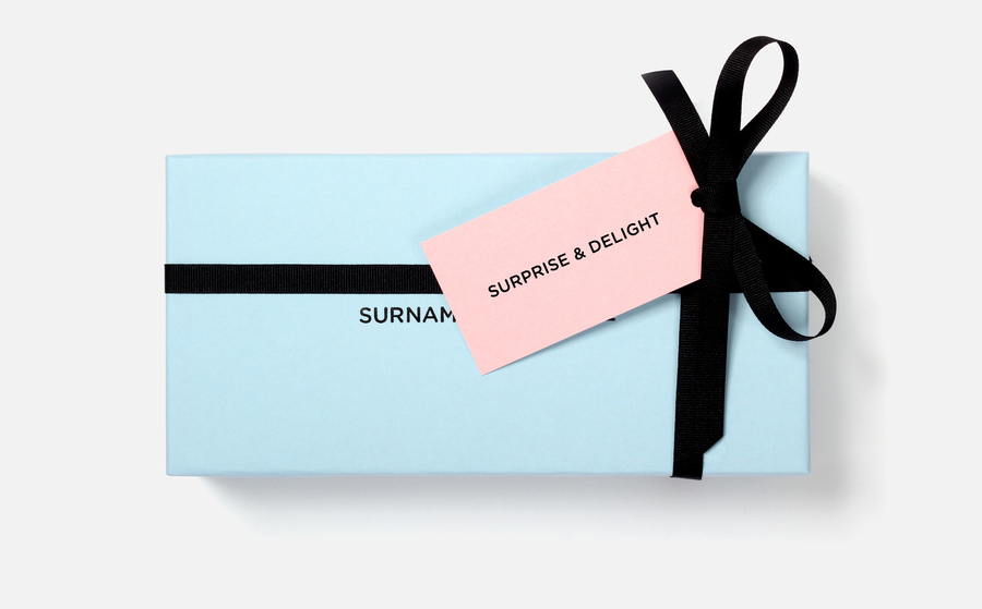
Surname & Surname by NB Studio, United Kingdom
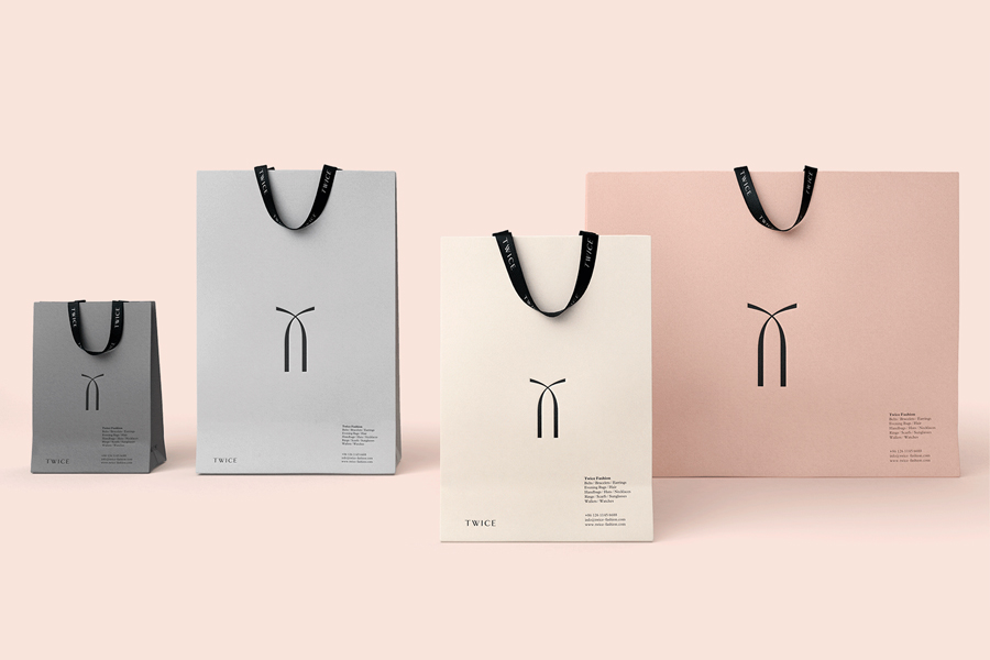
Twice Fashion by Socio Design, United Kingdom
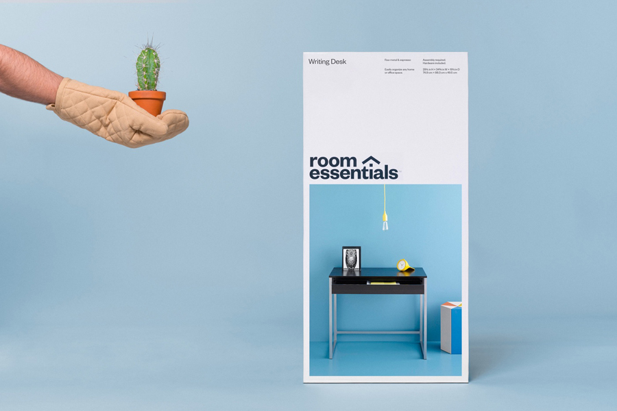
Room Essentials by Collins, United States
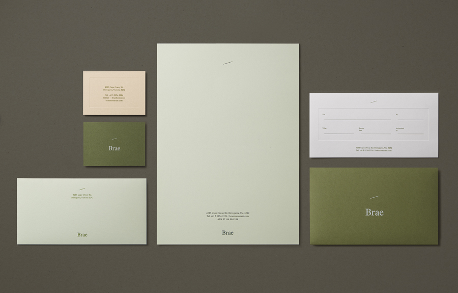
Brae by Studio Round, Australia
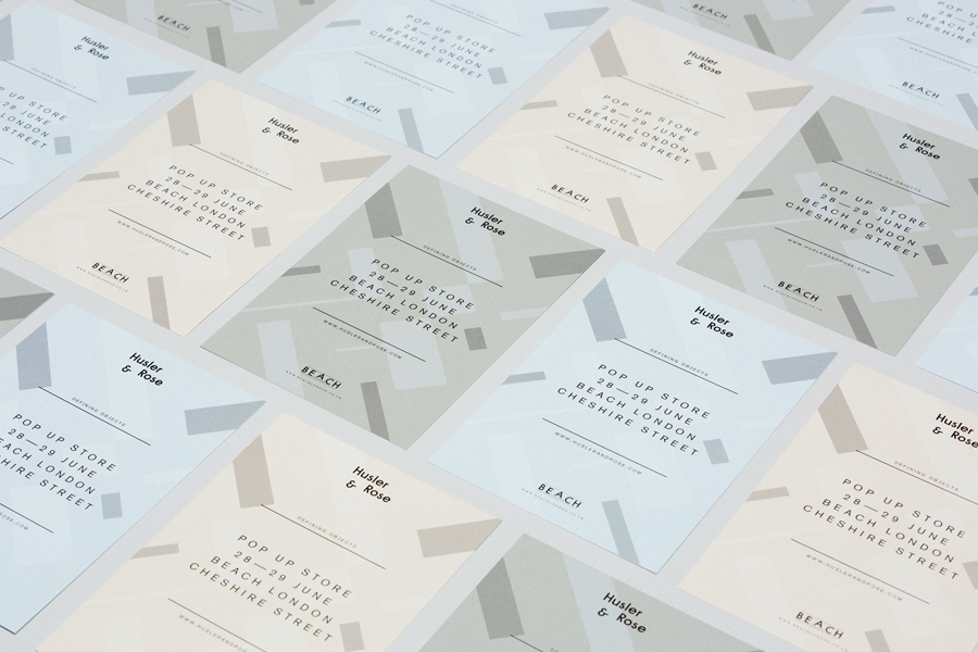
Hulser & Rose by Post, United Kingdom
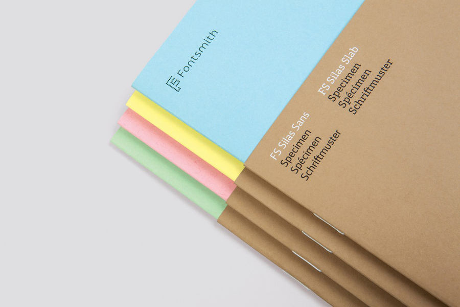
FS Silas by Believe in, United Kingdom
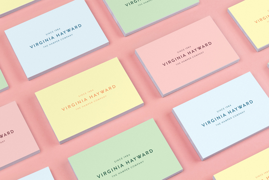
Virginia Hayward by Salad, United Kingdom
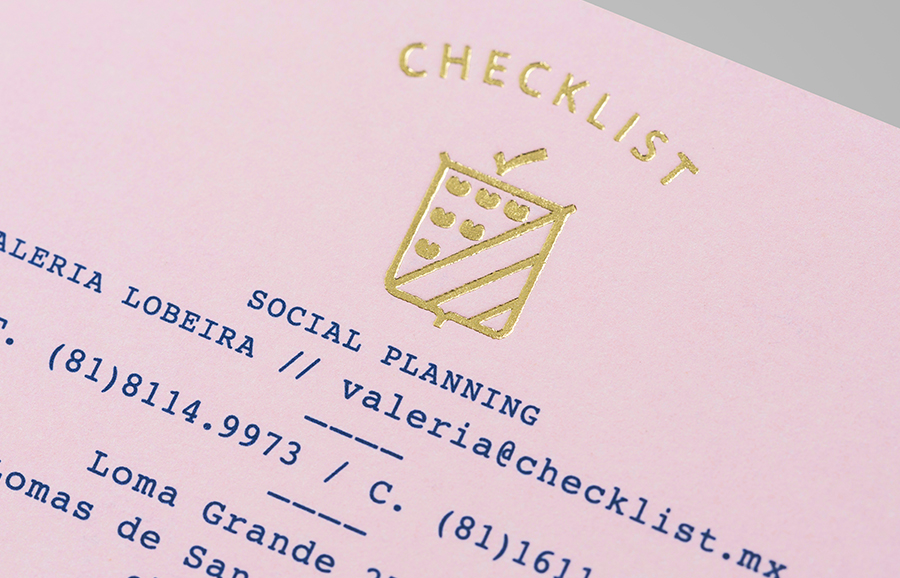
Checklist by Anagrama, Mexico
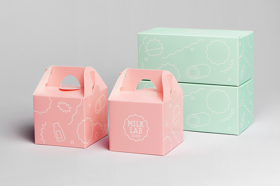
Milk Lab by Studio fnt, South Korea
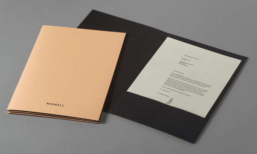
Mi&Mall by Atipo, Spain
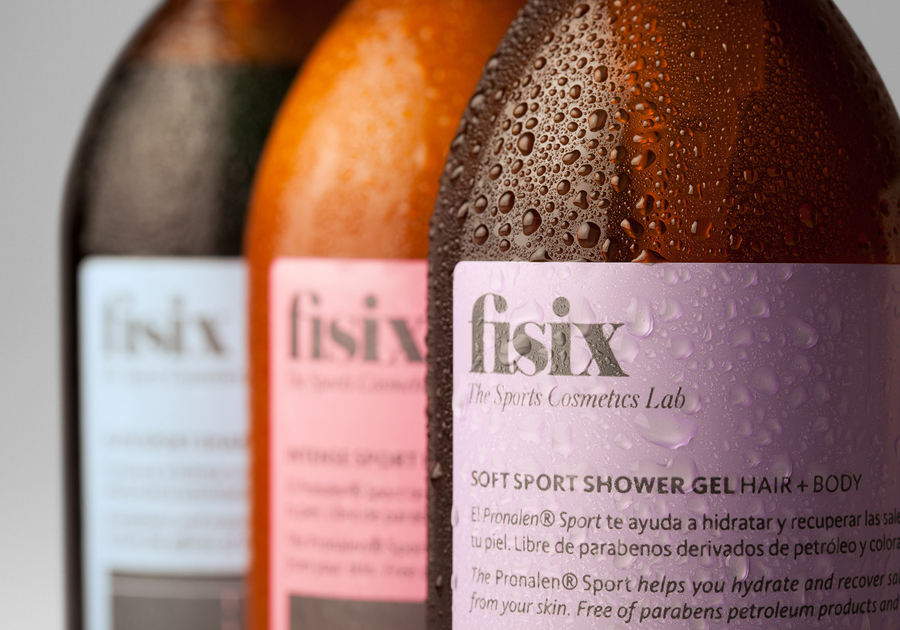
Fisix by Mucho, Spain
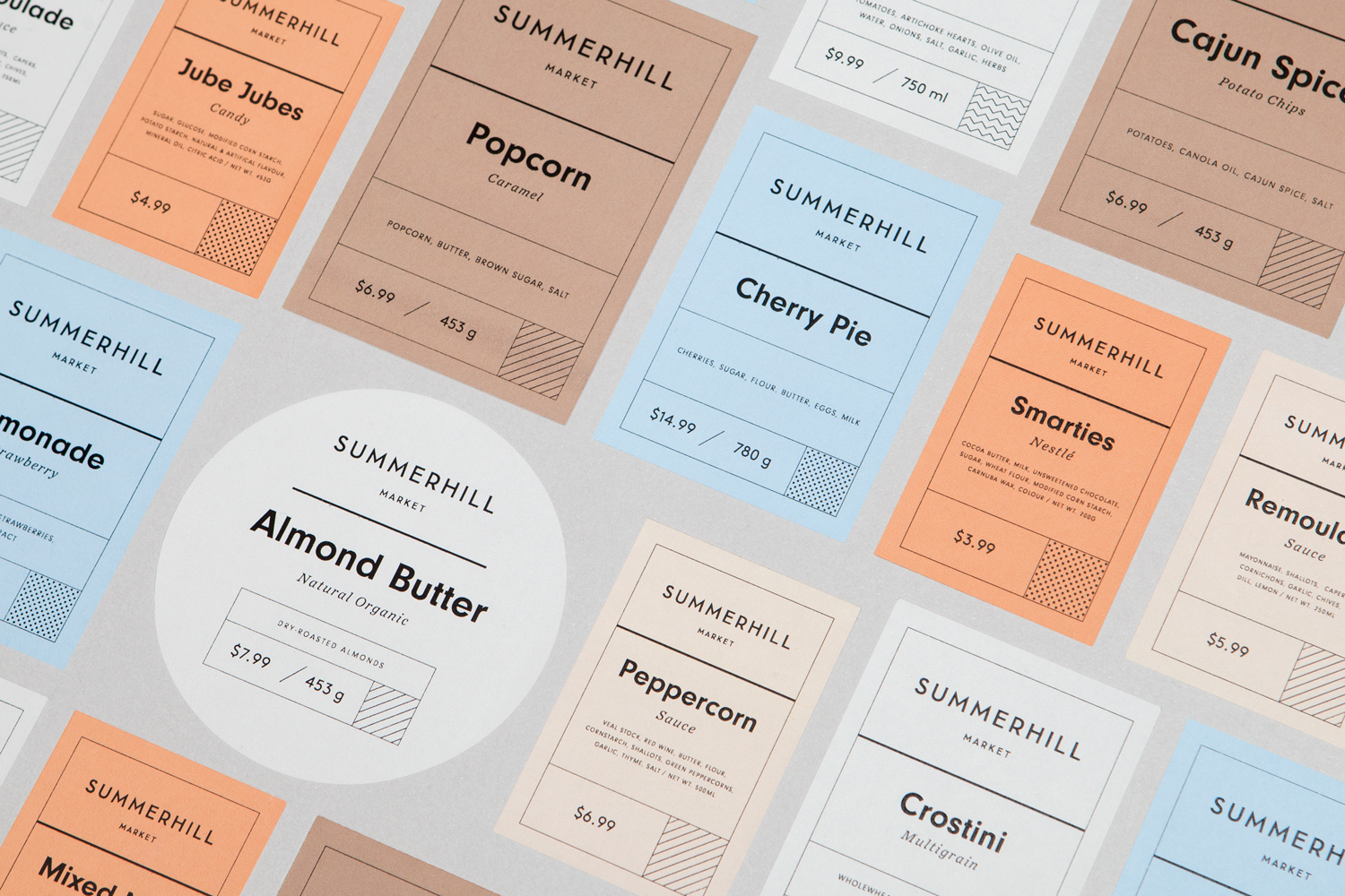
Summerhill by Blok, Canada
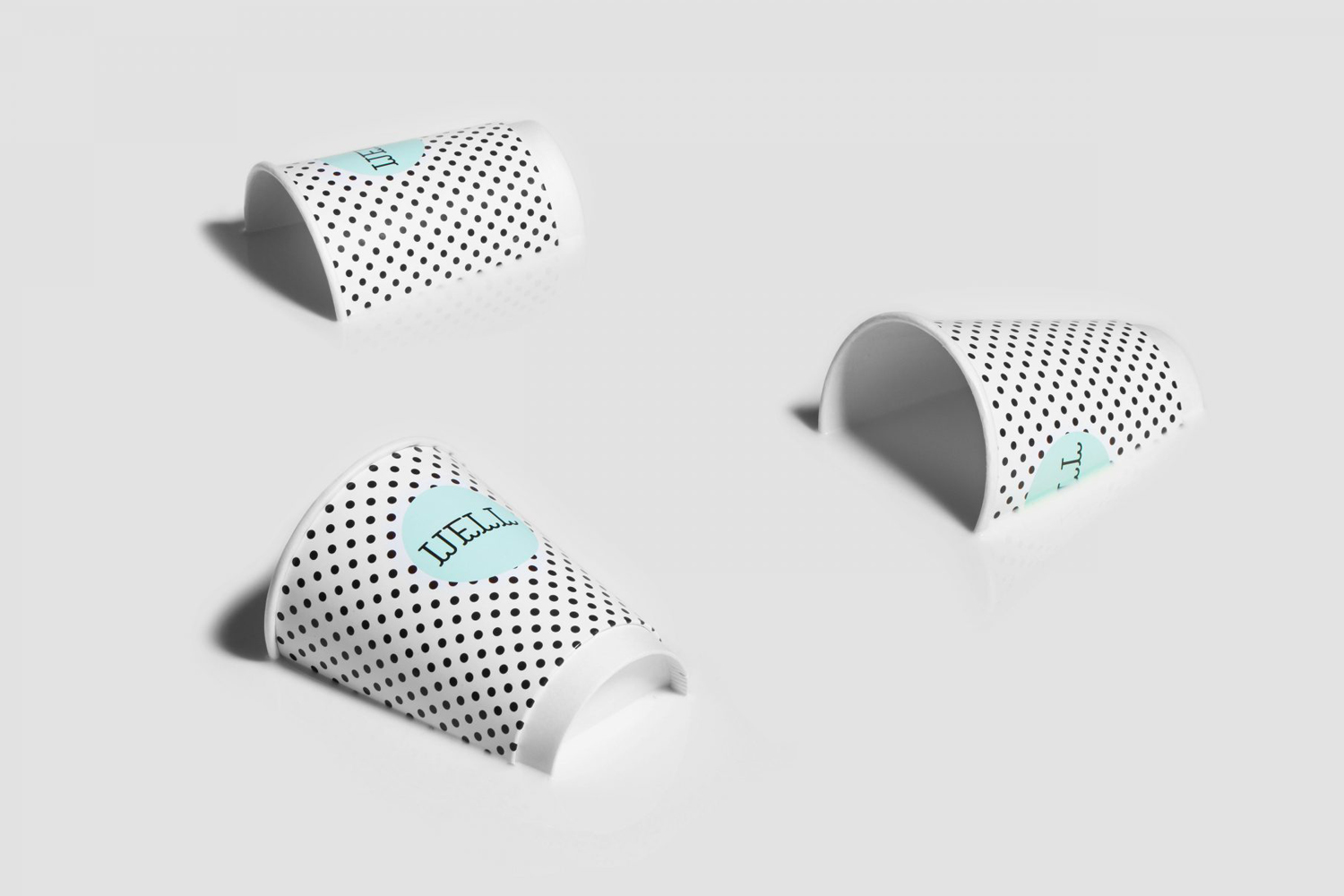
Well Coffee by Bond, Finland
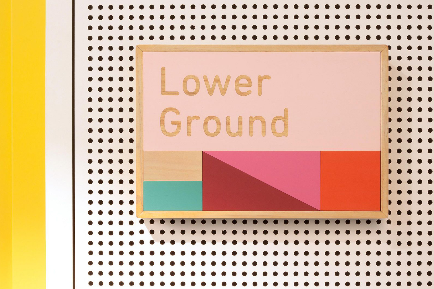
East Sydney Early Learning Centre by Toko, Australia
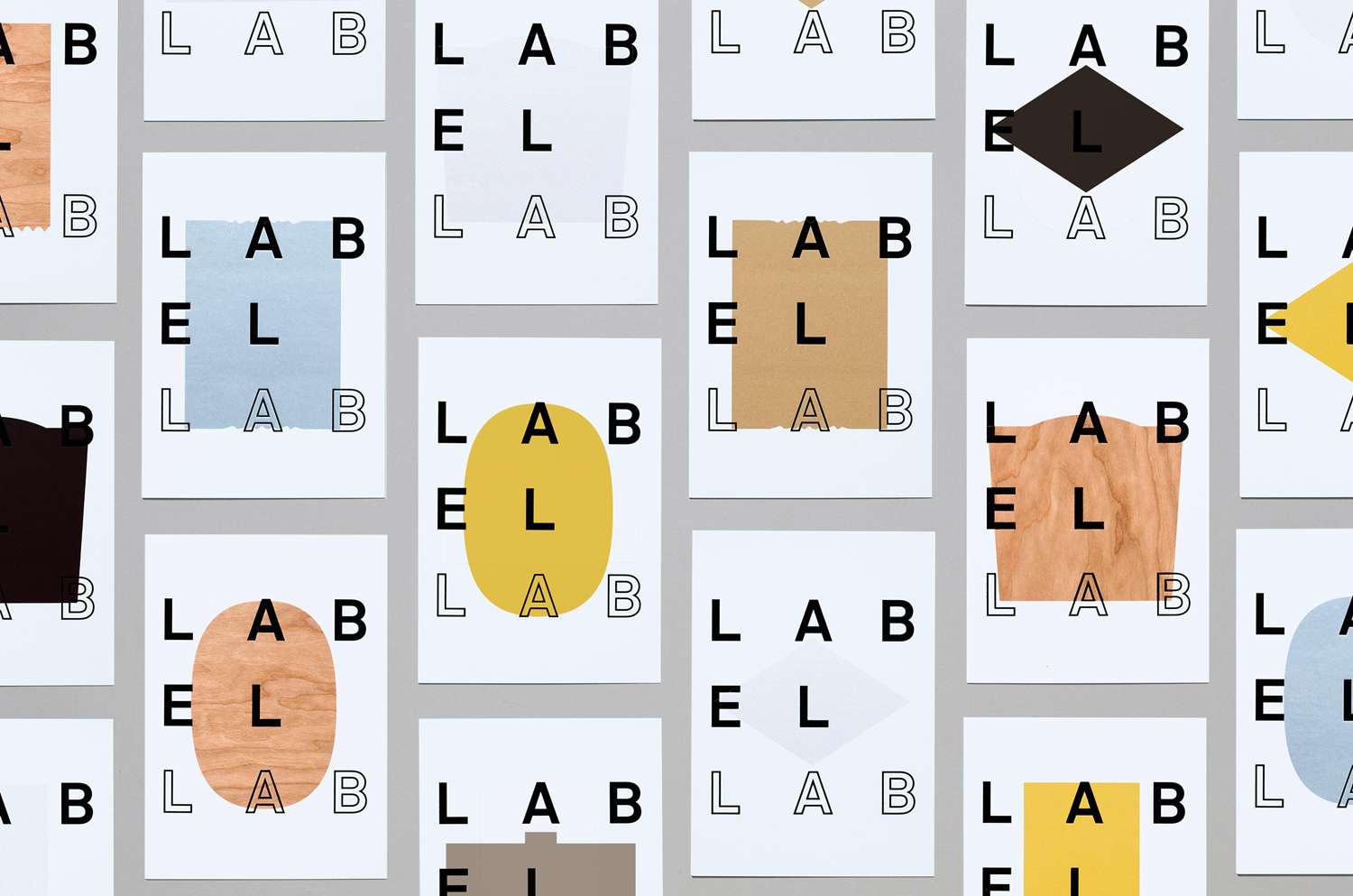
Label Lab by TM, United Kingdom
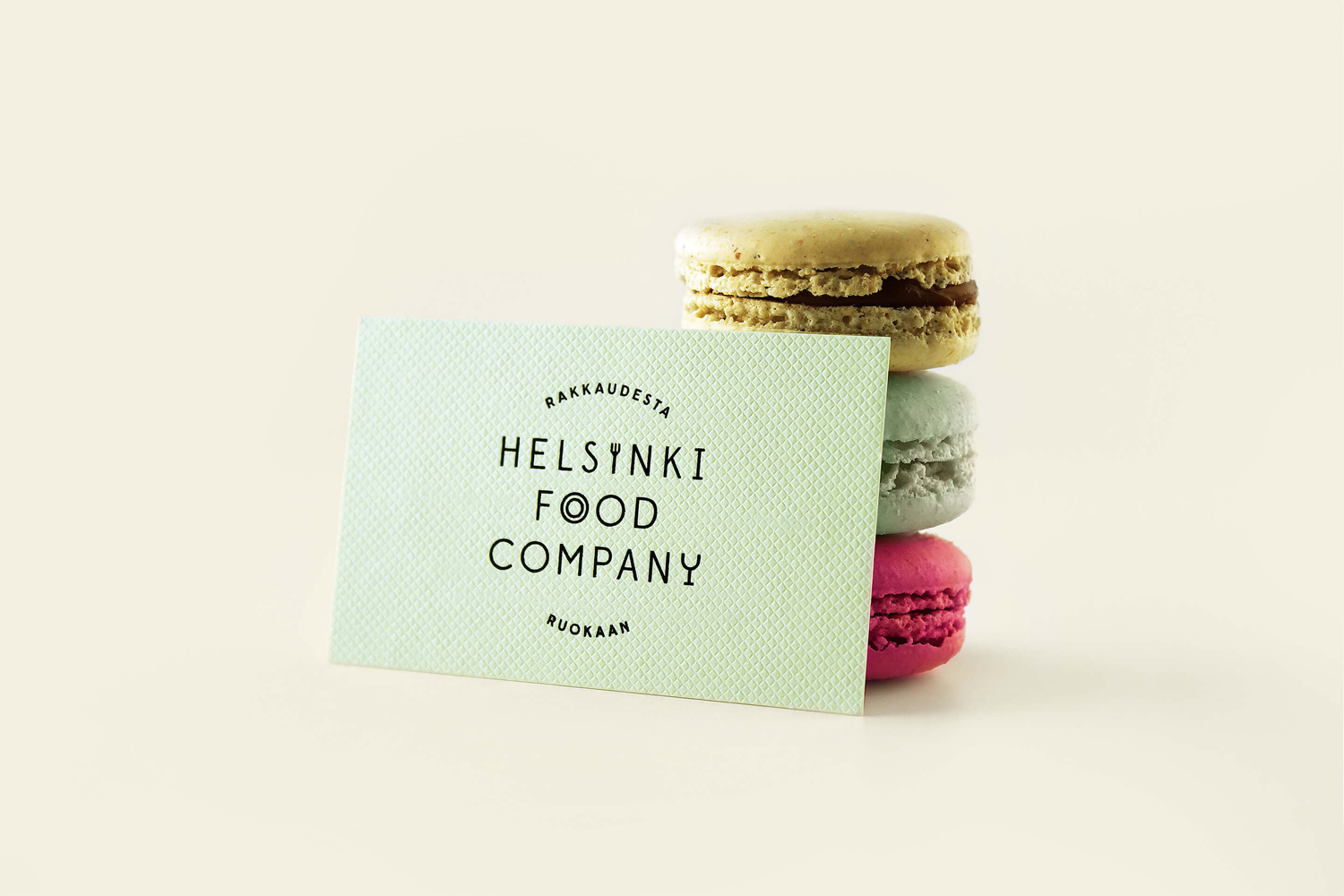
Helsinki Food Company by Werklig, Finland
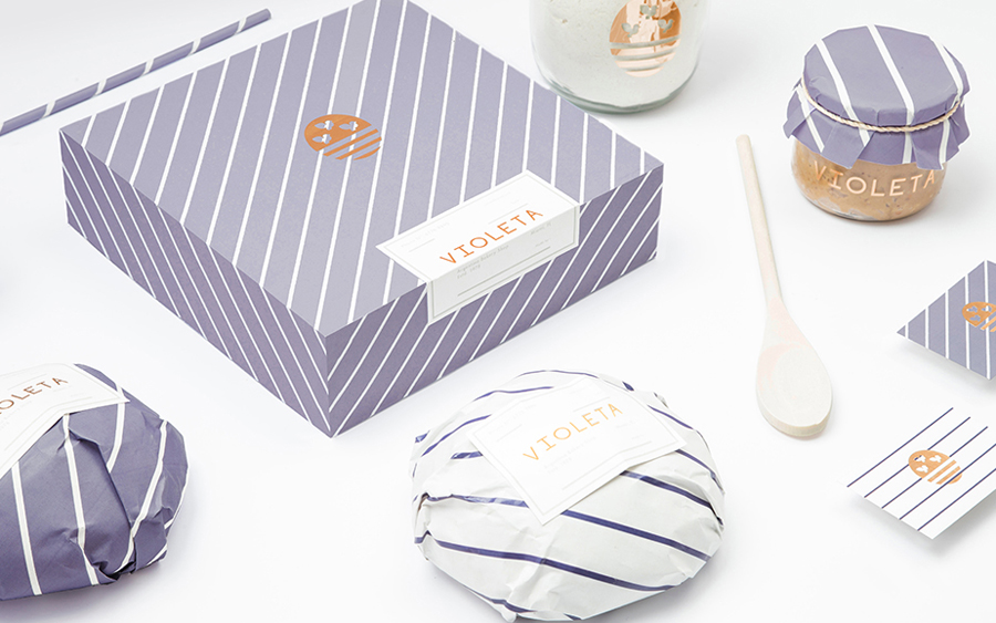
Violeta by Anagrama, Mexico
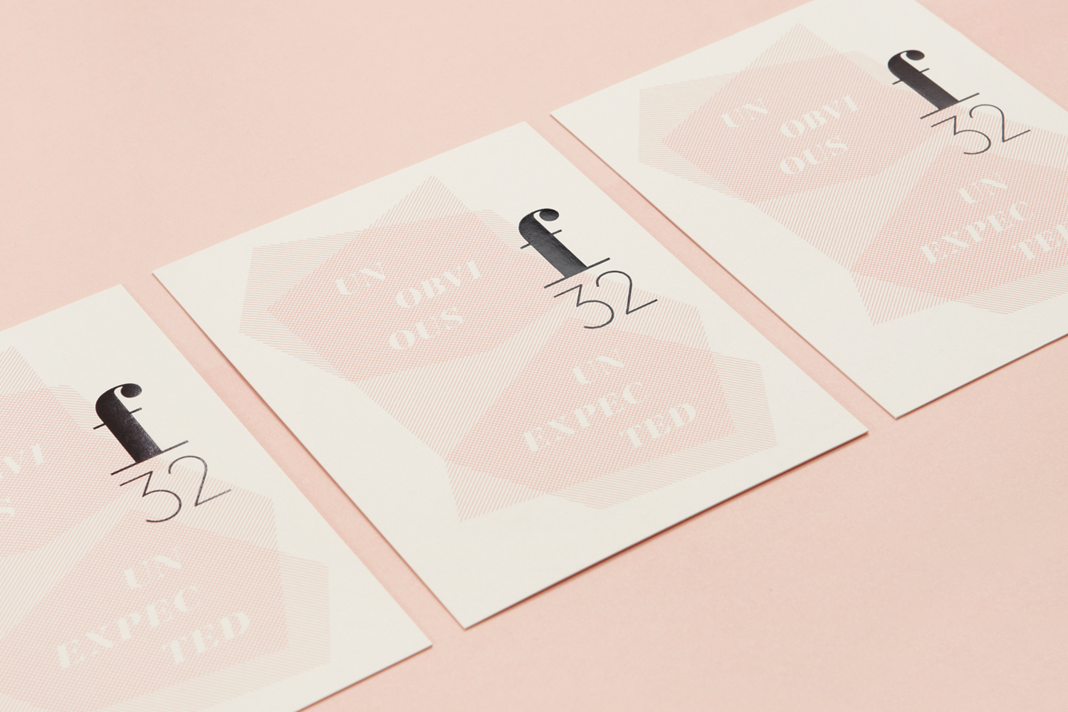
F32 by Blok, Canada
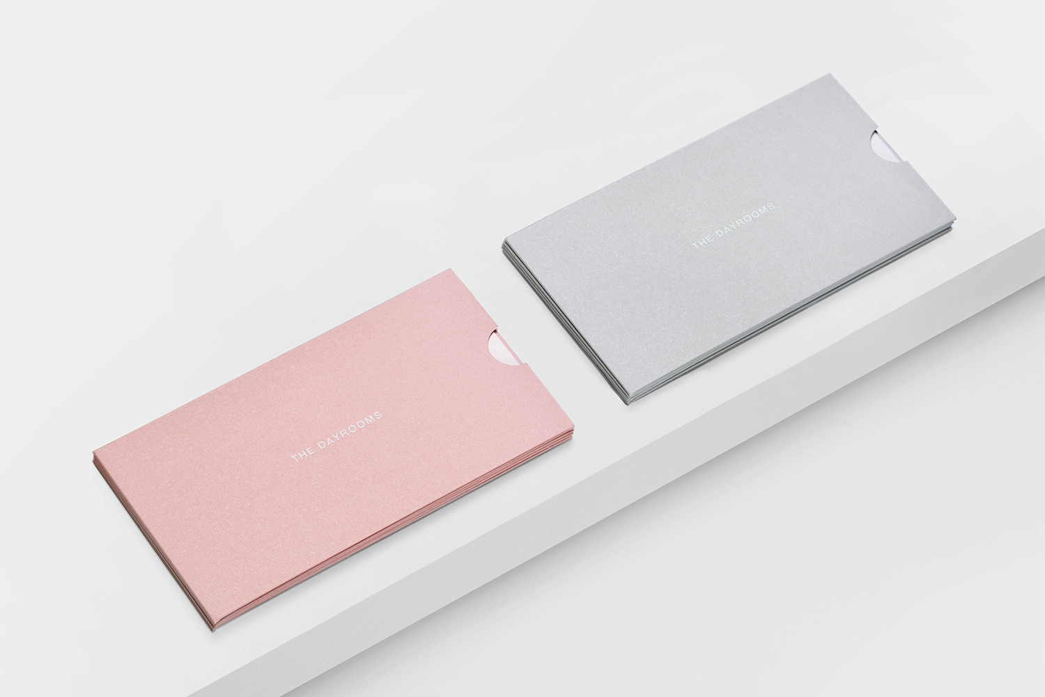
The Dayrooms by Two Times Elliott, United Kingdom
