
Function Engineering by Sagmeister & Walsh
Function Engineering is described by Sagmeister & Walsh, the design studio behind their new brand identity, as specialising in “mechanical design and engineering for product development within, but not limited to consumer electronics, computing and networking, mobile, medical, robotics, entertainment, commercial and industrial equipment.” Narrowing in on Function’s expertise in designing hinge and linkage mechanisms, Sagmeister & Walsh designed a new...
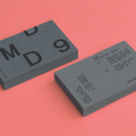
MDD9 by Two Times Elliott
MDD9 is a Hong Kong and London based multidisciplinary architectural and interior design studio, founded in 2009, that is engaged in a variety of building and construction projects that include new developments and renovations, urban planning, lighting, landscape and acoustic design. The studio’s visual identity, developed by Two Times Elliott, reflects the “dynamic outlook” of the individual architects as well...
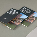
Vibe Select by Studio Constantine
Vibe Design Group are described by Studio Constantine, the design studio behind the brand identity of Vibe’s new sub brand Select, as a “multi award-winning Melbourne based architectural design practice” who produce “fiercely contemporary and conceptual buildings for the top end of the Australian residential market.” Studio Constantine worked with Vibe in the process of “productising and branding a new consulting...
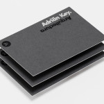
Adrián Key by Face
Adrián Key is a San Pedro based architecture firm and architect working with the rich and famous from “one of the most exclusive corners of northern Mexico”. Design agency Face Creative developed a new visual identity for the firm with a “clean, simple aesthetic with bold and modern touches, an icon that cleverly encases the name of the brand in its design, and...
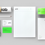
Griab by Kollor
Griab is a Swedish engineering firm, founded in 1957 and located in Helsingborg, Sweden, that specialises in delivering a holistic design and build service that includes land planning, wastewater management, architecture and construction. Developed by multidisciplinary design agency Kollor, Griab’s visual identity, “inspired by the the straight lines and shapes commonly seen in architecture” and created to help reinforce the firm’s environmental...
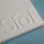
Síol Studio designed by Mucho
San Francisco-based architecture studio Síol recently commissioned multidisciplinary design agency Mucho to develop a new visual identity solution that would embody “their philosophy of conceptual, clean architecture for both interior and exterior design.” Based around a customised sans-serif logotype executed as a blind deboss, the identity conveys the familiar architectural themes of light and shadow formed within three-dimensional space and a practical, corporate efficiency....
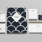
Tabarka Studio by Anagrama
Tabarka Studio specialises in ‘detail-oriented’ and handcrafted tiles made from terracotta, a ‘clay-based ceramic earthenware that becomes porous when fired creating a worn-out, antique finish’. Anagrama, the design agency responsible for the studio’s visual identity and collateral, describe their approach as embracing an ‘archaic timelessness’ that reflects the products through the use of a blue and white scale pattern, tiled icon...
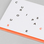
Curious Space by Mash Creative & May Ninth
Curious Space is a London-based scenographers—a specialist scene setter—that creates “unique and inspiring spaces for museums, galleries and more”. Their visual identity, developed by Mash Creative and May Ninth, ‘splits apart to create a physical space that intrigues whilst the type can sit either horizontally or vertically in numerous layouts within the dotted grid”, establishing a flexible and unusual yet structured...
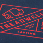
Treadwell by Perky Bros
Treadwell is a Kansas-based floor installation business that specialise in no-nonsense solutions that last. Perky Bros, the agency behind their name, visual identity and website, describe Treadwell’s philosophy as about ‘standing upright, walking the walk and empowering clients to move forward with confidence, secure in the knowledge that they’ve chosen the right product and the right people for the job’. The...
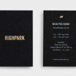
Highpark by Face
Highpark is a new residential project located in the middle of San Pedro Garza García and described by Face – the agency behind the development’s visual identity, print work and website – as ‘arguably one of Latin America’s most affluent municipalities’ and widely credited as an “architectural masterpiece”. Face go on to say that the “project needed to speak volumes about the...
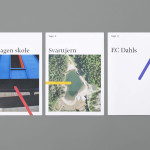
Tegn_3 by Neue
Tegn_3 is a Norwegian, multidisciplinary, architecture design studio that, through inclusive methods, process-oriented and competent project management, deliver holistic solutions that encompass the fields of architecture, planning and landscape, to large clients across Scandinavia. Their visual identity, developed by Neue, draws together the themes of technical knowledge, structure, connections, collaboration and creativity through neutral typography, a modular and expanding geometric...

Level Improvements by Studio Hi Ho
Level Improvements is a small-scale builder that possesses, in the words of Hi Ho – the studio responsible for their new identity – a characteristic often lacking in others in their field — a high level of craft and attention to detail. To reflect these values, Hi Ho developed a ‘easily managed and straight talking’ visual identity solution that leverages the...