Richard Baird

7-Eleven Sandwiches, Wraps and Salads by BVD
Stockholm based graphic design Studio BVD have created the packaging for Sweden’s 7-Eleven sandwich, wrap and salad range. The studio’s treatment combines the stacked sans-serif characters of Klim Type Foundry’s Calibre with bright spot colours, and enhances these with a rich, earthy brown background....
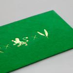
Iannilli by Savvy
Iannilli is a traditional Italian restaurant located in the Mexican city of Monterrey. Its visual identity, recently revised by design studio Savvy, contrasts classic and contemporary design cues to satisfy an established clientele – expecting traditional food and service – while also appealing to a younger generation....
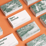
Filmfaktisk by Heydays
Filmfaktisk is a Norwegian team of film producers—with a strong focus on locations—that produce both commercial and fictional pieces work. Their visual identity, created by Oslo-based design agency Heydays, cleverly leverages the physical limitations of sign making and turns it into a positive and distinctive asset that visualises—through a simple line detail that connects the stems and the tittles of the i’s...

Helsinki Food Company designed by Werklig
The Helsinki Food Company provides design and production services – including consultation, styling, photography and recipe development – to regional broadcast, print and event sectors. Created by visual communications agency Werklig, their visual identity – an economical single colour print treatment of a logo-type constructed from a single consistent line weight and culinary-related letter-forms across a variety of tactile and dyed craft substrates – sets...
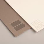
Bedroc by Perky Bros
Bedroc is a Tennessee-based consultancy firm that takes complex business issues and simplifies them with technology to reduce risk, optimise efficiency and creating revenue for its clients (ROC). The firm’s visual identity, created by multidisciplinary design agency Perky Bros, avoids the conventions of the industry and instead favours a direction that draws an analogy between bedrock and technology—the physical stability, sub-surface...

Mikkeller + Bedow Seasonal Beers by Bedow
Mikkeller + Bedow is a limited edition beer with a four seasons theme created by Danish brewery Mikkeller with packaging created by Stockholm-based graphic and product design studio Bedow....
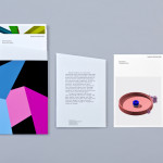
Nosive Strukture by Bunch
Nosive Strukture is a structural engineering firm who describe themselves as having a ‘unconventional attitude towards business, working environment and life itself.’ Inspired by their approach and a studio space of angled detail, independent design agency Bunch, “developed a stark, technical identity based around tensegrity structures and a black and white palette” executed across triplexed business cards, cardboard file folders, signage...
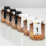
Doce Cielos by Anagrama
Doce Cielos is a traditional handcrafted Mexican honey brand with a mission ‘to encourage the recognition and consumption of native apiculture products’ and emphasise their ‘richness in flavor, texture, color and benefits to personal health’. The brand’s visual identity and packaging solution, developed by independent design agency Anagrama, is an unusual craft and corporate juxtaposition delivered through a well spaced...

Crosskey by Kurppa Hosk
Crosskey is a Finnish company that develops and maintains systems and solutions for the Nordic banking sector and capital markets, making it ‘easier and more profitable for its customers to operate their banks’. Based around the idea “Banking Power!” design agency Kurppa Hosk developed a visual identity solution, which mixes a simple corporate typeface, iconic mark and an economical colour...
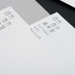
Sifang Art Museum by Foreign Policy
Sifang Art Museum is a gallery and creative space located in the Pukou region of Nanjing, China dedicated to art, architecture and international collaboration. Their visual identity, a bilingual logo-type set across a collateral of unusual trapezoidal cut detail and monochromatic colour palette—developed by Singapore-based creative and strategic design agency Foreign Policy—draws together the themes of architectural space, the dimensionality created by light and shadow,...
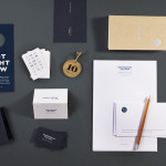
Townhouse by Koniak
Townhouse is a hotel designed and ‘curated’ by The Kastiel Family and located at the heart of the Tel Aviv. Based around tactile material and print finish, a mixed typographical approach in conjunction with a simple sans-serif logo-type and monogram, Townhouse’s visual identity, created by boutique design studio Koniak, frames the traditional crafted luxury of the hotel’s interior fixtures and fittings with a...
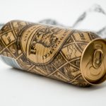
Kozel Limited Ed. by Yurko Gutsulyak
Czech brewer Velkopopovický Kozel have recently launched a limited edition packaging solution for their tinned light beer. Created by Ukraine-based studio Yurko Gutsulyak, the design unites regional and national illustrative detail across a wood print and light tissue wrap neatly conveying tradition, craft, heritage and provenance in a unique and distinctive way....