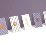
Violeta by Anagrama
Violeta is described by Anagrama, the design studio behind its new brand identity and packaging treatment, as an Argentinian bakery, named after its founder, that creates hand-crafted breads, cakes and pastries from its location in the Buenos Aires district of Las Lomas de San Isidro. Following more than 30 years of business and in lieu of a plan to begin...
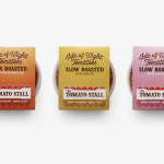
The Tomato Stall by Designers Anonymous
The Tomato Stall is a grower of speciality tomatoes whose distinct flavour is attributed to the increased sunshine they receive from being farmed on the southern English island of the Isle of Wight. From these, The Tomato Stall produces a range of ‘tomato inspired’ artisanal products that are stocked by farm shops and delis throughout the UK and sold from...

Kid O by Studio Lin
Kid O is a modern American toy company that creates products that engage and stimulate children through a rich variety of shapes, colours, and sizes. Designed by Studio Lin, Kid O’s new packaging treatment — which included over 50 boxes — takes the vivid colours of the industry, reduces these down to four, contains them within geometric boundaries and pairs...
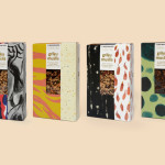
The Beginnings by Asketic
The Beginnings is a Latvian raw food and ingredients business creating and sourcing a variety of mueslis, jams, honeys and spices from around the world. Developed by multi-disciplinary design firm Asketic, The Beginning’s brand identity and packaging treatment goes all in for handcraft and contrast, mixing a variety of patterns and images informed by the origins of each ingredient to establish an ever changing and...
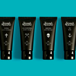
Triumph & Disaster – On The Road by DDMMYY
Triumph & Disaster (T&D) is a male skincare and accessory brand that appropriates the traditional grooming experience associated with the past and fuses it with the high quality, natural and scientifically formulated expectations of today’s market. T&D’s packaging, created by New Zealand based design studio DDMMYY, references and confidently brings the type-heavy, heraldic detail, and traditional structural and material choices of the past into the...

Terence Woodgate by Charlie Smith Design
Terence Woodgate is a lighting design and manufacturing business, founded by industrial designer Terence Woodgate in 2014, that looks to “fully optimise the benefits of LED technology”. Charlie Smith Design recently worked with Terence Woodgate to develop a visual identity for the business and modular packaging treatment for its first line of products as well as manuals, fitting instructions and website....
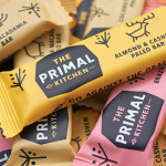
The Primal Kitchen by Midday
The Primal Kitchen is a UK based health food brand founded by nutritionist Suzie Walker with the intention of making the paleo lifestyle, a modern nutritional plan based on the presumed diet of Paleolithic humans, easier and more accessible. The Primal Kitchen commissioned design studio Midday to create a visual identity for the brand which would extend across the packaging for its cold pressed...
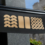
Los Italianos by Huaman
Los Italianos is a traditional Italian food producer and retailer with three locations across Barcelona but with its roots in the Piemonte region of Italy and a significant history that dates back to 1939. Los Italianos recently commissioned Spanish design studio Huaman to develop a new brand identity that would better position them within the gourmet category, introduce an elegance and modernity...
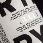
Kyrö Distillery Company by Werklig
Kyrö is a Finnish distillery, housed in a former dairy in the region of Isokyrö, that will yield a high quality 100% rye whisky in 2017 for national and international markets and currently batch produces a root variety for cocktails. Design studio Werklig was hired by the distillery to create their brand identity, which went on to include a logotype and custom typeface,...

Le Naturel by Moruba
Le Naturel is an all-natural wine created without the use of sulphites by Spanish producer Vintae. Vintae describes itself as an innovative, young and dynamic enterprise, representing the avant-garde and revolutionising different aspects of the wine-growing industry. The wine’s packaging, developed by Moruba, embraces an unusual and distinctive change in communicative priorities, discarding the perceived high qualities of foil and tactile papers, verbose narrative, the...
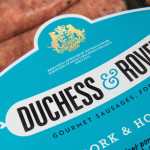
Duchess & Rover by Robot Food
The raw meat sector within the dog food industry continues to grow and innovate, reflecting owner’s increasing support and understanding that it can provide a fresh, natural and convenient way for their dogs to receive the nutrients they need. Recognising how unpleasant raw meat can be and looking to take advantage of the expanding market, design studio and now product development specialist Robot...
Single Origin Roasters by Maud
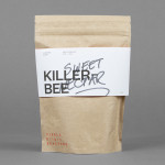
Single Origin is a Sydney-based coffee specialist with a roast works in Botany and a cafe in Surrey Hills. Single Origin approached Maud to create a brand identity solution—which included logo design, stationery and packaging—that would reflect the low-key nature of the brand, the founders’ desire to avoid any notion of commercialism and help them expand into new markets. In a ‘category rife...