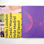
Campus by MultiAdaptor
Campus is Google’s network of co-working and event spaces for the many start-ups it has and continues to help fund. These are located in London, Madrid, Warsaw, São Paulo, Seoul, and Tel Aviv, with another to open in Berlin soon. The Campus community has over 80,000 members and collectively received over $537 million in funding which has created more than 11,000...

Institute by Commission Studio
Institute is a full service creative studio from New York working with clients to connect with people through creative direction, live experiences, concept development, content creation, production and post-production services. Institute’s work is described as being underpinned by thoughtful and meaningful creativity, and although their clients are often high profile, their presence is intentionally modest. London-based Commission Studio worked with Institute to develop...
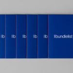
Bundlelist by Bunch
Bundlelist is an online platform that simplifies and draws together international mobile bundle costs, with a specific focus on mobile retail data, and facilitates comparisons between countries and mobile operators. Design studio Bunch worked to develop UX, UI and visual identity for the platform, which included logotype and a bundle of promotional notebooks....

High Street Wine Co. by Conductor
High Street Wine Co. is a wine bar and shop located in the Pearl neighbourhood of San Antonio, Texas. UK-based graphic design studio Conductor, working closely with architects Dado Group, created a visual identity that expresses something of the cheerful personality of its hosts, the ambience and community of a busy bar and its distinctive interior design. Drawing on the name for...
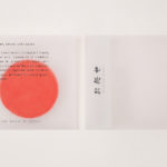
Omakase Room by Tatsu by Savvy
Omakase Room by Tatsu is a unique sushi dining experience located on New York’s Christopher Street. The concept is rooted in the centuries-old family traditions of Japanese Executive Chef and host Tatsu Sekiguchi and the celebration of the individual and personal. This can be experienced in the restaurant’s unique and intimate setting, one that seats only eight, and a menu...
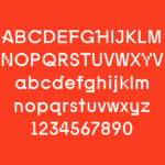
Kosmopolis by Hey
Kosmopolis is a five day literature festival that takes place in Barcelona every two years, but also has a programme of ongoing events in between. The festival, since 2002, has been organized by the exhibition and arts centre Centre de Cultura Contemporània de Barcelona, and intends to promote literature in its many different forms. It does this through a series of talks and...
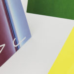
Kristin Jarmund Architects by Snøhetta
Kristin Jarmund Architects is an oslo-based architectural studio with a design philosophy that is focused on using a simplicity of form and a clarity of purpose to address complex problems, while at the same time, allowing for a contextual and human sensitivity. Reduction, as well as the duality inherent to the studio’s work, was the founding principles of their new...

June’s by Föda
June’s is a cafe and bar located on the corner of South Congress Avenue, Austin, Texas. It offers breakfast, brunch, and grab-and-go pastries and coffee throughout the morning, and has an all day bistro menu that is served late into the evenings. The bistro menu is complemented by a changing wine and bar program managed by Master Sommelier June Rodil. June’s...
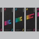
Frameline 41 by Mucho
Frameline is an American nonprofit arts organisation and the world’s longest running LGBTQ film festival. Frameline continues its mission, since its founding in 1977, to change the world through the power of gay cinema, and to connect filmmakers with audiences locally and internationally. Graphic design studio Mucho worked with Frameline on its visual identity and campaigns for its 40th and 41st LGBTQ...
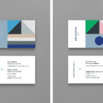
Brighton & Brighton Beach ELC by Studio Brave
Brighton & Brighton Beach are privately owned boutique childcare and early learning centres in Brighton, Australia. Brighton ELC, the first of the two, opened in 2001 and caters to 60 children, aged between the ages of 8 months and 6 years, and recently underwent renovations, led by Christopher Elliott Design. To coincide with this renovation, Brighton ELC worked with Studio Brave on...

Corps Reviver & L’Heure du Cocktail by Spin
Corps Reviver is a French publisher and revivalist, redesigning and reprinting classic literary works, the first of which is L’Heure du Cocktail, The Cocktail Hour, written by journalists Marcel Requien and Lucien Farnoux-Reynaud and originally published in 1927. L’Heure du Cocktail, at the time, revolutionised the cocktail book, approaching the subject in a new way. This 2017 bilingual edition, presented in French and English,...
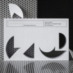
Roger Burkhard by Lundgren+Lindqvist
Roger Burkhard is a creative web development and interactive studio based in Bern, Switzerland, with a roster of clients throughout the creative industries. The studio worked with Scandinavian designers Lundgren+ Lindqvist on the development of a new brand identity. This included monogram, brand guidelines and website, as well as a stationery set that covered business card and promotional cards, letterhead,...