MoMA by Order
The MoMA logotype, set in Franklin Gothic No. 2 and designed by Ivan Chermayeff, is an icon, and has been part of the New York urban landscape and international museum graphic vernacular since its creation in 1964. With evolving communicative needs and channels, the MoMA logotype was made a central graphic device as part of a new visual identity launched in...

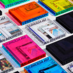
Napier Street by Studio Hi Ho
231 Napier Street is an eleven apartment building, now sold out, created by property developer Milieu, set with the culturally rich part of Fitzroy, Melbourne. It is their first collaboration with architect Edition Office—an innovative practice with a strong conceptual focus—and part of the developer’s ongoing enquiry into and interrogation of the dialogue between architecture and place. This interrogation forms...
One Wellington St Kilda by Studio Ongarato
One Wellington, a partnership between LAS Group and Qualitas, is a new property development located in the Melbourne suburb of St Kilda, not far from eclectic Fitzroy Street. The building’s architecture—designed by KPDO and comprised of 181 apartments across two buildings of 26 and 10 floors—features flowing curves inspired by its bayside location, highly-customisable interior options and unobstructed sky views. One...
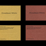
Freadman White by Studio Hi Ho
Freadman White is a Melbourne-based architectural practice, led by Ilana Freadman and Michael White, that seeks to embed a curiosity-driven and experientially charged tension into their architectural work, reveal beauty in simple and overlooked settings, and design contextually informed structures with a disciplined whimsy. Further, rather than responding literally to physical surroundings, the practice develops spaces that are visually intriguing,...
Ascari by Blok Design
Ascari is an Italian restaurant which two locations, one on Queens Street East and another newly opened establishment on King St West. Toronto, Canada. It is named after the proprietor’s hero, Formula 1 legend, Alberto Ascari, (who was also known for his love of food). To reflect both the passion for good simple food and racing, design studio Blok developed an identity that brings together...

Atlantic Theater 2019 – ’20 Season by Pentagram
Atlantic Theater Company was founded in 1985 by playwright David Mamet and actor William H. Macy and, since then, has established itself as an influential Off-Broadway theatre group. It is also known for having a bold and original voice, producing groundbreaking new works by both emerging and established playwrights. This bold and original voice was central to the design of the theatre’s...
New Victory Theatre by Pentagram
The New Victory Theatre, located on New York’s 42nd Street, is described as the city’s first and only not for profit performing arts venue for kids and families. It has a programme that covers a multitude of artistic disciplines and draws on traditions from a variety of cultures. Alongside performances and family workshops the theatre also seeks to offer performing arts...
CareerTrackers Awards by Garbett
CareerTrackers is an Australian charitable organisation that addresses Indigenous disadvantage by developing professional career pathways, internship programs and links with private sector employers for Indigenous university students. It does this through a model adapted from an African-American internship program that has been tackling disadvantage for over 45 years. This model sees students intern with sponsoring companies with the intention of converting them...
Shakespeare In The Park 2019 by Pentagram
Shakespeare In The Park is an annual event and duo of free performances presented by New York’s The Public that takes place at the Delacorte Theater in Central Park in May and June. 2019 saw performances of Much Ado About Nothing and Coriolanus under the theme “Rumours and Rebels”. The event was promoted through a city-wide campaign developed by Pentagram’s...

Salbini by Studio Brave
Salbini, formerly Fesal, is an online retailer of premium European furniture and appliances based in southern Italy and shipping internationally. It deals in both one-off purchases and tailoring for large commercial projects, offering both local and global brands. Fesal comissioned Studio Brave to rename and refresh its brand and overhaul its online store. While the project features revisions to type...
The Golden Hour by Triboro
The Golden Hour is an outdoor seasonal restaurant located in New York’s The High Line Hotel. It is a place to experience the softening of sunlight with unobstructed views of the Chelsea skyline. The restaurant intends to draw to mind the casual elegance of a coastal soirée rather than the rushing of pre-dinner drinks. The restaurant space is described as being...
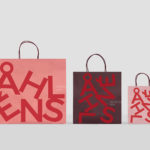
Åhléns by Happy FB
Åhléns began in 1899 as a small mail-order business. Aside from it being one of the oldest it has also grown to become one of the largest retail chains in Sweden. By carefully collating a variety of items across brands and price categories, the retailer maintains its relevance today, understanding and responding to the many ways in which its customers...