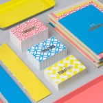
Torafuku by Brief
Torafuku has a simple yet adventurous menu that reinterprets pan asian flavours as modern shared dishes. These are made from good quality and locally sourced ingredients, which are complimented by a variety of contemporary cocktails, a carefully curated wine list and local craft beers. Torafuku is located on the border of Vancouver‘s historic Chinatown and features an open and reductive urban interior space of leather upholstered benches, light...
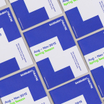
Basement Theatre by Studio Alexander
Basement Theatre is an independent, underground, community theatre located on Auckland’s Lower Greys Avenue. It was established in 2008 as a place to showcase new voices, fresh perspectives and emerging young talent, and to provide these with the space to develop their performances. The theatre has played host to dancers, visual artists, poets, musicians, comedians and everything in between. Taking their...
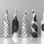
Iron Grill by End Of Work
Iron Grill is fast food outlet preparing healthy, flame grilled wraps and burgers, to order, from its kitchen and counter at the Optus headquarters at Macquarie Park, Australia. The food court at Optus is a competitive environment with a large captive audience of over 6,500 people and a number of other food outlets competing for business but serving familiar, unhealthy favourites. To help define and convey...
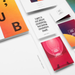
James Turrell; Jardín Botánico by Savvy
Botanico Culiacan is a 10 acre botanical garden, designed and built by Tatiana Bilbao in 2012, and located in the city of Culiacán, México. The garden is dedicated to conservation, eduction and botanical investigation, plays host to a variety of cultural events and is home to a contemporary art collection commissioned specifically for the space. Botanico Culiacan’s latest installation, James Turell’s Encounter, is the...
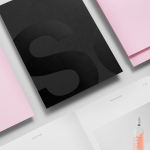
Studio South by Studio South
Studio South, formerly APLUS, is graphic design studio working within the fields of brand identity and packaging from their office in the city of Auckland, New Zealand. In conjunction with a new name and site launch, which coincides with the expansion of studio space, South have also developed a new visual identity treatment. This extends across business cards, folders and headed paper, a...
Fundació Joan Miró 40th Anniversary by Mucho
Fundació Joan Miró is a cultural centre located on Barcelona’s Montjuïc hill. It was opened in 1975 as a place to encourage young artists to experiment with and exhibit contemporary art, and would allow the general public better access to new work of the time, which it continues to do today. Fundació Joan Miró has a distinctive exterior structure of modular geometric prefabricated surfaces, extrusions, recesses...

The Factory by Ghost
The Factory is an Oklahoma based fashion retailer, inspired by the energy and attitude of the people of Manhattan, Los Angeles and Tokyo, that mixes streetware with high fashion garments, shoes and accessories. Think ripped jeans, vintage purse and Louboutins. American graphic design studio Ghost worked with The Factory to develop a brand identity concept, which went on to include logotype and...
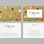
Gripoix Paris by Mind
Gripoix is a Parisian costume jewellery manufacturer with a significant history, one that stretches back to the late 19th Century and the Art Nouveau period. Gridpoix’s pieces are created using a traditional kilncasting technique, known as pate de verre, which sees molten glass poured into a thin linear framework, giving each a luxury and uniquely crafted quality. This traditional process, and the period in which...
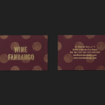
Wine Fandango by Moruba
Drawing inspiration from New York neon, and its show business associations, graphic design studio Moruba have developed a new brand identity treatment for Wine Fandango, a restaurant and wine bar, located in the Spanish city of Logroño, that features a rich interior design of textured glass, wood floors and furniture, ceramic tiles, exposed brick and gold fixtures. Wine Fandango’s identity is made up of custom typography and logotype, patterns,...
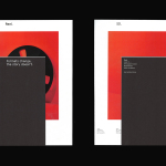
Reel by Richards Partners
Reel, formerly Reel Good, is a digital production company telling memorable stories and crafting digital experiences from its offices in Auckland, New Zealand. It has positioned itself at the intersection between new technologies and established filming techniques, and delivers both creative and distribution services. These include providing direction, production, post-production, animation and music to clients such as New Zealand Air, Casio, Warner Music...
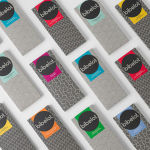
Bibelot by A Friend Of Mine
Bibelot is a luxury European-inspired dessert boutique in Melbourne with a coffee bar, chocolate shop, high tea salon, gelaterie and artisinal patisserie. It features an interior of long marble counters, a light spotted stone floor, spot lighting, cornicing, black and white walls, as well as bronze and tiled detailing. Informed by the sense of place and the permanence that underpins Bibelot’s...
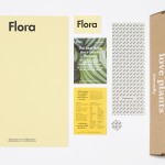
Flora by P.A.R
Flora is a Barcelona based business that looks to provide an alternative to caring for live plants, and describes itself as having an interest in bringing nature indoors in a new way and offering an antidote to the frantic pace, dark rooms and concrete of the city. Flora essentially sell, from their online shop, framed prints of plants shot on a...