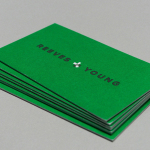
Reeves & Young by Matchstic
Reeves & Young is an Atlanta based construction and sub-contracting business that was formed in 2015 following the merger of Reeves Contracting Company and Potts Construction. To coincide with this merger, Reeves & Young worked with American graphic design studio Matchstic to develop a new brand identity that would convey the combined strength of the two businesses but would also be sensitive to...
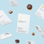
Bombonería Pons by Mucho
Bombonería Pons is a family owned Barcelona based business, established in 1960, dedicated to producing the finest handcrafted chocolates. With a desire to engage with a younger consumer Bombonería Pons worked with international graphic design studio Mucho to develop a brand identity that would be sensitive to its traditional values and history yet give it a contemporary appeal. This extended across packaging, brochure, stationery, business cards and...
The Practical Man by Garbett
The Practical Man is an online retail destination for men’s sports style and fitness, activewear and equipment, but also editorial content that covers reviews, fitness-focused travel guides and in-depth insight into new brands. It curates a catalogue of world-leading products that exist at the intersection of fashion and sports performance, designed by innovative and passionate brands with progressive approaches. Australian graphic design studio Garbett worked with The Practical Man...

Pia Ulin Photography by The Studio
Pia Ulin is a Swedish photographer, working between New York and Stockholm, who has built a considerable reputation from her daylight-only approach. This is said to infuse her images, which cover interior, lifestyle and still life, with a warm and natural quality. As well as producing editorial photography for publications such as Dwell, Martha Stewart and Elle Decoration, Pia has also contributed...

Haydn & Rollett by Richards Partners
Haydn & Rollett is an Auckland based construction company that has been in business since 1946. To coincide with its 70th birthday and in acknowledgement of the broadening of its services beyond just construction, the company worked with graphic design studio Richards Partners to develop a new brand identity that would better communicate who they are today whilst not abandoning their past. This...
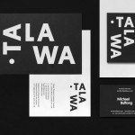
Talawa by Spy
Talawa, Jamaican patois for “small but feisty”, is an all black theatre company that looked to address the lack of opportunities for minorities and their marginalisation at the time of its founding in 1986. Since then it has established itself as one of the most successful theatres of its type in the United Kingdom. “Our work is informed by the wealth...
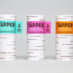
Tapped Birch Water by Horse
Tapped is an organic birch water, drawn straight from trees growing in Finland, and available in Bilberry & Lingonberry, Apple & Root Ginger and unflavoured varieties in the UK from Whole Foods Market, Planet Organic and online. Birch water is a traditional spring time drink and medicinal ingredient in Finland, tapped from birch trees which filter ground water up through their roots and trunk...
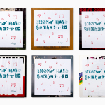
Second Hand Orchestra by Bedow
Second Hand Orchestra is a collection of tracks recorded for a documentary that was unfortunately and abruptly cancelled. Rather than let the work fall by the wayside, band leader Karl-Jonas Winqvist has released these as a limited edition album of 300 LPs. These feature a visual identity and packaging design of custom typography, individually numbered and block foiled sleeves, and screen printed t-shirts created by Stockholm...
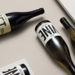
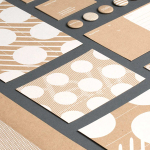
Estones de Mishima by Folch
Vins de Mas Sersal is a Spanish wine producer, founded by winemaker Salvi Moliner and sommelier Sergi Montalà in 2008. Inspired by the lyrics of Qui n’ha Begut from the album Set Tota La Vida (Thirsty The Whole Life) by singer, songwriter and friend of Salvi and Sergi, David Carabén of the indie band Mishima, the winery created a special...
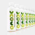
Unoco Raw Coconut Water by B&B Studio
UK based Unoco works with a community of smallholders in the Philippines to produce an unrefined, unpasteurised and untreated raw coconut water. This is drawn from young coconuts, characterised by their green rather than brown colour, picked at their nutritional prime and placed into bottles rather than tetra pak or cans using HPP. This process gives the water a distinctive pink colour, a result...
Studio Una by Studio Una
Studio Una is graphic design business, run by Sebastian Hager and Sebastian König, with an office in the German city of Hamburg. The duo works within the fields of visual communication and brand identity design, online and in print, and describe themselves as attaching great importance to the aesthetic effect of design, alongside strong concepts and strategic decisions. This positioning is conveyed...
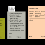
MOS Architects by Studio Lin
MOS is an American architectural practice that mixes playful experimentation with serious research. The practice, as it exists now, following two years of what seems to be an informal approach, was established in 2005, and has worked through a range of design experiments it describes as a make-believe of architectural fantasies, problems, and thoughts on what the practice would be building in the...