
tvN by Studio fnt
Total Variety Network (tvN) is a South Korean nationwide television network, founded in 2006, that offers a wide variety of general entertainment programming. tvN recently worked with Studio fnt on the creation of an offline visual identity for its store, expressed through its products, a mix of office stationery and furniture. These include adhesive notes and notebooks, pen and business card holders,...
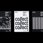
Collect by Spin
Collect is an international art fair that this year took place between the 2–6 of February at London’s Saatchi Gallery. Presented by the Crafts Council, Collect gave visitors the chance to see and buy museum-quality and contemporary ceramics, glass, jewellery, wood, metal and textiles created by established and emerging artists and makers represented by over thirty of the world’s best galleries. Collect’s...
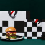
Orson Burger Kitchen by Anagrama
Taking inspiration from the work of artist Edward Hopper, and the style of the American diners of the 1920s and 1930s, Mexican design studio Anagrama developed an interior and visual identity design for Orson, a restaurant in the city of San Pedro pairing burgers with a wide selection of wines and milkshakes. The project, alongside a distinctive interior design of material detail,...

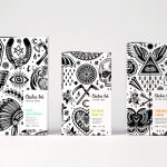
The Dayrooms by Two Times Elliott
The Dayrooms is a multi-label womenswear store, located in the London district of Notting Hill, created by Aytan Mehdiyeva and Zumrud Mammadova. The store gives a UK platform to emerging Australian designers and is an expression of Aytan and Zumrud’s shared passion for fashion and travel, and Aytan’s love of photography, textiles and Australian craftsmanship. This is reflected throughout The Dayroom’s graphic identity, developed by Two Times...
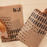
H+J by Spy
H+J is a UK independent catering business, established in 2004, that has provided food and catering solutions to venues such as The Cutty Sark, Moët & Chandon, Abbey Road, RIBA and Selfridges. Their services include working lunches and private dining rooms, large scale food courts, cafes and deli bars. London-based graphic design studio Spy worked with H+J to develop a new brand identity that would...

Lundén Architecture Company by Tsto
Lundén Architecture Company is a Helsinki-based design studio developing innovative structures, infrastructures and spaces. The studio, through their knowledge of strategic development, experimental building technology and urban design, drawn from their collaborations with experts from different fields, offer proposals that affect the future of the built environment. Projects have included a new school and community complex that inspires learning during...
Blå Bär by BVD
Blå Bär (Swedish for blueberries) sells a variety miscellaneous goods from Scandinavia from its store in Osaka, Japan. These include, but are not limited to, glass and kitchenware, soft furnishings, ornaments and jewellery. Many of these could be described as having something of a shared Scandinavian simplicity of form, lightness of colour, natural material quality and cheerful character in pattern...
Artek Helsinki by Tsto
Artek is a Finnish furniture and product design business and retailer with a flagship store in Helsinki. It was founded in 1935 by architect Alvar Aalto and wife Aino Aalto, the arts promoter Maire Gullichsen and art historian Nils-Gustav Hahl. Artek grew alongside and shared many of the qualities of the 20th century modernist movement, blending art and technology, and making the...

Well Coffee by Bond
Well Coffee is a new vegetarian café in the centre of the Finnish capital of Helsinki. It has a distinctive interior of steel frames and wood surfaces, exposed concrete walls, drilled and CNC cut panels of circles, large menu board, marine lamps and potted plants. These blend the current and utilitarian with the more welcoming. Scandinavian graphic design studio Bond worked with the...
Electric Ink by Robot Food
With the rise in the popularity of tattoos and the lack of credible long-term care products, Leeds-based design studio Robot Food formulated, branded and packaged Electric Ink, a tattoo care range for the mainstream market. The range includes a serum that enhances colour, an oil that delivers a freshly-inked look, and a daily moisturiser. Each feature distinctive packaging design that draws on...

Sant Francesc by Mucho
Sant Francesc is a 5-star hotel located in the Placa Sant Francesc, beside the Church of the Templarios, within the city of Palma on the Spanish island of Mallorca. The hotel is set inside the walls of a restored historical landmark built in a neoclassical style during the 19th century and has 42 rooms and suites. Some of these rooms include wood-beamed ceilings, original frescos and...
Blackhorse Lane Ateliers by StudioSmall
Blackhorse Lane Ateliers is a UK-based premium selvedge and organic raw denim jeans brand. It was founded in 2016 by Han Ates, who has over 25 years experience in the textiles industry, and is located in a renovated 1920s factory building with a distinctive profile in Walthamstow, North London. Blackhorse Lane Ateliers is committed to implementing a sustainable and ethical production model....