
Mr Yum by Re Design
Sometimes a project comes along that doesn’t just make you think about how nice its typography is, or ponder if millennial pink is making a comeback (or indeed,, if it ever went away), or why suddenly a branded bucket hat seems to be a key facet of any company/product/concept’s ‘swag’. Sometimes, it makes you think about what ‘branding’ even means,...

Pirkkalan by Werklig
It’s been years since millennials were first accused of buying too many avocado toasts and expensive coffees. The stereotype of young people loving handmade, refined and artisanal products holds true in their spending patterns, and today, that generation has matured into business leaders, reshaping the world’s mindset to align with these priorities. As consumers, Gen Z seem to be picking...
Omlet by Ragged Edge
We’re undeniably in an age of pet care 2.0: the post-fur-baby era, where people are finally beginning to see their animals’ needs and wants as independent to their own (i.e. dried pigs ears over vegan dog treats, eschewing leads for cats, and so on). These shifts in how we think about what it means to have and look after animals...
Kettle Kids by Two Times Elliott
The once laudable claim to have started a thriving business with ‘a small loan’ from a doting family member may have been muddied beyond recognition by the truth-stretching of serial tax-offender and part-time Presidential candidate Donald Trump. Despite this, turning ‘one thousand pounds from nan’ into a luxury watch and diamond dealership with a sparkling flagship store in Mayfair remains...
Black Bee Honey by OMSE
It was yesterday I made a run to the local supermarket to pick up some essentials. I had two choices, turn left to Waitrose or right to Morrisons. Despite being somewhat price conscious, I enjoy looking at the packaging at the higher-priced Waitrose, so went left–let’s say it’s the cost of being a designer. Anyway, honey was on the list....
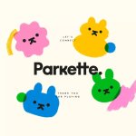
Parkette by Kinoto
Cute, bright, and striking; there’s very little not to love about this identity for Parkette. Based in Hamilton, Canada, Parkette is billed as a boutique shop ‘dedicated to kids and the kids at heart’, selling crafts kits, clothes, accessories, books, homeware, toys, and ‘other treasures’. The name is taken from a term many locals in Hamilton use to describe a...

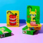
Erbert by AUGE
Few countries on Earth take their food as seriously as Italy. It’s not difficult to justify the enormous pride Italians take in their spectacular culinary heritage, with their cuisine considered the ‘most exported’ on the planet. But while the wider world is undeniably in thrall, Italians’ patriotic palettes create and necessitate a notoriously conservative domestic cooking culture. Italian ingredients, recipes...
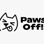
Paws Off! by Seachange
Anyone who’s ever had a dog, or just interacted with one, has likely spotted that over and above pretty much anything, food is the centre of their universe. Unfortunately for us, though, it’s not just dog-safe food that they’ll do whatever it takes to get their paws on: human food, it seems, often has the most appeal. But just as...
smlXL by DIA
As the adage goes, ‘Give a man a fish, you feed him for a day; teach him to fish, and you feed him for a lifetime’. With this vivid paradigm of self-sufficiency in mind, we can esteem the advent of creative coding in branding, allowing design agencies to hand brands over to clients as generative tools capable of generating limitless...
Food Nation by Seachange
It’s about time plant-based brands found their sense of humour. Having been a vegan for 17 years now, I can safely say that veggie/vegan brands have historically been tiresomely dull – and until recently, they’ve been allowed to be. But with the recent years’ boom in all things ‘plant based’, simply existing because there’s no other type of soy milk...
Mill by Manual
There’s a lot to be said for the Instagram-worthiness of, say, a faux-futuristic beauty brand identity that’s all gloopy, metallic, kinetic typography, ‘terminal green’, and unabashedly Gen Z-baiting ‘y2k’ art direction. It’s easy to assume that projects that allow designers the creative freedom for unabashed experimentation – playing fast and loose with legibility and lofty conceptual thinking – are the...
Veg NI by Jack Renwick Studio
The economics of regional farming, in the face of global market forces, continues to be unfavourable to local producers; narrowing margins and pushing some out of business. Alongside this, unfair and self-defeating politics continue to chip away at a basic message; locally grown food is a good, not just in a regional economic sense, but in terms of the health...