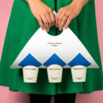
Anton&Anton Kioski by Bond
Anton&Anton (A&A) is an alternative to and antithesis of the large supermarket chains. Staff are described as relaxed, smiley and proud. Their ranges (mostly) organic, some homecooked and also available online for home delivery. With a desire to express an approachable, playful yet credible positioning, and a need to develop a cohesive set of packaging and communications assets A&A worked...

Garden 13, Graanmarkt 13 by Base
Graanmarkt 13 is a restaurant, high-end concept store and apartment in Antwerp. It is described by Base, the studio behind its graphic identity, as a special house, a crossover place full of surprises. This was articulated through a story that positioned Graanmarkt 13 as a haven for people in search of objects and experiences with soul and meaning. Garden 13...
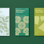
Piccolo by Here Design
Piccolo is an Italian seed brand with a particular favour for those that are ideal for urban growers, people with small balcony gardens or working with limited space. It is a brand with character, with product naming that includes Slim Jim Aubergine and Spacemaster Cucumber expressing the space-smart dwarf varieties of the range. Piccolo worked with UK-based studio Here Design to develop a...
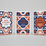
Riso D’uomo by Here Design
Riso D’uomo is a Milanese Carnaroli rice brand, cultivated from the same stock over hundreds of years, and grown within sight of the historic Duomo di Milano. Carnaroli is often referred to as ‘the king of rice’, and is known for its high-quality nutritional properties, cooking consistency and a ‘bite’ that makes it ideal for risotto. Taking inspiration from Riso D’uomo’s provenance, specifically the ornate...

A.N Other by Socio Design
A. N Other gives its perfumers the creative room to craft limited edition, luxury and high concentration fragrances free from the pressures of consumer trends, market segmentation and budgetary constraints. These are then sold direct-to-consumer through its website. A.N Other places greater value on the internal composition of each of its fragrances, and the inspirations and aspirations of its creators, than...

Zebra Dream by TCYK
Zebra Dream is a range of organic, soy and dairy-free coconut based ice-creams made from fair-trade ingredients. With a desire to capture a larger portion of the market whilst retaining its die-hard following, Australian design studio The Company You Keep (TCYK) reimagined the brand from the ground up, redesigning Zebra Dream’s graphic identity and packaging, taking it from a dark pack with a...

St. ERHARD by Bedow
With a desire to stand out, and in response to the extensive saturation of heritage-related visual cues throughout the German beer market, brewery St. ERHARD worked outside of the country with Swedish studio Bedow to develop a modern graphic identity for three of its brews. Farmer, Mayflower and Saison are premium beers, each of which are crafted, brewed and bottled by St. Erhard in...

Tangent GC Hand Cream by Carl Nas Associates
Tangent GC began as a Scandinavian organic garment and shoe care company developing products that intended to ensure longevity, and entered the organic skincare market in 2016. The company’s graphic identity, a simple typographical expression, designed by Essen International, delivered a sense of informational immediacy through the absence of superfluous stylistic detail and colour, yet divide content and drew out a distinction in...

Modern Recreation by Blok
Modern Recreation (ModRec) is an international coffee subscription service that offers its subscribers an ever-changing selection of the very best in micro-roast coffees sourced from around the world. ModRec takes pride in its positioning; the rejection of artifice, pretence and mass culture in favour of what it says is a realness, spontaneity and individuality. This attitude, and the unique character of...
Port of Mokha by Manual
Port of Mokha is a coffee, sourced from Yemen, that is said to be the rarest, most expensive and best tasting in the world. As a brand it is critically acclaimed, winning awards and receiving the highest ratings in blind cuppings, and mindful, helping to support local communities. Port of Mokha’s story begins with the return and daring escape of...

Volcano At Home by Commission
Volcano At Home is an ethically traded coffee range, roasted in small batches by a dedicated team, and sold in 100% compostable Nespresso-compatible pods. The range has been created for the retail, subscription and wholesale markets and is available in three varieties, Bold Morning Shot, Balanced All Day and Reserve Rich And Sweet. Volcano At Home is the latest venture of London-based independent coffee roasters Volcano Coffee Works and...
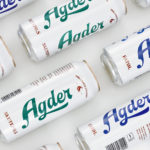
Agder Bryggeri by Frank
Agder Bryggeri is a well-regarded and historical name amongst breweries throughout Norway. It was first established in 1900 but was closed down in 1904 due to operational problems. Recently, the brewery has been resurrected as part of Norsk Bryggerier’s commitment to local beer brands, and is now sold throughout the Agder counties of southern Norway. As part of this resurrection...