
Popchips by Marx
Popchips is a four flavour range of potato chips from Ping which have been popped—much like popcorn—rather than backed or fried to create a healthier snack. New Zealand-based Marx Design were responsible for developing a new mascot for Ping that could work across multiple products in the snack food category and a packaging solution for the Popchips brand that would “avoid the clichés...
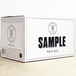
Sample Brew by Longton
To standout in an increasingly saturated market, boutique brewer Sample commissioned Melbourne-based design agency Longton to brand and package their American-inspired pale ale, slow brewed to the standards of the 1516 German purity law. Longton’s solution reflects this approach, a purity of ingredients and the brewery’s name with a distinctive and reductionist ‘sample pack’ aesthetic that balances a sense of small-scale,...
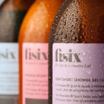
Fisix by Mucho
Fisix is a line of cosmetic products that includes shower gels, shampoos and hydrating skin balms, developed by four marathon running friends who ‘couldn’t find a range that met their needs as sportsmen’, branded and packaged by multidisciplinary design agency Mucho....

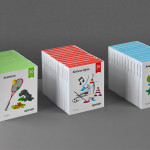
Tingz by B&B Studio
Launched by natural chewing gum brand Peppersmith, Tingz is a new, two flavour confectionary range that uses Xylitol, a natural wood sugar, to add plaque reducing properties to the sweets. Developed by London-based B&B Studio the packaging for Tingz builds on the quirky personality of the Peppersmith brand by illustrating two wide-mouthed characters, a contrasting white and bright colour palette and subtle texture to establish a healthy...
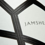
Jamsheed by Cloudy Co.
Melbourne-based design studio Cloudy Co. have recently developed the labels and visual identity for Yarra Valley boutique wine label Jamsheed, ‘named after a Persian king who according to ancient writings had a fondness for storing fresh grapes in jars, thus leading to the discovery of wine’. The packaging solution expands on the name and communicates a sense of bold flavour and craft through geometric, Persian pattern...
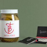
The Beaufort by The Company You Keep
Design agency The Company You Keep (TCYK) have recently finished working with bartender Dave Kerr on the naming, branding, collateral design and signage for The Beaufort, a themed dive bar located on Melbourne’s Rathdowne St. The agency’s visual identity solution, a combination of a quirky, well rendered, bespoke logo-type – built from unusual but original uppercase characters inspired by iron dock...

7-Eleven Sandwiches, Wraps and Salads by BVD
Stockholm based graphic design Studio BVD have created the packaging for Sweden’s 7-Eleven sandwich, wrap and salad range. The studio’s treatment combines the stacked sans-serif characters of Klim Type Foundry’s Calibre with bright spot colours, and enhances these with a rich, earthy brown background....
Iannilli by Savvy
Iannilli is a traditional Italian restaurant located in the Mexican city of Monterrey. Its visual identity, recently revised by design studio Savvy, contrasts classic and contemporary design cues to satisfy an established clientele – expecting traditional food and service – while also appealing to a younger generation....

Mikkeller + Bedow Seasonal Beers by Bedow
Mikkeller + Bedow is a limited edition beer with a four seasons theme created by Danish brewery Mikkeller with packaging created by Stockholm-based graphic and product design studio Bedow....

Doce Cielos by Anagrama
Doce Cielos is a traditional handcrafted Mexican honey brand with a mission ‘to encourage the recognition and consumption of native apiculture products’ and emphasise their ‘richness in flavor, texture, color and benefits to personal health’. The brand’s visual identity and packaging solution, developed by independent design agency Anagrama, is an unusual craft and corporate juxtaposition delivered through a well spaced...

Kozel Limited Ed. by Yurko Gutsulyak
Czech brewer Velkopopovický Kozel have recently launched a limited edition packaging solution for their tinned light beer. Created by Ukraine-based studio Yurko Gutsulyak, the design unites regional and national illustrative detail across a wood print and light tissue wrap neatly conveying tradition, craft, heritage and provenance in a unique and distinctive way....
Ogopogo by Bunch
Ogopogo is a start-up that is introducing the boxed experience concept to the Croatian market. Their new brand identity, which include logo, print, packaging and website design developed by Bunch, juxtaposes the corporate formality and geometric consistency of a simple sans serif logo-type with the bespoke, crafted and playful qualities of bright folded paper photography....