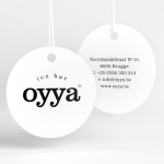
Oyya by Skinn
Oyya is an ice bar located in the Belgium city of Bruges that retails a variety of frozen yoghurts, yoghurt drinks, waffles and 28 ice creams — the most in the city. Its brand identity, which included logotype, print, signage, uniforms and interior design created by local studio Skinn, while largely logo-centric and having a strict consistency across stickers, tubs,...
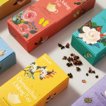
Daebeté Scented Tea by Victor Design
Daebeté is a floral infused tea range that uses a high-grade Taiwanese oolong variety, made using a unique process of withering, oxidation, curling and twisting, that has then been given a floral hint using ancient baking methods. This process creates a subtle yet sweet flavour profile that carefully balances the aroma of flowers with the flavour of tea. The packaging for the...
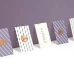
Violeta by Anagrama
Violeta is described by Anagrama, the design studio behind its new brand identity and packaging treatment, as an Argentinian bakery, named after its founder, that creates hand-crafted breads, cakes and pastries from its location in the Buenos Aires district of Las Lomas de San Isidro. Following more than 30 years of business and in lieu of a plan to begin...
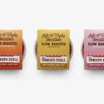
The Tomato Stall by Designers Anonymous
The Tomato Stall is a grower of speciality tomatoes whose distinct flavour is attributed to the increased sunshine they receive from being farmed on the southern English island of the Isle of Wight. From these, The Tomato Stall produces a range of ‘tomato inspired’ artisanal products that are stocked by farm shops and delis throughout the UK and sold from...
Kid O by Studio Lin
Kid O is a modern American toy company that creates products that engage and stimulate children through a rich variety of shapes, colours, and sizes. Designed by Studio Lin, Kid O’s new packaging treatment — which included over 50 boxes — takes the vivid colours of the industry, reduces these down to four, contains them within geometric boundaries and pairs...
Colours Of The Kalahari by Believe In
Believe In recently published images of their print and brand identity work created for the Mall Galleries’ exhibition Colours Of The Kalahari, the first major display and sale of southern African Bushman art ever to be held in London. The exhibition represents the latest generation of contemporary San artists from an unbroken line that stretches back 20,000 years, and includes 150...
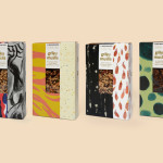
The Beginnings by Asketic
The Beginnings is a Latvian raw food and ingredients business creating and sourcing a variety of mueslis, jams, honeys and spices from around the world. Developed by multi-disciplinary design firm Asketic, The Beginning’s brand identity and packaging treatment goes all in for handcraft and contrast, mixing a variety of patterns and images informed by the origins of each ingredient to establish an ever changing and...

Triumph & Disaster – On The Road by DDMMYY
Triumph & Disaster (T&D) is a male skincare and accessory brand that appropriates the traditional grooming experience associated with the past and fuses it with the high quality, natural and scientifically formulated expectations of today’s market. T&D’s packaging, created by New Zealand based design studio DDMMYY, references and confidently brings the type-heavy, heraldic detail, and traditional structural and material choices of the past into the...
Terence Woodgate by Charlie Smith Design
Terence Woodgate is a lighting design and manufacturing business, founded by industrial designer Terence Woodgate in 2014, that looks to “fully optimise the benefits of LED technology”. Charlie Smith Design recently worked with Terence Woodgate to develop a visual identity for the business and modular packaging treatment for its first line of products as well as manuals, fitting instructions and website....
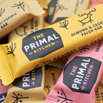
The Primal Kitchen by Midday
The Primal Kitchen is a UK based health food brand founded by nutritionist Suzie Walker with the intention of making the paleo lifestyle, a modern nutritional plan based on the presumed diet of Paleolithic humans, easier and more accessible. The Primal Kitchen commissioned design studio Midday to create a visual identity for the brand which would extend across the packaging for its cold pressed...
Simone Handbag Museum by Charlie Smith Design
Simone Handbag Museum is dedicated to the history of handbags with ‘international significance’ and provides its visitors with a curated, contemporary and historical collection to explore over two floors at the centre of the South Korean city of Seoul. London based Charlie Smith Design were recently commissioned to develop a brand identity for the museum that would resonate with and unite its diverse collection across...
Mary Wong by Fork
Mary Wong is a fast-food chain, with locations throughout the Russian city of Rostov-on-Don, that prepares Chinese noodles with both Asian and American influences. Mary Wong’s brand identity, a combination of bilingual typography, logotype, black noodle boxes with bright spot coloured stickers, t-shirts, environmental design and signage developed by Moscow based studio Fork, was inspired by Tokyo and New York nightscapes and...