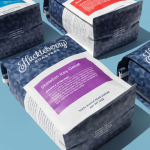
Huckleberry Roasters by Mast
Huckleberry is a Colorado-based coffee roaster established in 2011 by Koan Goedman and Mark Mann. Huckleberry worked with local graphic design studio Mast to rework their packaging in a way that would make the most of some well-established assets which included Mackey Saturday’s logotype, and would introduce more of the personality of its founder’s. This was achieved through the introduction of bright spot colours, geometric pattern...
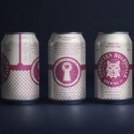
Forgotten Boardwalk Brewing by Perky Bros
Forgotten Boardwalk is a New Jersey microbrewery producing uniquely flavoured, year-round and seasonal craft beer. It was set up by Jamie Queli, one of the youngest female brewery owners in the US, and draws its name from the folklore of the Jersey Shore Boardwalk. This is the foundation of an extensive new brand identity, designed by Tennessee based Perky Bros, which brings to life the sideshow...
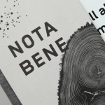
Nota Bene by Blok
Nota Bene is a restaurant, located on Toronto’s Queen Street West, with a menu made from locally-sourced and seasonal ingredients. It was opened by chef David Lee and business partners Yannick Bigourdan and Franco Prevedello in 2008, and was awarded “Best New Restaurant” by Toronto Life and enRoute Magazine soon after. To coincide with the restaurant’s 2016 relaunch—which saw David Lee take...
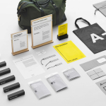
A-TO-B by Stockholm Design Lab
A-TO-B is a retail destination dedicated to all things travel. It curates and sells smart practical products for the modern traveller, complimented by insight and advice. Whether it be an around the world trip or the daily commute, a preference for small private labels or well-known bag brands, A-TO-B has it covered. Venue Retail Group—owners of A-TO-B and over 150 shoe, bag and...

Bombonería Pons by Mucho
Bombonería Pons is a family owned Barcelona based business, established in 1960, dedicated to producing the finest handcrafted chocolates. With a desire to engage with a younger consumer Bombonería Pons worked with international graphic design studio Mucho to develop a brand identity that would be sensitive to its traditional values and history yet give it a contemporary appeal. This extended across packaging, brochure, stationery, business cards and...
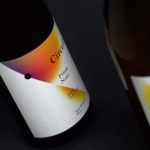
Black Estate — Circuit by Toko
Circuit is a 2014 Pinot Noir and 2015 Pinot Gris range from New Zealand’s Black Estate, a Vineyard run by The Naish Family and located across three hillsides in the Waipara Valley, an area of North Canterbury with clay and clay-limestone soil. Black Estate worked with Australian graphic design studio Toko on the branding and packaging of these two new wine varieties...
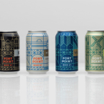
Fort Point Beer Co. by Manual
Fort Point is a San Francisco-based small batch craft beer company that references traditional styles yet is firmly rooted in the present, and has a philosophy that values craftsmanship and innovation, creativity and technique. In 2015, working with local graphic design studio Manual, Fort Point launched a new graphic identity and packaging system to unite its expanding range. Fort Point’s forward-thinking, fast-growing...

Teabox by Pentagram
Teabox is an e-commerce tea business, established in 2012 and located at the heart of India’s tea-growing regions, that looks to revolutionise the experience of buying and enjoying one of the oldest drinks in history by bringing it directly to consumers. It is based on the popular monthly subscription model, and uses data science to match teas to subscriber’s personal tastes. Teabox worked with Pentagram partner...
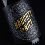
Vocation Brewery Limited Edition by Robot Food
Vocation is a UK microbrewery, established and run by John Hickling, with a range of craft beers described as having distinctive and punchy flavour profiles. Communicating the brewery’s unique personality and the crafted quality of its range rested in the hands of UK based graphic design studio Robot Food. Drawing on the beer’s tropical, fruity, floral and hoppy characteristics, the brewery’s fearless, daring and renegade attitude, and the...
Mita Chocolate Co. by Moniker
Mita is an artisanal bean to bar chocolate business grinding and moulding on a single site in Bogata, and sourcing its beans from across Venezuela, Peru, Ecuador and Colombia. Mita worked with San francisco based graphic design studio Moniker to create a visual identity and package design system that would easily scale as new products are introduced....
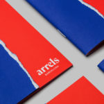
Arrels by Hey
Arrels (roots in English) is a Spanish shoe brand, established by cousins, friends and partners Javier & Pepe Llaudet, and inspired by the Mediterranean, its traditions, rhythm, colour and creative atmosphere. Javier & Pepe also draw on the city of Barcelona (the place they want to be), the countryside (where they are from), and their passion for music. These inspirations make their way into Arrels’ new brand identity,...
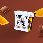
Naughty But Rice by Robot Food
Naughty But Rice is a rice pudding range created by The Hain Daniels Group in response to an increase in the dessert’s popularity in the United Kingdom. Unlike the product’s of established and mainstream brands, Naughty But Rice, as the name suggests, offers consumers a modern and indulgent twist on the traditional favourite, with flavours that include Coconut & Raspberry, Salted Caramel and Chocolate...