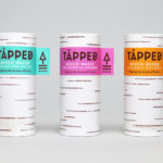
Tapped Birch Water by Horse
Tapped is an organic birch water, drawn straight from trees growing in Finland, and available in Bilberry & Lingonberry, Apple & Root Ginger and unflavoured varieties in the UK from Whole Foods Market, Planet Organic and online. Birch water is a traditional spring time drink and medicinal ingredient in Finland, tapped from birch trees which filter ground water up through their roots and trunk...
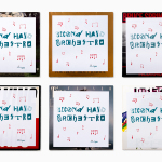
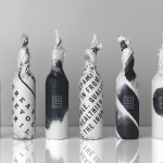
Second Hand Orchestra by Bedow
Second Hand Orchestra is a collection of tracks recorded for a documentary that was unfortunately and abruptly cancelled. Rather than let the work fall by the wayside, band leader Karl-Jonas Winqvist has released these as a limited edition album of 300 LPs. These feature a visual identity and packaging design of custom typography, individually numbered and block foiled sleeves, and screen printed t-shirts created by Stockholm...
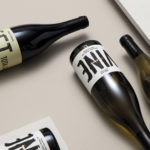
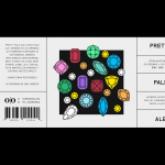
Estones de Mishima by Folch
Vins de Mas Sersal is a Spanish wine producer, founded by winemaker Salvi Moliner and sommelier Sergi Montalà in 2008. Inspired by the lyrics of Qui n’ha Begut from the album Set Tota La Vida (Thirsty The Whole Life) by singer, songwriter and friend of Salvi and Sergi, David Carabén of the indie band Mishima, the winery created a special...
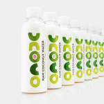
Unoco Raw Coconut Water by B&B Studio
UK based Unoco works with a community of smallholders in the Philippines to produce an unrefined, unpasteurised and untreated raw coconut water. This is drawn from young coconuts, characterised by their green rather than brown colour, picked at their nutritional prime and placed into bottles rather than tetra pak or cans using HPP. This process gives the water a distinctive pink colour, a result...
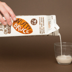
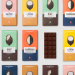
Bruce Juice by Marx Design
Bruce Juice is a 100% raw, cold pressed, fruit juice and plant milk brand new to the Australian market. It launched this year with five juice and vegetable blends, Red, Redder, Orange, Greener, Golden and Nutter, an almond milk, and a packaging and visual identity treatment by New Zealand based graphic design studio Marx Design. Using a mix of illustration and texture, loose hand drawn logotype and custom typography, bright...
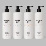
Soap Co. by Paul Belford Ltd
Soap Co. is a UK based social enterprise, luxury soap manufacturer and brand, that provides employment to people who are blind, disabled or disadvantaged. These individuals make up 70% of their team. All profits go back into the business to create and fund further job opportunities. Soap Co. recently launched a range of luxury handmade soaps, hand washes and hand lotions,...
O/O Brewing by Lundgren+Lindqvist
O/O Brewing is a high-end craft brewery, set up in 2011 by Olle Andersson & Olof Andersson, with premises in the Swedish city of Gothenburg. O/O worked with Scandinavian graphic design studio Lundgren+Lindqvist, who had created labels for a variety of other O/O beer, to develop new packaging for their brews. The studio revised and simplified the design system from earlier releases but continued to...
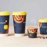
Pressbyrån by Bold
Pressbyrån is a Swedish convenience store with over 300 locations nationwide, and one of the country’s most recognised brands. It retails fresh pastry, sweets, coffee and hotdogs, alongside groceries, public transport tickets, magazines and papers, amongst a few other things. Stockholm based graphic design studio Bold worked with the store to create new packaging for its range of consumable products with the...
Loving Earth by Round
Loving Earth is an Australian business, established in 2007 by Scott Fry and Martha Butler, that produces a variety of chocolates, snacks, cereals, butters and spreads. All of Loving Earth’s products are made from high quality, organic and fairtrade ingredients, and include ranges that are gluten, grain, dairy and sugar-free. Although taking advantage of a growing multi-million dollar industry, Loving Earth’s values are...
Iron Grill by End Of Work
Iron Grill is fast food outlet preparing healthy, flame grilled wraps and burgers, to order, from its kitchen and counter at the Optus headquarters at Macquarie Park, Australia. The food court at Optus is a competitive environment with a large captive audience of over 6,500 people and a number of other food outlets competing for business but serving familiar, unhealthy favourites. To help define and convey...
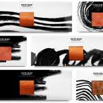
Springs’ Smokery by Distil Studio
Springs’ Smokery has been producing high quality smoked salmon for three generations from its location in South Downs, UK, using Sussex oak and a traditional dry-salting process which has remained unchanged for 50 years. Springs’ recently worked with graphic design studio Distil to develop a new visual identity and package design. Distil’s treatment is an exercise in aesthetic impact derived from colour...
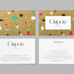
Gripoix Paris by Mind
Gripoix is a Parisian costume jewellery manufacturer with a significant history, one that stretches back to the late 19th Century and the Art Nouveau period. Gridpoix’s pieces are created using a traditional kilncasting technique, known as pate de verre, which sees molten glass poured into a thin linear framework, giving each a luxury and uniquely crafted quality. This traditional process, and the period in which...