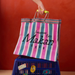
Yes we Makan
The chintzy rose; the bright but slightly dusky pink; the multifarious wordmarks; the apparently haphazard, painterly decorative flourishes; an approach to letter sizing that’s borderline unhinged – the branding for Makan has the potential to be all kinds of terrible. Instead, it’s absolutely the opposite, thanks to the deft hands at Foreign Policy (Park Bench Deli, Project Send, Critical Mass)....
BP&O Voices
Packaging:
Space Craft
A guest article written by packaging expert Lisa Cain. BP&O Voices presents the opinions of industry experts on a wide range of topics....
Storrd by Among Equals
London is awash with convenience stores – from the acrid yellow signage of Nisa to the misleadingly named ubiquity of Costcutter to the countless independents named things like Ben’s, despite the fact they have nothing to do with anybody called Ben. Such shops – reliably there at most times of day, reliably overpriced (hence the convenience I suppose, like an...
Logo
Usalco
Matchstic
2026, USA, Utilities
Logo
Aptos
Ashfall Studio
2025, USA, Technology
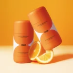
3TEMP by Studio NARI
If you had to guess what 3TEMP is and does, it’s hard to imagine many people would come up with the right answer: with no prior knowledge of the company, it sounds like the sort of thing a half-arsed episode of Black Mirror could come up with – some kind of temping agency but everyone is actually AI, or perhaps...
Logo
Elevant
Percept
2025, Australia, Finance
BP&O Voices
Packaging:
Botanical, But Make It Bold
A guest article written by packaging expert Lisa Cain. BP&O Voices presents the opinions of industry experts on a wide range of topics....
Logo
Network Solutions
In house
2025, USA, Technology
Kanal by Base Design
Kanal is a museum-to-be with an admirable yet bold raison d’être that defies much of what we think we know about the nature of highbrow cultural sites: not a “finished institution, but a cultural project in motion,” as its general director Yves Goldstein puts it. Based in Brussels, Kanal will – somewhat surprisingly – become the city’s only museum of...
Logo
The Huntington
Base Design
2025, USA
Eat Dirt by Cachete Jack and Marta Veludo Studio
The best branding and packaging projects – or at least the ones that most excite this slightly jaded old design hack – are those that not only take a category and do something genuinely innovative within it, but the ones that rethink structure as much as style. The identity for Eat Dirt does all that and more, and so safe...