Gaptooth Soda by Saint Urbain
One person’s imperfection is another’s luck– especially, it turns out, when it comes to teeth. The front-tooth-gap, as exemplified and celebrated by the likes of Madonna (and, it turns out, Chaucer’s famously, unabashedly lustful “gap-toothed” Wife of Bath) is known in more scientific or medical terms as a ‘diastema’. Many see this aesthetic dental quirk as attractive; others not so...
Logo
Huckberry
This Studio
2026, USA, Retail
BP&O Voices
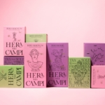
Packaging:
Properly Cultivated
Packaging expert Lisa Cain looks at Multiverse’s work with Italian rice brand Hera Nei Campi....
Fizzing with expression
It’s always a joy when a project manages to do something that feels new, bold, refreshing and resolutely contemporary; all the while wearing its influences absolutely front and centre on its sleeve. Treblasé is one such project, thanks to this superb brand design by Oslo-based multi-disciplinary design studio Olssøn Barbieri (Pursue Hard Seltzer, Stereoscope, Chelan Beauty). Riding on the high...
Cute, curious and cuddly
Fitness and health tracking apps are not generally known for their sense of fun. The likes of MyFitnessPal, while great in terms of functionality, for the most part, keep the design stuff resolutely serious, no-nonsense, and perfunctory. Meanwhile the likes of Strava elicit joy through very few things, the main one being when people decide to run in a shape...
Like, so retro, but so the future
There’s really so little not to love about this branding for Sooki – in fact, I’d go as far as saying there’s nothing not to love. It’s purely, and simply, gorgeous; every goddam inch of it. Kudos, then, to The Collected Works, the New York City- and New Orleans-based independent design studio behind the identity design created to bring Sooki...
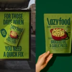
BP&O Voices
Packaging:
Lazy Food, Big Energy
A guest article written by packaging expert Lisa Cain. BP&O Voices presents the opinions of industry experts on a wide range of topics....
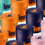
Logo
Conceivable
Firmalt
2026, USA, Supplements
Where fallow deer roam
Deer feel like unlikely ambassadors/ mascots/ PosterCreatures for olive oil, but it turns out they work brilliantly – when, that is, in the superlatively capable hands of a studio like SMLXL. Said olive oil is D’arbequina, a name which more broadly simply refers to the sort of plant from which the oil is produced: Arbequina is a widely cultivated olive...
BP&O Voices
Packaging:
Illustrated Instincts
A guest article written by packaging expert Lisa Cain. BP&O Voices presents the opinions of industry experts on a wide range of topics....
Free your mouth
You don’t really hear the word ‘quip’ all that often – it feels somewhat antiquanted in a way, a little eccentric, somehow very English. The sort of thing gracing the cover of the sort of book someone bought as a gift for someone they don’t really know very well, nor particularly care about – maybe 101 of Oscar Wilde’s Wittiest...
Pink! pink! everywhere!
Wine company Nice started life in 2019, and ever since, has aimed to be a far more straightforward alternative to the wildly confusing, jargon-packed, somewhat stuffy world of wine. In Nice’s words, the whole idea is to “liberate drinkers from wine headaches” both literal and metaphorical, “whether it’s inflexible packaging, confusing labels or next day regret”… Now after more than...