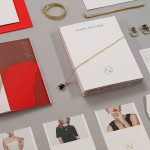
Mark Milton by ico Design
London-based design studio ico Design have recently completed their brand identity work for Mark Milton, a jeweller with a family heritage within the industry that dates back to 1947, and who carefully selects and retails a range of necklaces, earrings, bracelets and rings for women. Bound by the theme of curation, ico Design’s solution provides the Mark Milton brand with a high quality communicative breadth...
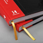
The Swedish History Museum by Bold
The Swedish History Museum is one of the country’s largest museums with a collection of over 10 million objects from a history that spans thousands of years. The museum also functions as a venue for lectures, concerts and a variety of activities. Stockholm-based design studio Bold were recently commissioned to develop a new brand identity for the museum that would...
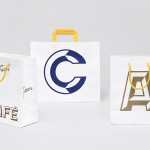
Fazer Café by Kokoro & Moi
Established in 1891 by Karl and Berta Fazer and located in Helsinki district of Kluuvikatu, Fazer began life as a French-Russian conditory that has grown to become one of Finland’s largest food companies, working within the bakery, confectionery, and work-place restaurant sectors. Summer 2013 saw the return of Fazer’s café chain to Helsinki with locations in the centre of the city and in the...
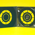
Giant Owl Productions by Alphabetical
Giant Owl is a London-based independent production company that creates television programmes, commercials and short films for clients such as Channel 4 and Rimmel London. Design agency Alphabetical recently developed a new brand identity solution for Giant Owl—which included an animated logo, flat colour palette, glow-in-the-dark paper and bold illustrative detail—that leverages a simple observation to balance an expected technicality with a playful...
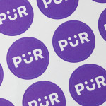
PÜR by Bond
PÜR is a health-food store with two locations in the Finnish capital of Helsinki. Design studio Bond worked with PÜR on brand identity, from logo, iconography and art direction, to interior design, website, advertising and marketing materials. Using a blend of bold sans-serif characters and moment of typographical play, earthy material detail and a pastel colour palette, still life photography...
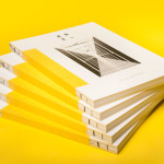
Raiffeisen Rechenzentrum by Moodley
The Raiffeisen Rechenzentrum is a customised IT infrastructure service provider and subsidiary of Raiffeisen Landesbank with a modern, ‘high availability’ and maximum security data centre located in Austria. Design agency Moodley recently developed RRZ’s brand identity—which included a logo, business cards, brochure and website—based around a single sans-serif, a contrast of humanistic and technological imagery and a white, black and bright...
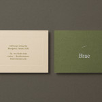
Brae by Studio Round
Brae is a restaurant, located in the Australian town of Birregurra, that describes itself as having a menu of unique and contemporary dishes built around a respect for nature and seasonality, and crafted from organic ingredients both locally sourced and grown on its own 30 acre site. Brae’s new brand identity—which included a new logo-type, menu, stationery set and website developed...

Intu by Heydays
Intu is a Norwegian accounting and consultation firm and real-time technological solutions provider located in the town of Bodø. Design agency Heydays developed a new brand identity solution for Intu—which included naming, logotype, business cards, print communication, custom typography and website design—based around the link between the firm’s two key services and the software it uses to deliver these efficiently....
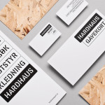
Hardhaus by Heydays
Hardhaus is a Norwegian specialist mountain sports retailer located in the alpine municipality of Sykkylven. Based around the concept of ‘technical durability’, Heydays developed a new brand identity solution for Hardhaus—which included a logo, stationery and website—that juxtaposes the utility of a heavy uppercase and stencil cut sans-serif—bold and ‘oversized’ in its execution in print—and the robust and hardy aesthetic of chipboard imagery, with...
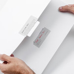
Håndværk by Savvy
Håndværk is a New York based clothing brand that mixes craftmanship, minimal elegance, premium materials and innovative fabrics to produce high quality everyday essentials for both men and women. Designed by Savvy, Håndværk’s new brand identity—which includes a logo, swing tags and packaging solution with a blind emboss detail—conveys the brand’s elegant and elemental nature with what Savvy describe as clean lines and...

Candela by RoAndCo
“Candela is a women’s footwear and ready-to-wear line created by Gabriela Perezutti. Influenced in part by her childhood spent on a horse ranch in Uruguay, the collection embodies Gabi’s soft femininity, adventurous gaucho spirit and South American roots. We [RoAndCo] conveyed this spirit throughout all iterations of the company’s branding—from business cards and lookbooks to art direction and campaigns—through elements...
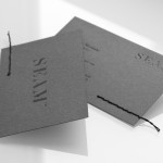
Seam by For Brands
Polish design agency For Brands were recently commissioned to create a new visual identity for Seam, a distributor of luxury clothing brands, that would convey a sense of craftsmanship and an eye for detail. For Brands mixes classic typographic detail with contemporary customisation delivered across tactile material choices with hand finished detail, fusing urban, craft and fashion sensibilities....