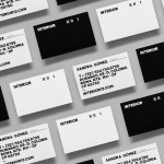
Interior XIII by Anagrama
Interior 13 is a distributor of Mexican and international auteur films and promoter of independent cinema. Design agency Anagrama were recently commissioned by Interior 13 to develop a new visual identity that would be “easily relatable to the cinematographic world” as well as being “functional in terms of online promotion.”...
Frederik Laux Photography by LSDK
Frederik Laux is an award winning German portrait, fashion, lifestyle and editorial photographer with a client list that includes Alliance and Mercedes-benz. His new visual identity, developed by Stuttgart based design agency LSDK, takes a competently spaced but generic condensed, sans-serif logotype and executes it as a redacted three-line mark die cut by hand across a print solution that mixes...

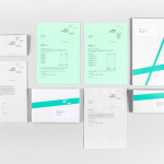
Bundle by The Company You Keep
Bundle is a service established by Sarah Cole that provides mums-to-be with a curated bag containing everything they need for their stay in hospital. Melbourne based design studio The Company You Keep (TCYK) developed a visual identity for Bundle that, through colour, bold sans-serif typography, the high quality perceptions of embossed and debossed print work and plenty of space, reflects the quality of...

MDD9 by Two Times Elliott
MDD9 is a Hong Kong and London based multidisciplinary architectural and interior design studio, founded in 2009, that is engaged in a variety of building and construction projects that include new developments and renovations, urban planning, lighting, landscape and acoustic design. The studio’s visual identity, developed by Two Times Elliott, reflects the “dynamic outlook” of the individual architects as well...

The Fableists by Freytag Anderson
The Fableists is a children’s clothing company that creates quality basics, predominantly unisex, designed to last with ‘punk rock flair’ and utilitarian, vintage clothing and work wear influence. Their products are underpinned by a sustainable brand philosophy that pays and treats their suppliers fairly, considers its impact on the environment and aims to educate buyers on the complete life cycle of their...
Partick Dental by Freytag Anderson
Design studio Freytag Anderson were recently commissioned by Glasgow based Partick Dental to create a “fresh and vibrant visual identity” for their local practices. The studio saw the opportunity to create a clear concept that would avoid the “usual clichés associated with the industry” and have an inclusivity that would strike a solid balance between minimal, contemporary, inviting and established, through a...
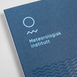
Meteorologisk Institutt by Neue
Meteorologisk Institutt provides meteorological data to Norway’s military, civil services and the general public with the intention of safe guarding life, property and the environment. Design agency Neue developed a new visual identity solution for the institute that mixes geometric shapes, material and print choices and the humanistic and environmental detail of photography to achieve communicative and aesthetic contrast and capture the data drawn from...

Checklist by Anagrama
Checklist is a Mexican event planning business that specialises in ‘milestone occasions’ such as birthdays, anniversaries and graduations as well as corporate events. Checklist caters ‘exclusively for their client’s unique needs’ and can also provide options that are environmentally friendly. Design agency Anagrama recently devised an ‘institutional’ visual identity solution for Checklist that mixes the age and authority of a heraldic shield,...
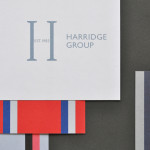
Harridge Group by Igloo
Harridge, formerly Ealing Travel Services, is a corporate travel group made up of Harridge Business Travel, Harridge Luxury and Harridge Events. London-based design studio Igloo were recently commissioned to design the group’s visual identity and brand architecture which would reference its “significant history and experience”. Their design solution, a combination of serif detail, sans-serif characters and a modern colour palette and pattern set, drawing on...

No. Six Depot by Perky Bros
“No. Six Depot is a family owned, small-batch coffee roaster and café nested in the beautiful Berkshires. Located in a historic train station on 6 Depot St, they serve teas, salts and coffee from small farms and roast on location. Their identity [designed by Perky Bros] juxtaposes a mix of unique rural and modern elements — drawing inspiration from their own backyard railroad...

Creagent by Bond
Creagent is a Finnish ‘design broker’ that provides a “unique pool of talented designers from all fields and a wide range of expertise to match various business needs.” Creagent’s new brand identity and website, developed by multidisciplinary design studio Bond – currently on a roll with new work for Allsorts and the University of the Arts Helsinki – utilises a bold, brightly coloured set of pictograms and...

University of the Arts Helsinki by Bond
“The Finnish Academy of Fine Arts, Sibelius Academy and Theatre Academy Helsinki merged in the beginning of 2013 into the University of the Arts Helsinki. Bond created the complete branding solution for the new university. The strategy for the identity was to create a distinctive set of logotypes based on a common design language, and to introduce an anchor symbol...