All Purpose ditches wine clichés in its lurid new identity for natural wine importer Ancestrel
Based in leafy yummy-mummyish south London enclave Forest Hill, Ancestrel (yes that’s a deliberate misspelling) is a wine shop and so much more – it’s proudly the first company in the UK to import natural wine. Having started life in 2016, Ancestrel has spent the decade since making a name for itself as a renowned importer, wholesaler, and retailer of...
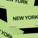
Pentagram nails controlled chaos in its identity for Manhattan “shophouse” style Thai restaurant LenLen
It’s not easy to make an identity look genuinely effortless – more often than not, the very intention to do so renders the result looking the exact opposite. And nothing, no one, ever wants to be levelled with the accusation of appearing to be ‘trying too hard’. However, Pentagram New York’s partner Andrea Trabucco-Campos and team has succeeded in that...
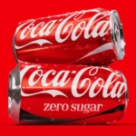
Coca-Cola’s new identity by JKR proves that sometimes the smartest rebrand is barely a rebrand at all
It’s hard to think of a bigger name client than Coca-Cola: the brand is so huge that it’s become a shorthand for anything meaning ‘global mega-corp’. Its reach is so vast, its history so firmly cemented in culture that it practically owns a certain combination of red and white; a specific sort of alliterative script serif type. Even its bottle...
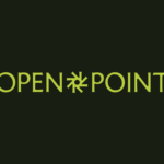
20(Something) borrows from museum-modernity as much as tech in its new identity for civic software platform Open Point
I’ve no idea what this trend is called, or indeed if it even has a name, but I’m seeing it around a hell of a lot lately: t-shirts (usually very crisp, almost box-fresh-clean, and white) with a tonne of text emblazoned across the back. It doesn’t seem to matter at all what the text says, to means, but there’s a...

Koto gives programmer forum Stack Overflow a reason to exist in the age of AI
Since starting life in 2008, Stack Overflow has functioned as a website/platform/forum that soon became a sort of internet go-to as a shared notebook or tool guide for programmers: somewhere they can ask questions, answer them, and have them answered by other actual real life people who’ve probably been there and done that, and want to impart the wisdom they’ve...
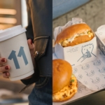
Makebardo’s charming illustrations for Cairo cafe/music venue E11VN just about rescue a rather hideous brand name
It’s never fun being negative about a project – it’s far more gratifying to show really great work, genuinely exciting or useful brands and organisations – and get under the skin of what makes them so. Obviously, a fair bit of this comes down to subjective taste; taking our own experiences and interpretations and cultural backgrounds and personalities and all...
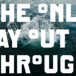
Industrial, conceptual, and starkly beautiful: DutchScot’s branding for SF sauna and cold plunge, Fjord
Fjord is a new floating sauna and cold-water plunge experience moored in San Francisco Bay’s Sausalito area. Rather than being exclusively positioned as a wellness-type experience, instead it looks to float, as it were, somewhere between architecture, hospitality and outdoor recreation. It’s a very modern take on the centuries-old tradition of saunas and how they’re used – the shift between...

Pentagram’s designs for male health brand Rugiet are unabashedly phallic, but they work
One of the more hilariously on the, er, nose identities I’ve seen in recent times here in the form of Pentagram New York’s work for Rugiet, a men’s health brand offering personalised, clinically-backed treatments sold exclusively online. Formerly better known as Rugiet Health, Rugiet was founded in Austin, Texas, in 2020 as a telehealth company. Back then, the company was...
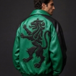
JKR overhauls football club Sporting CP by doing what it does best : plundering heritage to build a robustly simple, contemporary brand identity
JKR is perhaps – in recent-ish years at least – best known for its work with Burger King, undoubtedly one of the most oft-cited rebrands of the last decade in design circles. Then it did KFC; before that, the RSPCA, alongside a raft of other household name entities which aren’t acronyms – Uber, Boddingtons, Yahoo, Billington’s sugar. In short, hugely...
Studio Blackburn’s branding for Ellis Butchers is unflinchingly carcass-centric, yet somehow so full of warmth
As a vegan of two decades, and a squeamish one at that, the thought alone of a “whole-carcass butcher business” makes me feel rather queasy – so it’s a testament to Studio Blackburn’s incredible skill that despite my personal nonsense, I absolutely adore this branding project. And I love it not in spite of things like the utterly unflinching, raw-flesh-laden...
Exemplary brand collabs don’t compromise: the joyful designs for Midnight Hotdog ‘dog fur mist’ by SMLXL
Back in February, we covered a project that was so delightful I still think of it often (not least thanks to its utterly ridiculous, ingenuously earwormish jingle): HotDog, with its branding by SMLXL. There was, and is, so much to love about this identity: there’s the logo formed of two dogs, one sniffing the other’s bum, reduced to its most...
If you’ve visited an off-licence, you’ve heard of Lebara – now thanks to Verve, the brand finally makes sense
Lebara. Le-ba-ra. It’s a word that’s become so familiar to many of us, sonically at least, as to have become almost part of the wallpaper. But semantically, conceptually, literally – do many of us really know what it is? If you’re anything like me or the very small sample of around five to six people who just happened to be...